Exploring FBPlot’s Design Palettes. We’ll showcase each of the seven default palettes – Palette, Fantasy football, Pastel palette, Tibet building, Spain (general), Real Madrid, and FBC – using Mbappé’s performance radar as an example.
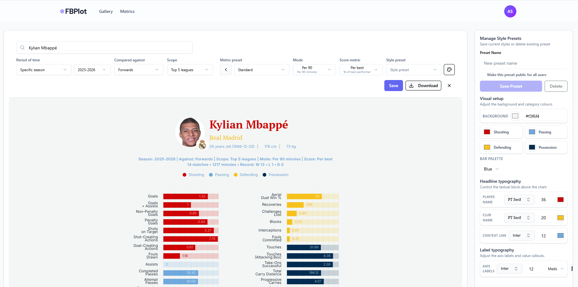
In scouting reports and press publications, visuals need to do more than show data – they must fit the story’s visual identity. FBPlot’s radar chart tool addresses this by offering a range of preset design palettes that can instantly tailor a chart’s look to match a team’s colors, a publication’s branding, or the thematic tone of an article. Instead of one-size-fits-all graphics, you can choose from seven distinctive default palettes (and even create your own) so that your Kylian Mbappé radar chart for a Real Madrid report doesn’t look the same as one for a general La Liga piece.
In this post, we’ll showcase each of the seven default palettes – Palette, Fantasy football, Pastel palette, Tibet building, Spain (general), Real Madrid, and FBC – using Mbappé’s performance radar as an example. We’ll discuss the character of each palette, when to use it (high-contrast for eye-catching media vs. subtle tones for formal reports, and so on), and note any pros and cons. Along the way, we’ll also highlight how FBPlot’s palette selector and customization features put you in control of your chart’s appearance. (For details on the metrics shown in these radars – like what constitutes “Shot-Creating Actions” or “xG” – see our Metrics Glossary for definitions.)
Selecting and Customizing Palettes in FBPlot
The palette selector in the FBPlot radar chart tool, listing the seven default palette options. Each preset is represented by a row of swatches showing its colors (e.g. Spain’s row features red and deep blue, Real Madrid’s shows white, red and blue, etc.). A checkmark indicates the currently applied palette (here “FBC”).
Choosing a palette in FBPlot is as simple as a couple of clicks. The palette selector (pictured above) is accessible in the radar chart editor and lets you preview all seven default schemes by name. With one click, you can apply a palette like “Spain” or “Pastel” and instantly recolor the chart to those tones. This means if you’re preparing a graphic for, say, the Spanish national team or a youth-focused fantasy football blog, you can swap to the relevant color theme on the fly. The presets cover a broad range of styles – from vibrant to muted – making it likely one will suit your needs. And if not, you’re not limited to the defaults.
The palette customization interface in FBPlot. In the “Visual setup” panel (top), users can adjust each color (background, and colors for categories like Shooting, Passing, etc.) using color pickers. This powerful interface allows fine-grained control to create a custom palette or tweak an existing one without any design software.
FBPlot provides full customization for design-conscious users who need a bespoke look. The visual settings panel (shown above) enables you to adjust every color and highlight – background, text, and the colors representing different metric groups – so you can create a chart that perfectly matches a team’s official palette or your publication’s style guide. For example, you can set the “Shooting” category to a specific pantone shade or change the background to transparent for print media. Beyond colors, you can also tweak typography (fonts, label size) and other styling options to ensure the chart integrates seamlessly with your layout. This flexibility means you’re not confined to the seven presets; they are starting points, and you can iterate from there to get exactly the right look[1]. Now, let’s look at each default palette in turn – what it looks like and when it shines.
Basic Palette – Bold Colors for High Impact
Kylian Mbappé’s radar chart with the basic palette. This palette drenches the chart in bold colors – a bright golden background and bold red accents – immediately grabbing attention.
The Basic palette has bold colors, making it ideal whenever you want a chart with a fiery, attention-grabbing backdrop. In the example above, the entire radar is set against a rich golden-yellow canvas with bold white text, and the data segments alternate through warm tones (red and purple hues) that echo the energy of contrasted colors. This high-contrast design ensures metrics pop: even small values don’t get lost against the vivid background.
- When to use it: Use the Basic palette for scenarios that call for passion and high energy – for instance, a piece highlighting a player’s stats or a magazine spread where you want the graphic to immediately catch the reader’s eye.
- Pros: Extremely eye-catching and distinctive; the red/gold scheme can reinforce a Spanish team narrative.
- Cons: The intense background color can overpower a page if not used carefully – in print reports or articles with lots of text, you might find the bright background a bit distracting or hard to match with other elements.
In such cases, consider using Basic’s palette for social media graphics or sidebars, while opting for a calmer style (like Pastel) in the main report. Overall, Basic’s palette is all about making a statement – great for bold visual statements and team-centric storytelling.
Fantasy Football Palette – Vivid and Playful for Modern Media
Mbappé’s radar chart with the Fantasy football palette. This design uses a medium gray backdrop to make neon-bright accents pop – note the hot pink title, neon green and electric blue data areas. It feels like a fantasy sports UI, instantly drawing the eye.
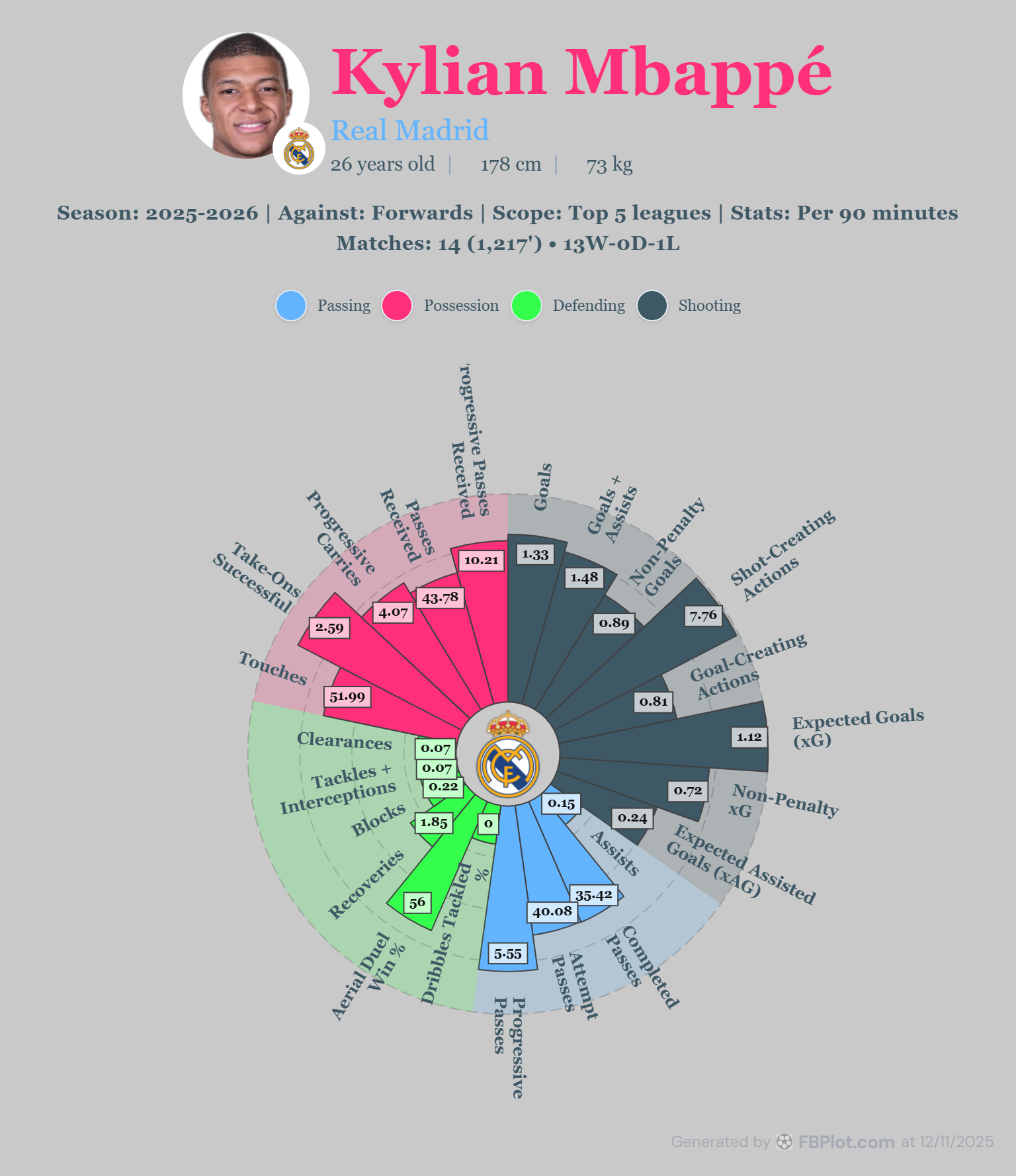
If you’re creating content for fantasy football audiences or social media, the Fantasy football palette is a perfect match. This palette has a vibrant, playful vibe reminiscent of fantasy league dashboards or video game graphics. In the example, Kylian Mbappé’s name appears in bright pink against a slate gray background, with Real Madrid in an aqua blue – these unconventional colors signal a fun, modern tone. The radar itself features neon green and magenta highlights among others, making each performance area stand out distinctly.
- When to use it: This palette excels in engaging a younger or online audience – think blog posts, Twitter/X infographics, or fantasy league articles where a flashy look can increase engagement. Sports media companies might use it for “player of the week” graphics or comparison charts in a fantasy context, because the high contrast ensures clarity even on a small phone screen.
- Pros: High-contrast neon colors on a neutral dark background offer great readability; the palette feels fresh and contemporary, aligning with esports or fantasy app aesthetics. It naturally draws the viewer’s attention on crowded social feeds.
- Cons: The flip side of its boldness is that it’s less suited for formal reports or traditional print media – a professional scouting dossier or a newspaper might find the hot pinks and bright greens out of place.
Additionally, if a chart needs to align with a specific team’s branding, Fantasy’s random bright colors could clash. Use this palette when you want to excite and engage, rather than to stay subtle.
Pastel Palette – Soft Tones for Reports and Editorials
Mbappé’s radar chart with the Pastel palette. This design uses a soft gray-beige background and gentle colors – yellow-orange, lilac, light gray – for a subdued, professional look. The text is black and legible, ensuring clarity without bold coloration.
The Pastel palette offers a subtle, muted color scheme that’s easy on the eyes – excellent for lengthy reports, print publications, or any context where you want the data to speak without loud colors. In the example above, the chart is set against an understated gray background, and the colors used for the data segments are soft yellows and purples along with neutral tones. Nothing is oversaturated: Mbappé’s name is rendered in a standard black, and category labels appear in gentle hues (orange for Passing, pale yellow for Possession, light gray for Defending, and lavender for Shooting). This restrained approach ensures the chart blends with text on a page rather than screaming for attention.
- When to use it: The Pastel palette is a go-to for professional scouting reports, academic analyses, or newspaper graphics, where maintaining a consistent, unobtrusive style is important. If you’re inserting a radar chart into a document with lots of text or combining it with other charts, Pastel’s soft palette will maintain visual harmony.
- Pros: The lighter colors and neutral background improve readability in print (no risk of dark backgrounds consuming ink or glaring off the page) and make your charts look polished and businesslike. It’s also a safe choice for colorblind readers – the distinctions are made with light vs. dark areas more than with saturations.
- Cons: The main trade-off is that Pastel is not as immediately eye-catching as some other palettes. In a social media post or a presentation slide, its subtlety might fail to grab attention, especially from afar. Also, if your publication has a vibrant brand color, the pastel scheme might not incorporate it fully (though you can always tweak individual colors). Overall, Pastel is about restraint and clarity, making it ideal for serious analyses and dense information displays where style must not detract from substance.
Tibet Building Palette – Rich Earthy Tones for a Unique Aesthetic
Mbappé’s radar chart with the Tibet building palette. This palette features earthy, heritage-like colors: a muted beige background, deep red and brick orange highlights, with golden and teal touches. It gives the chart a classic, almost vintage feel while remaining clear.
The Tibet building palette is the most uniquely named of the lot, and it delivers a distinctive visual style. Drawing from a palette of earthy tones and deep reds (inspired by traditional Tibetan architecture colors), it gives your radar chart a warm, vintage character. In the example, the background is a soft sand-beige, easing the contrast on the eyes. Data segments and labels incorporate colors like dark maroon, burnt orange, and muted gold, with even a hint of teal blue on some elements – reminiscent of ornate temple designs or aged prints. This scheme can set your chart apart from the standard blues and reds seen elsewhere.
- When to use it: The Tibet building palette is great for when you want your visualization to have a bespoke, editorial look. For instance, a feature piece in a magazine or a blog post doing a historical comparison might employ these tones to create an atmospheric effect. Scouts or analysts could use it in reports where the aim is to appear refined and less “techy” – the colors have a somewhat classical appeal. It can also complement content that isn’t team-specific but needs to stand out (imagine a neutral presentation theme or a report cover).
- Pros: The palette’s subdued reds and browns are easy on print materials and lend a professional gravitas to the chart. The high contrast of the deep red against beige ensures important values still stand out, but in a way that feels deliberate and sophisticated. Moreover, because these colors are uncommon in sports graphics, a radar chart in Tibet palette can be quite memorable.
- Cons: While unique, the palette might not match any team’s branding (unless a team coincidentally has a claret and gold scheme). If brand alignment is a priority, Tibet might require manual tweaking. Also, on digital platforms that favor brighter visuals, these tones could appear a bit retro or understated.
In summary, use Tibet building when you want a rich, editorial tone or to give your charts a touch of old-world charm, and you don’t mind stealing the show with an uncommon color set.
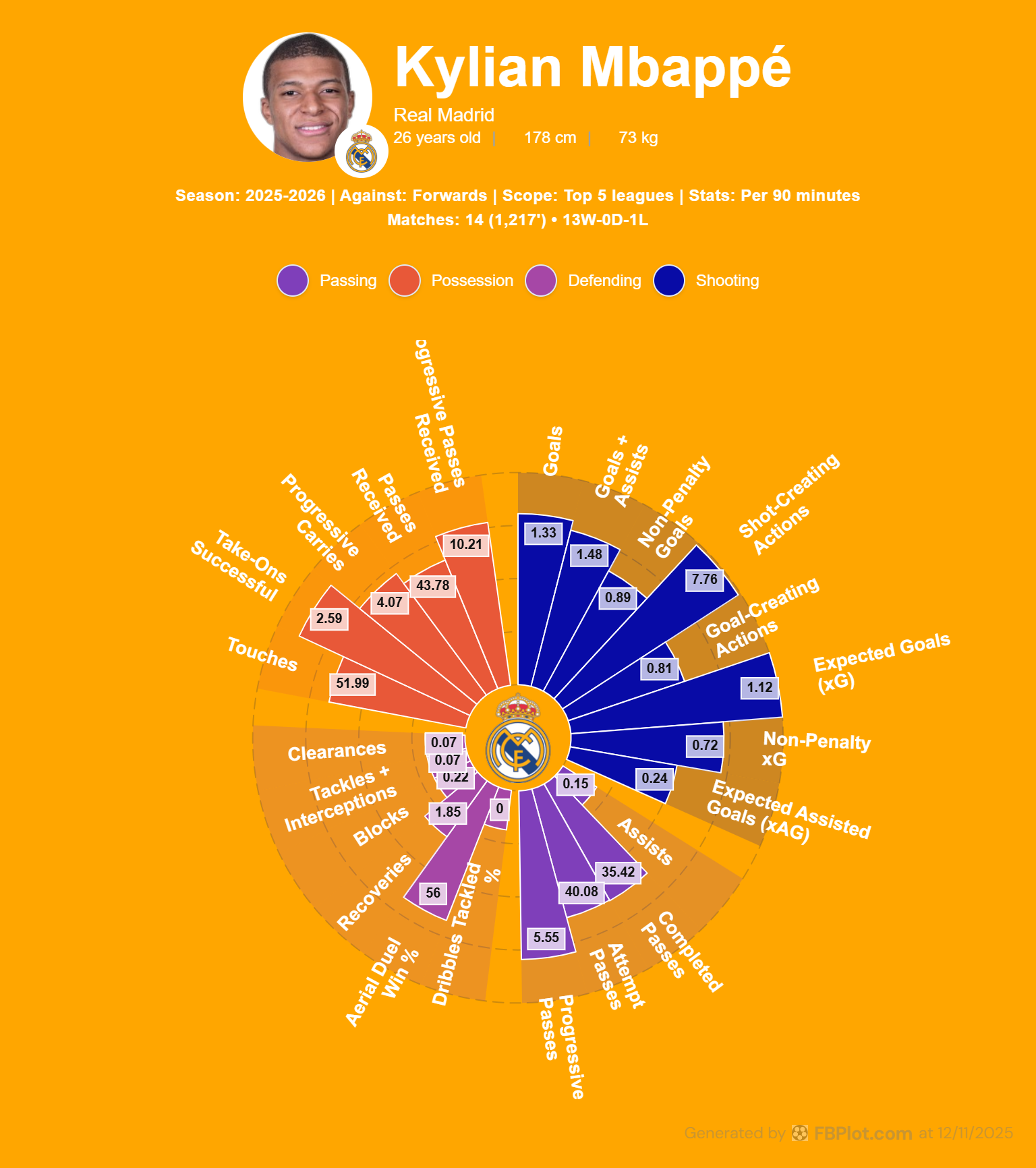
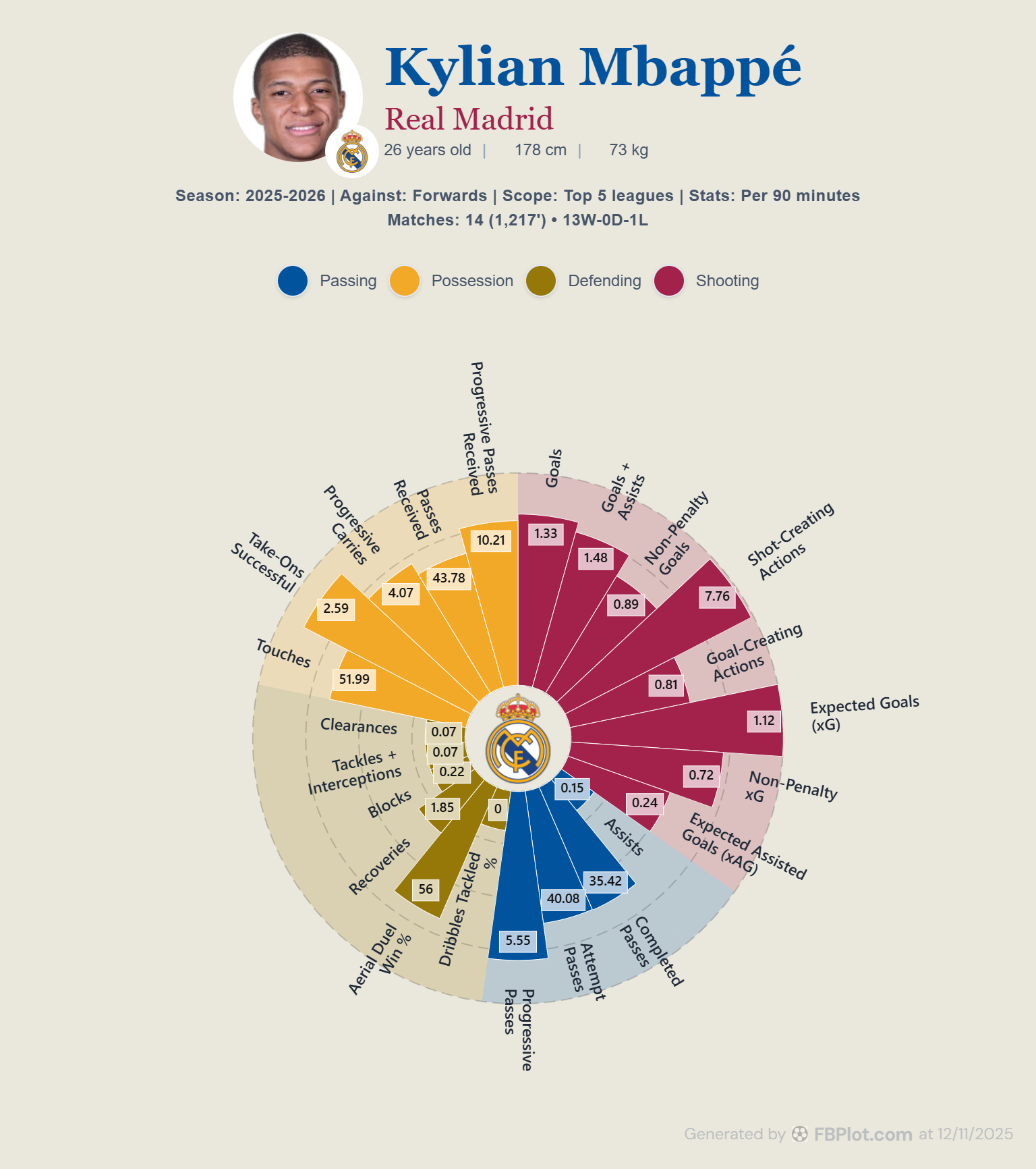
Spain – Balanced and Multi-Color for General Use
Mbappé’s radar chart with the default Palette. This is a balanced mix of colors: each metric category has its own hue (light blue for Passing, navy for Possession, golden yellow for Defending, and red for Shooting), all on a clean white background. The result is a classic, easy-to-read radar chart.

Simply named “Spain,” this default option is an all-purpose design that many users start with. It provides a balanced variety of colors so that each section of the radar chart is distinct, which is especially useful if you plan to discuss each aspect of performance separately. In the example, the four main metric groups are color-coded in a familiar way – for instance, Passing stats are light blue, Possession stats a darker blue, Defending stats golden yellow, and Shooting stats red. The background is plain white (or very light gray), and text is in appropriate contrasting colors (Mbappé’s name appears in bright red here, complementing the theme). This palette doesn’t align to any team specifically, but that’s its strength: it’s versatile and clear.
- When to use it: The Palette preset is ideal for general-purpose charts where you want maximum clarity and a professional look without leaning toward any team’s colors. It works well for presentations to mixed audiences, generic blog posts, or comparison charts involving players from different teams (since the colors won’t make the chart feel biased toward one side). If you’re unsure which palette fits, this one is usually a safe starting point.
- Pros: Highly readable and printer-friendly – the white background and varied colors ensure that both color and shape differences are easy to spot. Because each statistic category has its own color, it’s straightforward to create a narrative (e.g., “blue sections show Passing ability, where the player excels, whereas red sections (Shooting) are smaller”). The palette feels professional and neutral.
- Cons: Visually, it may not be as striking as some theme-based palettes; it has a somewhat standard infographic look. If your goal is to evoke a certain team or competition, you’d switch to a more thematic palette. However, there are few drawbacks in contexts of pure clarity.
In short, the default Palette is the “jack-of-all-trades” – great for benchmarking, comparisons, or any scenario where a clean, multi-color chart is desired.
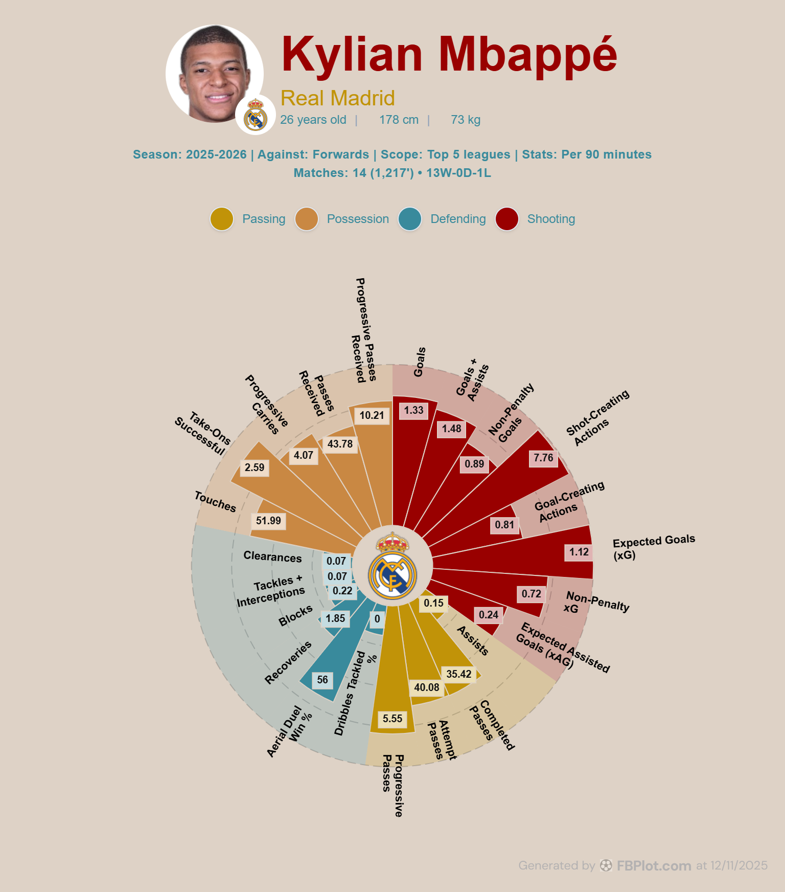
Real Madrid Palette – Clean and Classic for Team Branding
Mbappé’s radar chart with the Real Madrid palette. This palette reflects Real Madrid’s identity: a very light (nearly white) background, deep navy blue accents (see the title), and subtle use of red and golden yellow (from the club crest) in the chart. The overall feel is sleek and authoritative.
The Real Madrid palette is designed to mirror the iconic look associated with the club often nicknamed Los Blancos. As shown above, the background is nearly white (a pale gray, to allow white elements to show), giving the chart a clean, minimalistic canvas. Key text like “Kylian Mbappé” is in a deep Madrid blue, and we see the use of red and yellow accents that likely derive from details of Real’s crest (for example, the small red segment might reflect the crest’s crown cross, and the golden tone reflects the crown or trim). The chart’s defending segments here are gray, and passing segments navy blue – overall it’s a restrained color palette befitting a top club’s branding.
- When to use it: This one is a natural if you are featuring a Real Madrid player or comparing Real players – it instantly gives the graphic a Real-specific feel. Scouting departments at Real Madrid (or media covering the club) would use this to ensure any visual fits seamlessly with Real’s brand presentation. Even if the content isn’t officially for the club, using their palette in a graphic about them adds credibility and visual context for the reader. Outside of Real, this palette is useful whenever you want a crisp, professional look with light colors – it could pass as a generic “modern report” style if viewers don’t specifically associate the colors with Real.
- Pros: It’s very easy on the eyes – mostly light background and moderate accent colors – and it maintains high readability. The touch of team color adds character without needing garish background colors. This palette also prints well due to the white/gray background and limited saturated areas.
- Cons: It’s obviously tailored to Real Madrid, so using it for, say, an FC Barcelona player might be confusing or off-brand (you wouldn’t want to surround a Barça player’s stats with Real’s colors!). In those cases you’d choose a different palette or customize one.
Additionally, the subdued style, while elegant, might not grab a casual reader’s attention as much as a bold palette would. In summary, the Real Madrid palette offers a sleek, branded look – perfect for content centered on Real or whenever you need a trustworthy, boardroom-ready aesthetic.
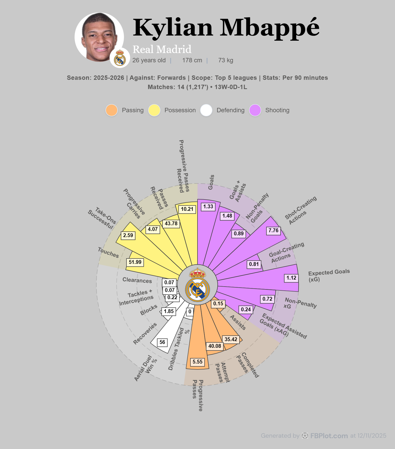
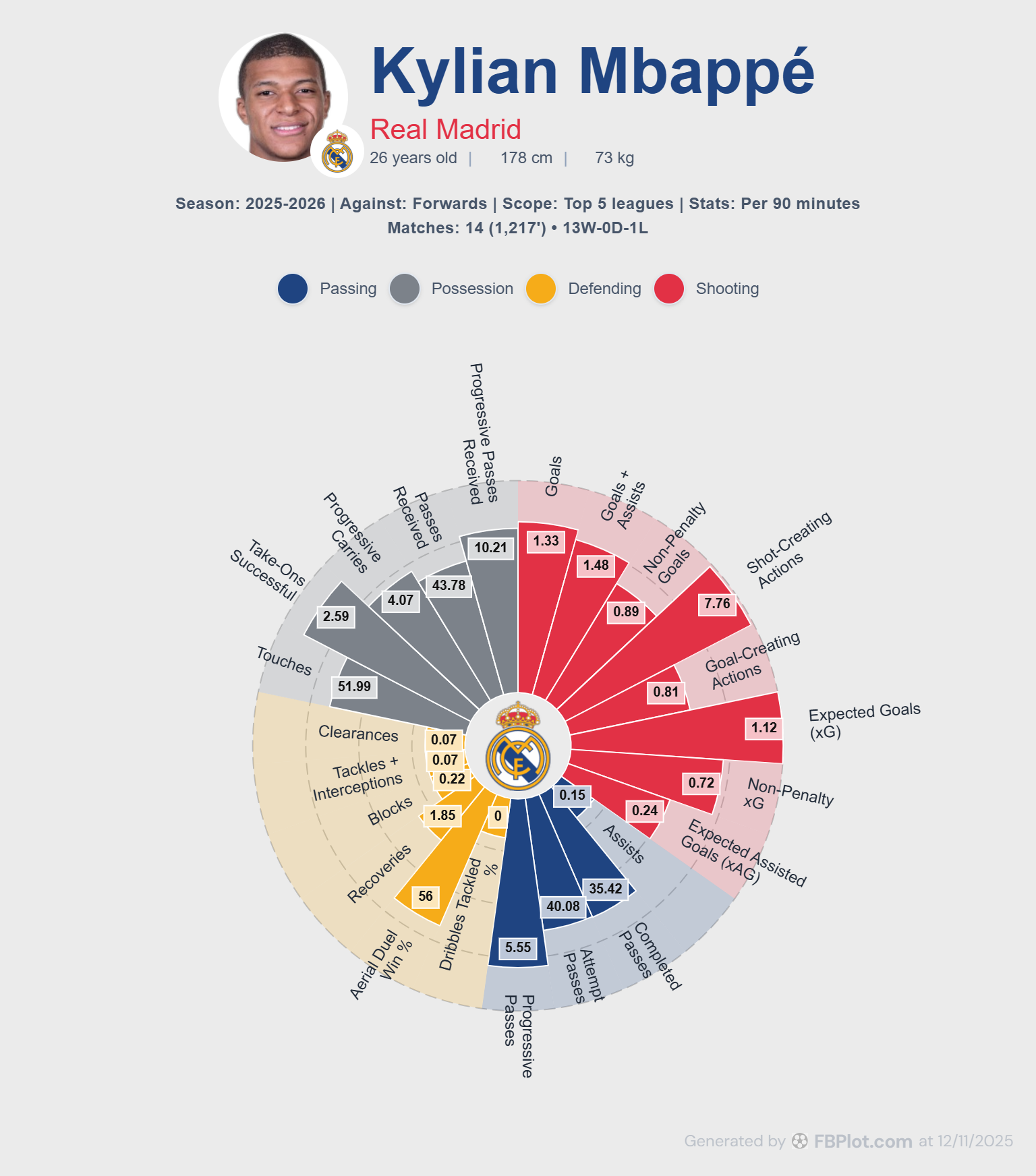
FBC Palette – FBPlot’s Signature Blend for Versatility
Mbappé’s radar chart with the FBC palette. This appears to be FBPlot’s in-house default palette, featuring a light beige background and a mix of strong but not overwhelming colors (navy blue for the title, red for highlights, and ochre and plum tones in the chart). It’s a balanced, professional look.
Finally, the FBC palette (named by the tool, and likely standing for FBPlot’s default or a Football Club composite palette) gives you a well-rounded design that doesn’t skew toward any one team’s colors. In the example, the chart uses a subtle warm background and a combination of blue, red, and gold hues. The title text is a deep blue, ensuring high contrast and readability, while “Real Madrid” is in a bold red. The data segments themselves rotate through a few colors: you can see a muted gold for one category, a slate blue for another, and a plum-red for the shooting metrics. The overall effect is a palette that feels rich yet neutral – it could suit many teams or topics because it doesn’t scream any particular club’s identity.
- When to use it: This palette is an excellent default for general football analytics content. If you’re making a chart and aren’t specifically tailoring it to a team, the FBC palette gives a polished, broadcast-ready look. Press agencies or scouting agencies might choose FBC for reports that cover multiple teams or league-wide analysis, where a neutral yet appealing style is preferred. It’s also a great starting point if you plan to customize – because it has a bit of everything (light background, medium-strong accents), you can easily adjust one or two colors to match a brand and still have a coherent scheme.
- Pros: Versatility is the keyword – the FBC palette’s mix of colors works against light or dark contexts and is friendly to most club color schemes if placed side by side. It delivers contrast (notice how clearly the radar’s values are readable) without using extremely neon or dark elements. This makes it suitable for both digital and print uses.
- Cons: Since it’s a general palette, it might not be as memorable or thematic as some others – it won’t automatically tie your chart to a specific team or story. Also, if your publication already has a strong color identity, you might opt to tweak the FBC colors to align more closely. That said, it’s easier to tweak this palette than to start from scratch, which speaks to its flexibility.
Overall, FBC serves as a reliable, professional-looking default – a palette you can trust for almost any project when you want a dash of color that still feels cohesive.
Bringing It All Together
The design palette you choose can profoundly affect how your audience perceives a radar chart. High-contrast schemes like Spain or Fantasy can inject energy and grab attention, whereas subtle palettes like Pastel or Real Madrid’s give an impression of rigor and professionalism. There’s no single “best” palette – the best choice depends on your audience and context. A scouting agency preparing an internal report may lean toward Pastel or Real Madrid for a clean look, while a media outlet might pick Fantasy or Spain to make a graphic pop on social media. The good news is FBPlot’s ecosystem makes it easy to experiment with these options. You can try out all seven default palettes with a click, and further refine any of them via the customization panel until the chart aligns perfectly with your needs.
Finally, remember that these palettes and customization features aren’t limited to radar charts. FBPlot offers other visualization tools – for example, our Player Bar Chart tool – and the same design flexibility carries over. You can maintain a consistent visual style across different chart types, reinforcing your brand or narrative (imagine using the Real Madrid palette for both radar and bar charts in a scouting dossier – the uniform colors give a polished, unified impression). If you’re unsure where to start, jump into the Player Radar Chart tool, load up a player (maybe Kylian Mbappé, as we did), and cycle through the palettes. Each will tell a slightly different visual story with the same data. By aligning your charts’ design with your team’s identity or your publication’s voice, you ensure that your audience not only sees the insights but also feels the context behind them. Happy charting, and enjoy the creative freedom that FBPlot’s palettes provide!
Found this helpful? Share it with your network
More Articles
How to create a football scatter plot
FBPlot makes it easy to build scatter plots that are both analytical and publishable. In a few steps—Select Data → Customise → Appearance → Export—you can compare players across two performance dimensions while adding a third layer of insight through bubble size. The standout capability is flexibility: you can assign multiple metrics to each axis (FBPlot sums them to create a single X and Y value), which means you can define your own composite measures like Goal Impact or Chance Creation without spreadsheets. Then, you can scale bubble radius by any metric (Key Passes, xA, Minutes, Progressive Carries) to reveal context and separate true outliers from statistical noise. Finally, the Appearance controls let you style the chart for different audiences—clean and restrained for scouting reports, contextual and eye-catching for media—so every scatter plot can match the brand and format of the person using it.
The Complete Guide to Radar Charts in Football Analysis
Radar charts (also known as spider charts or web charts) have become the go-to visualization for comparing players across multiple dimensions. But creating effective radar charts requires more than just plotting numbers. Let's explore how to do it right.