
Learn how to build and read football radar charts using explicit comparison groups, percentiles, units, samples and a compact set of role-relevant metrics.
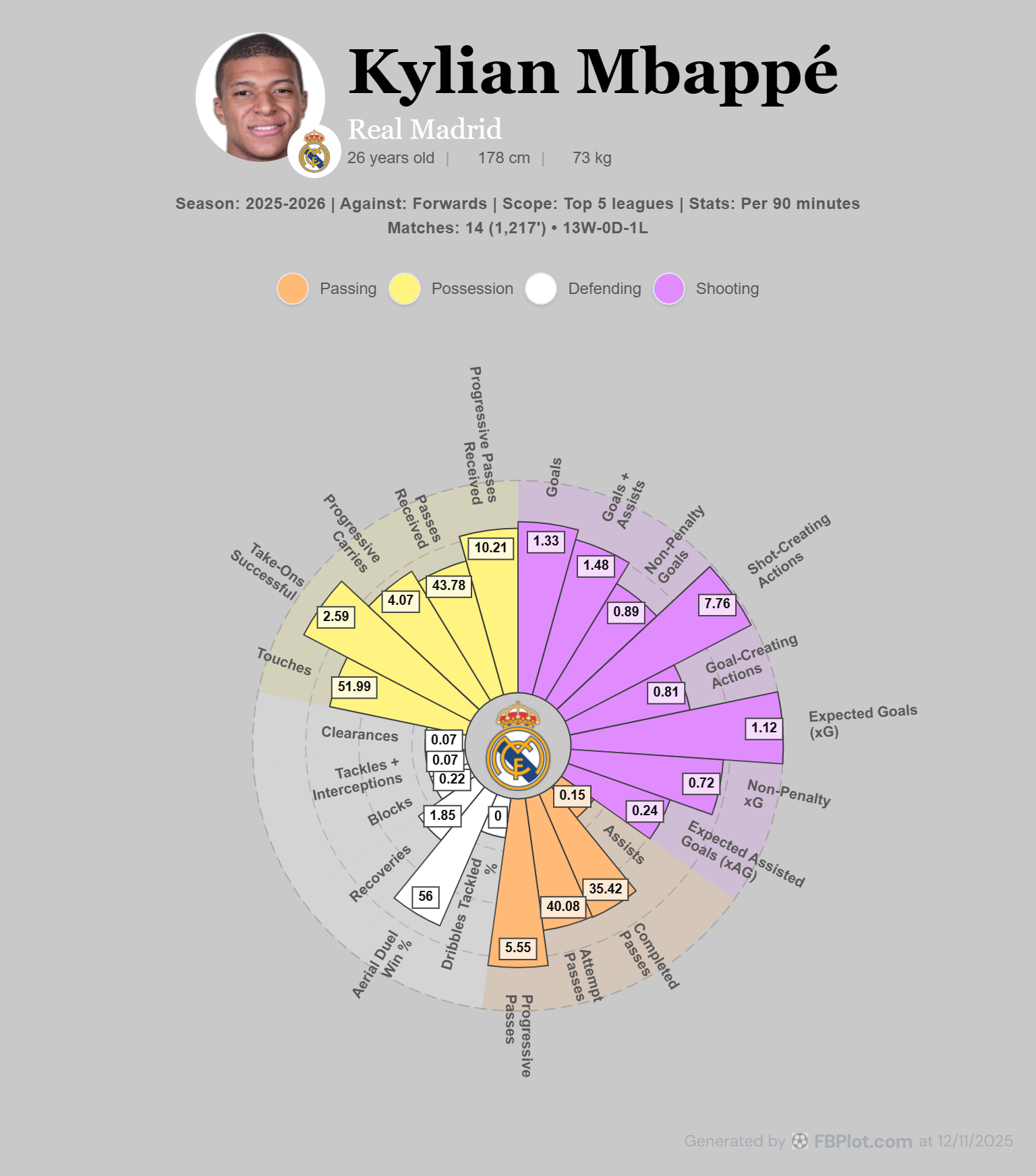
A radar chart is a profile, not an overall player rating. This guide shows how population, period and unit shape every axis, and how to preserve that context in a defensible FBPlot workflow.
A football radar chart compresses several metrics into one player profile. That makes strengths, weaknesses and stylistic differences easy to scan, but it also makes missing context easy to overlook.
The outline is not a universal rating. Every axis depends on a metric definition, period, unit and comparison population. Change any of those inputs and the shape can change without the player's observed performance changing.
This is FBPlot's main methodological guide to radar charts. For color and visual identity, use Aligning Radar Charts with Your Identity.
What a Radar Chart Answers
A radar is useful for this question:
What does this player's multi-metric profile look like inside a defined comparison population?
It is less suitable for precise lookup, a long ranking or a relationship between two variables. Use the player bar chart guide when individual metric values must remain easy to scan, or the scatter plot tutorial when the question concerns a relationship across many players.
A radar should support an analytical statement, not replace one.
Define the Comparison Population First
A percentile requires an ordered population. NIST's statistical reference defines percentiles from ordered observations; without the observations being compared, the number has no useful interpretation.
Before selecting metrics, record:
- period or season;
- position or role group;
- competition scope;
- minimum minutes or matches;
- age or other eligibility filters;
- unit mode;
- data cutoff.
"Forwards in the same league during 2025/26 with at least the chosen exposure" is interpretable. "All players" may be too broad if the roles and opportunities are materially different.
Values and Percentiles Are Different Layers
Each radar axis can contain:
- an observed value in the selected unit;
- a percentile or relative score calculated from eligible peers.
The observed value answers what the player recorded. The percentile answers where that value sits in one population.
A high percentile does not mean the player is universally excellent at the underlying skill. It means the value ranks highly under the selected metric, period, filters and population. Some metrics describe style or volume as much as quality.
See What Happens When the Population Changes
The paired FBPlot captures below hold player, season, position group, metrics and per-90 mode constant. Only comparison scope changes.
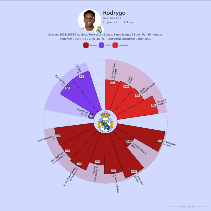
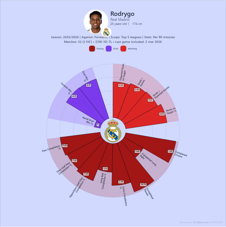
The comparison demonstrates a method, not a football conclusion: isolate one input, observe the relative scores and document the population change.
Choose the Unit Before Reading the Shape
Totals and per-90 rates answer different questions.
- Absolute values describe accumulated output during the period.
- Per 90 describes event rate conditional on minutes played.
- Contribution, where supported, describes a different relationship and must be read from its definition.
Per 90 does not control role, team context, league strength or small samples. The guide to per-90 football metrics explains the denominator and minimum-minutes workflow in detail.
Always show minutes or an eligibility rule when rates drive the interpretation.
Select Metrics From a Role Hypothesis
Do not begin with the maximum number of axes. Begin with the football question.
For example:
- a finishing profile might combine shooting volume, shot quality and outcome metrics;
- a progression profile might combine carrying and passing measures;
- a defensive profile might separate engagement, duel outcomes, recoveries and errors.
These are hypotheses, not universal position templates. Metric availability and definitions belong in the FBPlot Metrics Glossary.
A compact set is easier to audit. Start with roughly six to eight distinct metrics, then add an axis only if it answers a different part of the question.
Avoid near-duplicates that reward the same behavior several times. Goals, goals plus assists and goals plus expected assists may all be relevant in different analyses, but placing them together can give finishing contribution disproportionate visual weight.
Order Axes Deliberately
Adjacent axes create the outline and filled area. Reordering identical values can change the polygon's appearance even though no data changed.
Use a stable, disclosed order:
- group related concepts;
- keep the same order across players being compared;
- do not reorder axes to create a more dramatic shape;
- compare labels and values, not polygon area.
Graphical-perception research by Cleveland and McGill found that position and length support more accurate magnitude judgments than angle and area. That is a useful restraint for radar interpretation: use the profile for pattern, then return to axis values for precise claims.
Read a Radar in Five Passes
1. Read the Context Line
Check player, period, comparison group, scope and unit. Stop if any are missing.
2. Read the Metric Labels
Confirm that every metric fits the question and that higher values have the intended interpretation.
3. Inspect Each Axis
Read observed value and relative score separately. Do not infer a combined rating.
4. Look for Clusters
Several related axes pointing in a similar direction can support a profile observation. One isolated spike needs more caution.
5. Test an Alternative Population
Change one defensible input—such as scope or minimum minutes—and see whether the interpretation persists.
Common Radar Mistakes
Treating Area as Performance
The filled polygon has no FBPlot overall-score meaning. Area also depends on axis order.
Mixing Units
Do not describe a rate as a total or a percentile as an observed value.
Using an Incoherent Population
Comparing different roles can measure opportunity rather than player ability.
Hiding the Sample
A strong rate over limited minutes may be real for that sample and still be unstable.
Choosing Metrics for Shape
Metrics should come from the question, not from which combination produces the most attractive polygon.
Comparing Too Many Profiles
Overlapping many players can obscure labels and differences. Use a bar or scatter when precise multi-player comparison is the task.
Radar, Bar, Scatter or Swarm?
Use a radar for one compact multi-metric profile.
Choose another chart when:
- player bar: each metric value and percentile needs direct reading;
- scatter or bubble: you need a relationship, trade-off or outlier across many players;
- swarm: you need the distribution and density around a highlighted observation.
The football chart selection guide starts from the question and maps it to these chart families.
A Reproducible FBPlot Checklist
Before export:
- write the analytical question;
- choose a coherent period and population;
- set a minutes or matches rule;
- select one unit;
- choose a compact, non-duplicative metric set;
- verify definitions in the glossary;
- keep axis order stable;
- record comparison scope and data cutoff;
- inspect whether the conclusion survives one reasonable alternative population.
Build the Radar
Open the FBPlot Player Pizza Chart and write the comparison population before choosing metrics. If you cannot explain who is eligible, the radar is not ready to interpret.
Found this helpful? Share it with your network
More Articles
How to Document a Reproducible Football Chart
Record the minimum information another analyst needs to rebuild a football chart: question, source, period, population, metrics, units and configuration.
Small Samples in Football Analytics: Minutes, Matches and Uncertainty
Handle early-season and low-minute football data with explicit exposure rules, sensitivity checks and cautious language.