FBPlot makes it easy to build scatter plots that are both analytical and publishable. In a few steps—Select Data → Customise → Appearance → Export—you can compare players across two performance dimensions while adding a third layer of insight through bubble size. The standout capability is flexibility: you can assign multiple metrics to each axis (FBPlot sums them to create a single X and Y value), which means you can define your own composite measures like Goal Impact or Chance Creation without spreadsheets. Then, you can scale bubble radius by any metric (Key Passes, xA, Minutes, Progressive Carries) to reveal context and separate true outliers from statistical noise. Finally, the Appearance controls let you style the chart for different audiences—clean and restrained for scouting reports, contextual and eye-catching for media—so every scatter plot can match the brand and format of the person using it.
Scatter plots are the fastest way to answer a common football analytics question: which players stand out, and in what way? In one view, you can place every player in a comparison set across two performance dimensions (X and Y), then add a third dimension using bubble size. The result is a chart that is both analytical (you can shortlist, compare, and segment) and communicable (you can publish it as a clean visual for social, blogs, or scouting reports).
FBPlot’s scatter plot builder adds two features that make this format genuinely practical for real workflows:
- Multi-metric axes: each axis can include more than one metric; FBPlot sums the selected metrics per axis, letting you build simple “indices” (e.g., Goal Impact, Chance Creation) without spreadsheets.
- Bubble size by metric: bubble radius can scale based on a metric like Key Passes, xA, Progressive Carries, or even Minutes, adding context without cluttering the axes.
Below is a complete, end-to-end guide: Select Data → Customise → Appearance → Save & Export, with best practices for both analysis and publishing.
Why Use Scatter Plots for Player Comparison?
A scatter plot is ideal when you want to compare many players quickly and still keep the reasoning transparent. Unlike single-metric rankings (which often hide trade-offs), a scatter plot forces the key question into the open: who is high on both dimensions, who is unbalanced, and who is simply different?
Typical use cases include:
- Finding high-end creators (chance creation vs goal contribution)
- Identifying outliers (players who combine rare traits)
- Comparing shortlists across leagues or age groups (U21, U23, etc.)
- Producing publishable visuals for media, agencies, and internal scouting packs
- When done well, a scatter plot doesn’t just “show data”—it makes decisions easier.
Step 1 — Create a Scatter Plot in FBPlot
Click + Create and choose Scatter. From there, FBPlot guides you through a consistent workflow:
Select Data → Customise → Appearance → Save & Export
That sequence matters: first you define who is included, then what the chart measures, then how it looks, and finally how you share it.
Step 2 — Select Data (Build the Right Comparison Set)
Most “bad charts” aren’t bad because the chart type is wrong—they’re bad because the dataset is poorly defined. In Select Data, you set the rules for which players can appear.
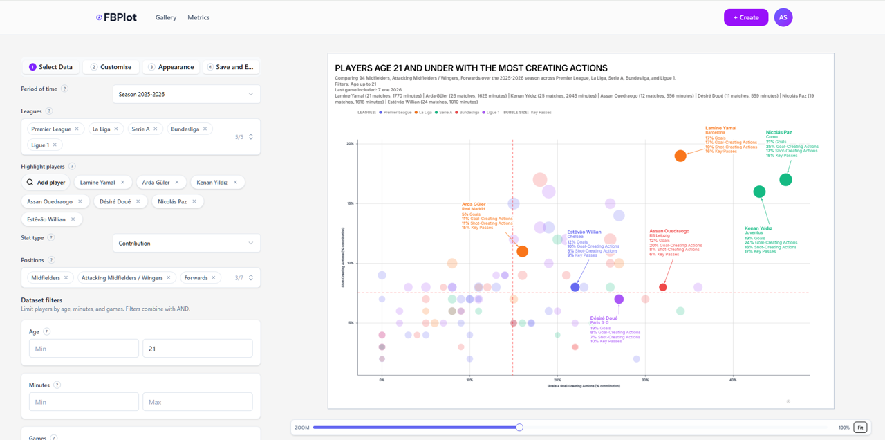
You will typically choose:
- Period of time (season or time window)
- Leagues / competitions (one or multiple)
- Positions (to keep comparisons fair)
- Dataset filters (age, minutes, games…)
- Highlight players (optional, but strongly recommended)
Example: “Best creators U21”
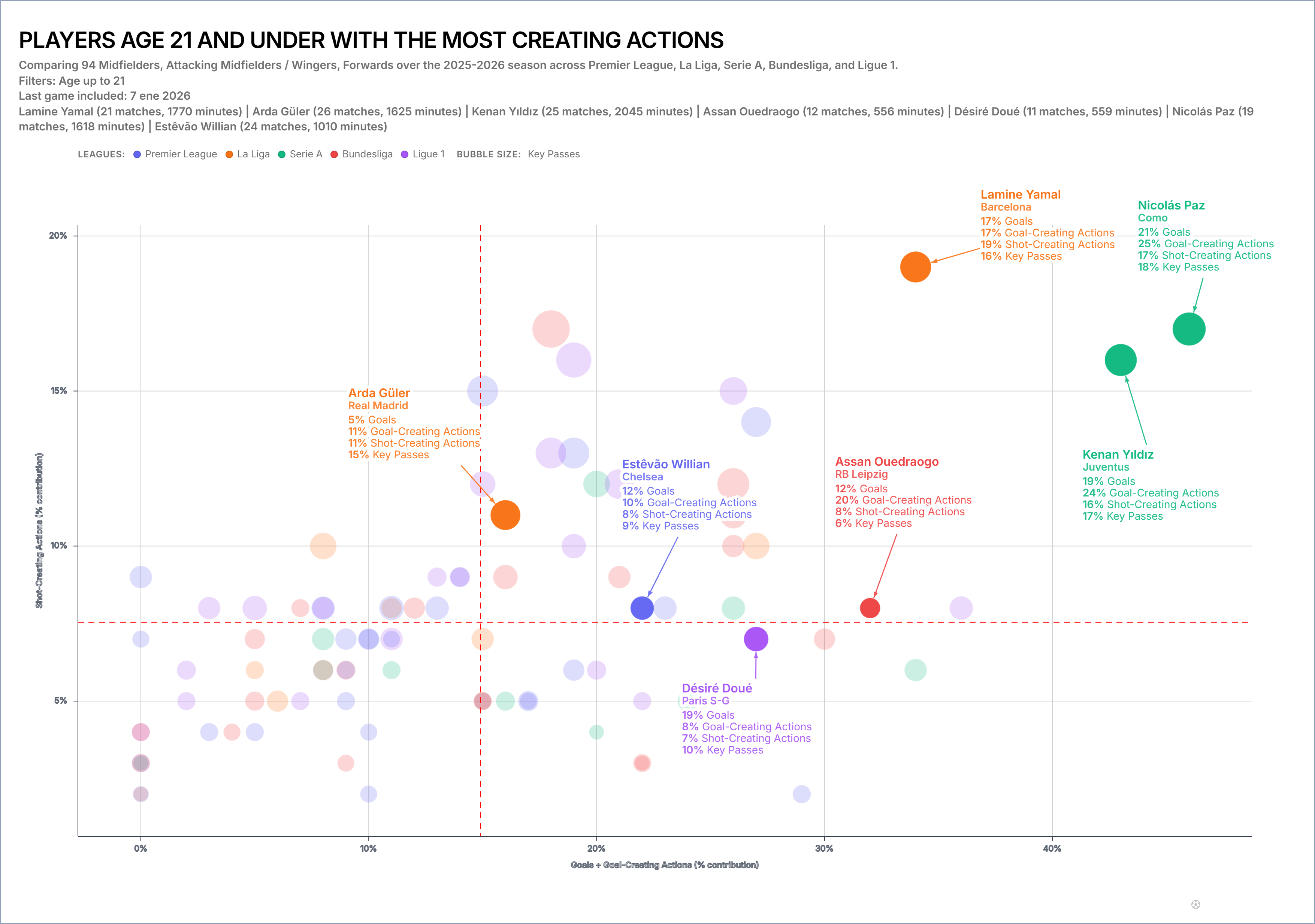
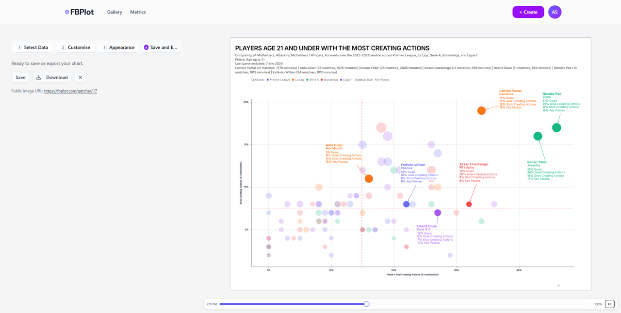
If your goal is a chart like “Players age 21 and under with the most creating actions”, a strong dataset setup looks like this:
- Age filter: max 21
- Leagues: e.g., Premier League, La Liga, Serie A, Bundesliga, Ligue 1
- Positions: Midfielders / Attacking Midfielders / Wingers / Forwards
- Highlight players: add the names you want to compare directly (your anchors)
This approach gives you two benefits:
- The chart stays readable because the comparison set is coherent.
- Highlighted players become instantly trackable, even in a dense plot.
Step 3 — Customise (Define X, Y, and Bubble Size)
This is where your scatter plot becomes meaningful. The goal is not to “pick metrics”; the goal is to define two dimensions that answer a real football question, and then add bubble size as supporting context.
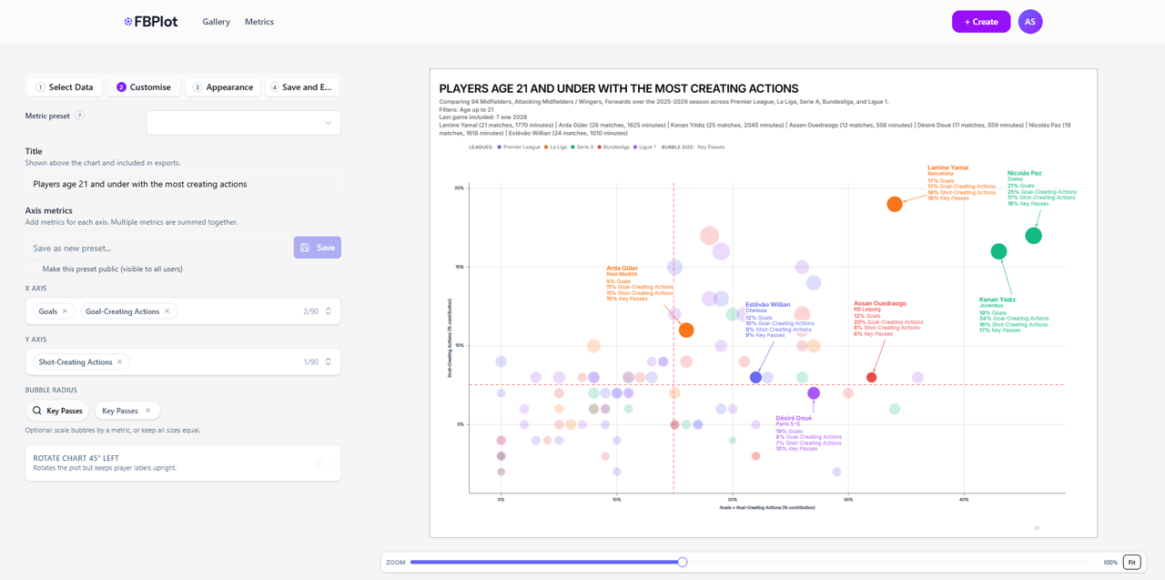
3.1 Title (Make the Question Explicit)
Use a title that reads like a scouting or editorial question:
- “U21 creators: goal impact vs chance creation”
- “Wingers: shot creation vs goal involvement”
- “Midfielders: progression vs final-third output”
A good title improves interpretation immediately—especially when the chart is exported and shared out of context.
3.2 X Axis (One Metric or a Summed Index)
In FBPlot, the X axis can include more than one metric. The system sums the selected metrics to compute the final X value.
That matters because it lets you build a composite dimension that is still explainable.
Example:
- X = Goals + Goal-Creating Actions
Interpretation: “How strongly does the player contribute to goals, directly and through goal-creating involvement?”
This is often better than choosing a single metric, because real football output is rarely one-dimensional.
3.3 Y Axis (A Second Dimension That Complements X)
Apply the same logic to Y.
Example:
- Y = Shot-Creating Actions
Now the chart has a clean reading:
- Further right = more goal impact
- Higher up = more shot creation
This is the core of scatter plot value: you can immediately see who is strong in both, who is strong in one, and who is neither.
3.4 Bubble Radius (Add a Third Dimension Without Clutter)
Bubble size is where scatter plots become genuinely insightful.
Example:
- Bubble size = Key Passes
Now you’re telling a richer story without adding complexity:
- X = goal involvement
- Y = shot creation
- Bubble size = key passing contribution
In practice, bubble sizing helps you avoid false conclusions—two players may share similar X/Y positions, but one might be doing it with much higher playmaking volume.
3.5 Save a Metric Preset (Pro Feature — Standardise Your Workflow)
If you regularly build scatter plots with the same logic (axes + bubble sizing), saving a Metric preset is the step that turns “one-off charting” into a repeatable workflow.
Metric presets are available in FBPlot Pro. They’re designed for users who need consistency across multiple charts—press series, agency reports, scouting pipelines, or weekly content formats.
CTA: If scatter plots are part of your routine, FBPlot Pro presets let you reuse the same setup across seasons/leagues in seconds, while keeping your analysis consistent.
Step 4 — Appearance (Turn Analysis Into a Brand-Ready Visual)
A scatter plot can be analytically correct and still fail in the real world if it isn’t readable or doesn’t fit the publishing context. FBPlot’s Appearance step is built for that reality: the same chart may need to look different for a journalist, a scouting agency, or a club presentation.
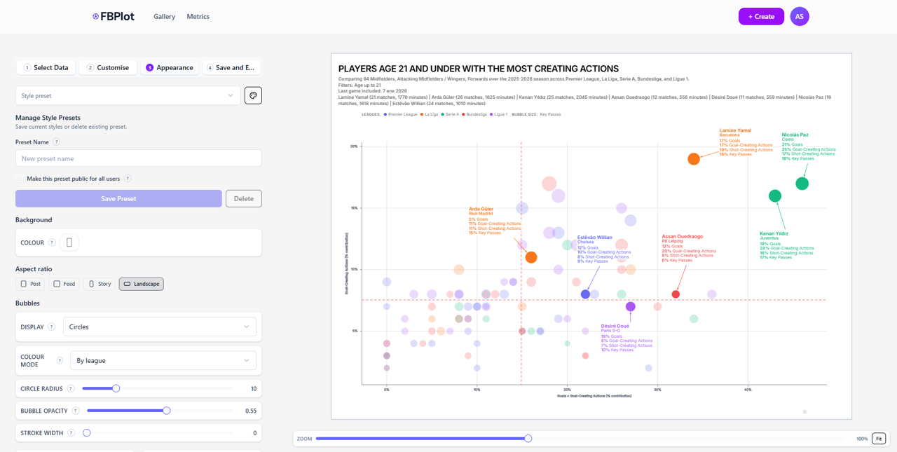
4.1 Aspect Ratio (Choose the Output Format First)
FBPlot supports multiple aspect ratios so your chart fits where it will be consumed:
- Post / Feed: optimized for social timelines and blog embeds
- Story: vertical layout for mobile publishing
- Landscape: best for reports, presentations, and desktop viewing
This is not cosmetic: the ratio affects label space, legend layout, and readability.
4.2 Colour Systems (Context or Brand, Depending on Your Goal)
You can style points to communicate structure at a glance (e.g., by league), or you can keep a more neutral palette for formal reporting.
Use cases:
- Press / creators: league colours help a broad audience interpret context quickly.
- Scouting agencies: restrained colours keep attention on outliers and labels.
- Clubs / analysts: consistent colour rules match internal dashboards and slide decks.
The point is flexibility: FBPlot lets you align the chart to the visual language of your audience.
4.3 Typography and Fonts (The Difference Between “Readable” and “Publishable”)
Most charts are viewed on mobile. Typography choices decide whether the graphic works in the real world.
In Appearance, you can tune font styling so:
- Player labels remain legible at typical social sizes
- The title feels editorial (for media) or technical (for scouting)
- The information hierarchy is clear (title → key labels → context)
This is especially important when you highlight players and export for web posts.
4.4 Bubble Styling (Clarity Under Density)
When many players are plotted, the chart can become visually heavy. Appearance controls help preserve clarity:
- Opacity: reduces overlap noise and reveals clusters
- Stroke width: improves separation when bubbles overlap
- Base radius controls: keeps bubble sizing informative without dominating the chart
A good rule: bubble size should add meaning, not steal attention.
4.5 Labels, Highlights, and Chart Readability
If you’re creating content for press or scouting, labels are the story. Highlighting a few players ensures your audience can follow the narrative immediately, while the rest of the dataset provides context.
You can also use:
- Legend choices (e.g., league context)
- Visual framing to keep the plot clean when exported
- Zoom and framing controls to avoid cramped outputs
The result is a scatter plot that doesn’t just “look nice”—it’s designed for communication.
Step 5 — Save, Export, and Share
Once the scatter plot matches both your analysis goal and visual style:
- Save it so you can revisit and iterate later
- Download an image for social posts, reports, or presentations
- Use the public image URL to share a stable chart output (useful for embedding and quick distribution)
This is a key part of FBPlot’s design philosophy: your chart should move easily from analysis to publication.
Best Practices for Multi-Metric Axes (Avoid Over-Complexity)
Multi-metric axes are powerful because they let you define your own composite dimensions. The only requirement is that the axis remains explainable.
Do:
- Combine metrics that express one idea (e.g., output, creation, progression)
- Keep it explainable in one sentence
- Start with 1–2 metrics per axis and only expand if necessary
Avoid:
- Mixing unrelated concepts without a clear rationale
- Adding too many metrics (harder to trust and harder to communicate)
- Creating an axis you can’t name (if you can’t label it mentally, your reader won’t get it)
FAQ: Scatter Plots in FBPlot
Can I use multiple metrics on the same axis? Yes. FBPlot allows more than one metric per axis, and sums them to compute the axis value.
Can bubble size depend on a metric? Yes. Bubble radius can scale by a metric (Key Passes, xA, Minutes, etc.) to add a third dimension.
Can I style charts to match different brands (press vs scouting)? Yes. Appearance controls (colour systems, fonts/typography, bubble styling, backgrounds, aspect ratios) are built to produce exports that match different publishing contexts.
Can I reuse the same setup across charts? Yes—saving presets is available in FBPlot Pro, designed for repeatable workflows.
A Repeatable “Creator Scatter Plot” Template (Quick Start)
If you want a proven starting point for attacking player comparisons:
- X: Goals + Goal-Creating Actions
- Y: Shot-Creating Actions
- Bubble size: Key Passes
- Filters: position + minutes threshold + age group
- Highlight: 5–10 players to anchor the story
It’s simple, explainable, and produces a chart that works both for analysis and for publishing.
Found this helpful? Share it with your network
More Articles
Aligning Radar Charts with Your Identity
Exploring FBPlot’s Design Palettes. We’ll showcase each of the seven default palettes – Palette, Fantasy football, Pastel palette, Tibet building, Spain (general), Real Madrid, and FBC – using Mbappé’s performance radar as an example.
The Complete Guide to Radar Charts in Football Analysis
Radar charts (also known as spider charts or web charts) have become the go-to visualization for comparing players across multiple dimensions. But creating effective radar charts requires more than just plotting numbers. Let's explore how to do it right.