
A season-to-season player comparison needs aligned roles, competitions, minutes, units and data cutoffs before a changed chart can support a changed-player claim.
Build a fair same-player comparison across seasons, separate role and team changes from performance, and document the configuration another analyst can reproduce.
The two charts show the same name, so the comparison feels controlled. It rarely is.
Between one season and the next, the player may change club, position, coach, teammates, competition, minutes, set-piece duties or physical condition. Even when none of those changes, the eligible percentile population will. A different shape is an observation. “The player improved” is an explanation that still needs to be earned.
The FBPlot comparison workflow can place two or three player-season profiles on shared axes. The quality of the result depends on the contract you write before selecting them.
Freeze the Question
Avoid the vague prompt “Was he better last season?” Replace it with something that the chosen metrics can address:
- Did the player's chance-creation frequency change?
- Did ball progression move from passing to carrying?
- Did the player's share of team output change?
- Did the defensive workload change with the new role?
Each question produces a different chart. A general “better” comparison encourages the analyst to collect whichever metrics create the most dramatic difference.
Keep the Metric Set Identical
Use the same metric IDs, order and direction for both seasons. Do not replace an unflattering row or allow a preset update to change one side of the comparison.
Record the preset and the final manual metric list. If a metric is unavailable in one season, either remove it from both or state that the comparison is incomplete.
This is also the moment to check definitions. A label that changed provider methodology between periods should not be treated as a continuous series without evidence.
Align the Unit, Not Just the Label
Absolute totals compare accumulated output and availability. Per-90 values compare event frequency while on the pitch. Team contribution compares responsibility inside each team. Percentiles compare relative standing in a selected population.
Pick one mode for the main comparison. If you need a second mode, place it in a separate chart and explain why it answers a different question.
A strong workflow often uses totals first and rates second. If the total rises while the rate falls, the player may simply have played more. That is a useful finding, not a problem to hide.
Minutes and Starts Change the Confidence
One season may contain a full campaign; the other may contain a short run after injury or a series of substitute appearances. Per 90 reduces the arithmetic effect of minutes but does not make the samples equally stable.
Show minutes and matches. Consider a minimum-exposure rule for the comparison population, and state whether the player's own sample crosses it comfortably.
The guide to comparing unequal minutes provides a deeper rate-versus-volume method.
Role Drift Is Often the Real Story
A winger moved inside may shoot more and cross less. A midfielder deployed deeper may create fewer shots but attempt more passes. A centre-back in a higher line may record fewer clearances and defend more space.
Those changes do not invalidate the comparison. They change its interpretation.
Write a role note for each season and mark any major tactical change. Then decide whether the article is evaluating performance inside one stable job or documenting how the job changed.
The Population Can Move Underneath the Player
Percentiles depend on the eligible peers. The same raw value can receive a different percentile when the comparison league, role group, minutes threshold or season population changes.
This means a season-to-season percentile change can contain two movements:
- the player's observed value changed;
- the population distribution changed.
Keep the raw or per-90 values visible beside the percentile. If the percentile moves but the value barely does, investigate the population before writing a player-development story.
Use the Season Line as Evidence
The captured FBPlot chart below is a single-season profile, not a cross-season result. Its value for this method is the context line: season, role, scope, mode, matches and minutes are carried with the visual.
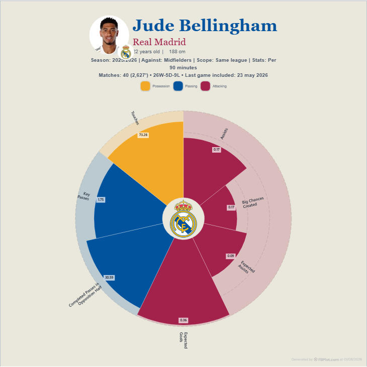
When two profiles are overlaid, repeat that context in the caption rather than assuming the legend carries it all.
A Reproducible Season-Comparison Manifest
Save these fields with the export:
- player and club in each period;
- exact season or date range;
- competitions included;
- role and position group;
- matches, minutes and eligibility threshold;
- metric IDs and definitions;
- absolute, per-90, contribution or percentile mode;
- comparison scope and data cutoff;
- known role, team or provider changes.
The reproducible chart documentation guide turns this list into an audit trail.
Write the Conclusion in Two Parts
First state the observation:
The player's per-90 value increased on three creation metrics and decreased on two progression metrics between the configured seasons.
Then state the interpretation and limits:
The pattern is consistent with a more advanced role, but the team, competition mix and percentile population also changed; match review is required before attributing the difference to development.
This structure keeps the chart useful without asking it to prove cause.
Use FBPlot Player Comparison to select the same player in two seasons. Lock the metric list and mode before looking at the shapes, then export the configuration with the conclusion.
Found this helpful? Share it with your network