
Learn how to interpret football metrics in context: check units and sample, compare similar roles, combine complementary signals, and use the FBPlot Metrics Glossary for canonical definitions.
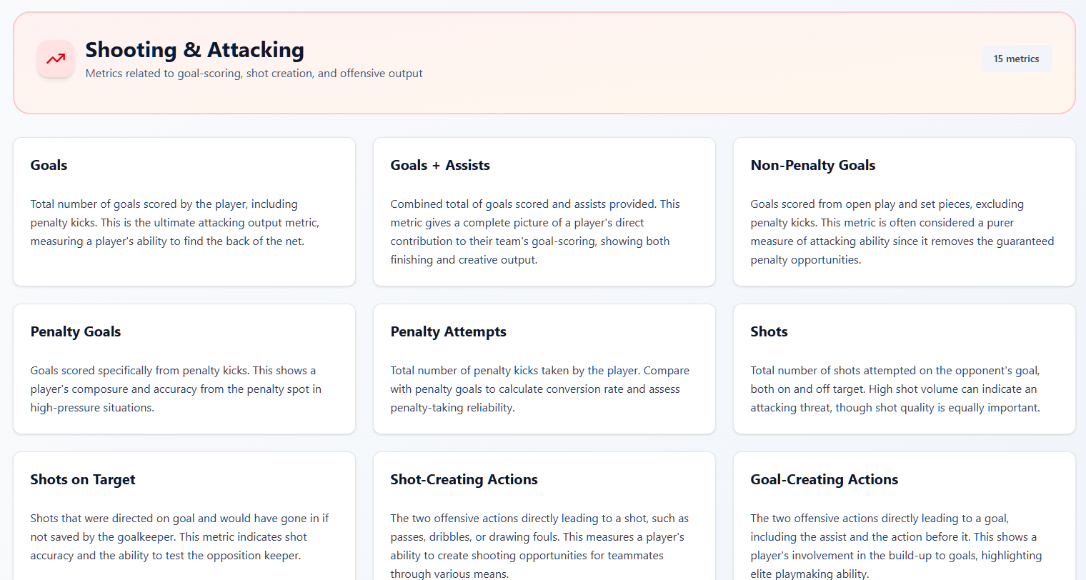
The FBPlot Metrics Glossary is the source for metric definitions. This guide has a different job: it explains how to use those definitions without losing the football context around them.
When you need to show both an observed value and its position among comparable players, follow the football player bar chart interpretation guide before exporting the graphic.
Start With the Question
Choose a metric because it helps answer a football question, not because it is available.
- For finishing, compare outcomes with measures of chance quality and shot volume.
- For creation, combine the frequency of actions with the quality of the chances that follow.
- For progression, consider both passing and carrying, plus the role a player has in possession.
- For defending, interpret actions alongside team style, territory and time spent without the ball.
Write the question above the analysis. This makes it easier to reject metrics that are interesting but irrelevant.
Check the Definition and Unit
Before comparing players, confirm the exact definition in the Metrics Glossary. Similar labels can be calculated differently by different providers, and a total, a per-90 rate and a percentage answer different questions.
Record:
- the metric definition;
- whether the value is a total, rate, percentage or percentile;
- the data provider or model when it matters;
- the season or date range;
- the competitions included.
Build a Fair Comparison Group
A number only becomes meaningful when the comparison population is clear. Compare players with broadly similar roles and enough playing time to make the sample useful.
Position labels alone are not always sufficient. Two midfielders can have very different responsibilities, and team possession or defensive style can change the opportunities they receive. Use filters as a starting point, then check role and tactical context.
Use Per-90 Values Carefully
Per-90 rates help compare players with different minutes, but they do not remove small-sample noise. A player with limited minutes can post an extreme rate that is unlikely to persist.
Always show the minutes or appearances behind the rate, set a sensible minimum for the task, and avoid treating per-90 values as a projection of future output.
The dedicated per-90 football metrics guide explains the formula, totals-versus-rates decision and a reproducible minimum-minutes workflow.
Combine Complementary Metrics
No single metric captures a complete player profile. Pair measures that illuminate different parts of the same question:
- volume with efficiency;
- outcomes with underlying process;
- on-ball production with opportunity or team context;
- quantitative results with video review.
Avoid adding metrics merely to make the analysis look comprehensive. If two measures tell nearly the same story, explain why both are needed or choose one.
Choose the Right Visual
Start with the relationship the reader needs to see. The football chart selection guide maps profiles, metric rows, relationships and distributions to the current FBPlot chart families.
Use a scatter plot when the question is about the relationship between two measures, outliers or trade-offs. The football scatter plot tutorial shows how to define the axes and add a third measure through bubble size.
Use a radar chart when the question is about a multidimensional profile. The football radar chart guide explains metric selection, peer groups and presentation.
Follow One Metric Through Three Different Questions
The easiest way to understand an advanced metric is to watch its meaning change when the unit changes. Take attempted passes. An absolute total asks how much passing volume a player accumulated over the period. Per 90 asks how frequently he attempted passes while on the pitch. Team contribution asks what share of the team's recorded attempts belonged to him. A percentile then ranks the selected value inside a defined peer group.
Vitinha's FBPlot chart below uses the third question. The percentage labels represent team contribution for supported metrics, while bar length represents percentile rank against same-league midfielders. The visual contains two numbers with different jobs; reading either as the other would change the conclusion.
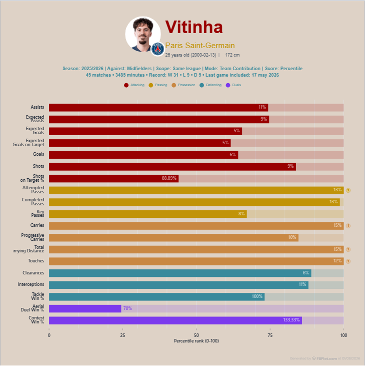
This is where beginners often blame themselves for finding the chart difficult. The difficulty is real: percentage metrics, contribution shares and derived rates do not all have interchangeable denominators. An unusual value should send you back to the glossary, not tempt you to invent a football explanation.
Now imagine the same player in per-90 mode. A high rate could reflect his role when selected, while a lower total could reflect missed minutes. In absolute mode, availability becomes part of the output. None of these views is the “true” one. The right view is the one whose denominator matches the question written at the top of the analysis.
From Number to Football Conversation
Once the definition is secure, ask what opportunity produced the action. A midfielder's pass volume depends on team possession, build-up role and match state. A defender's interception count can rise because of anticipation, territorial pressure or repeated exposure. Expected goals depends on the quality and location of shots the model records, not simply finishing talent.
This is why complementary metrics are useful when they create tension rather than agreement. Goals beside expected goals can expose a gap worth investigating. Progressive carries beside completed passes can separate two routes of ball progression. Minutes beside a per-90 rate can make a spectacular number feel appropriately provisional. The second metric should complicate the story in a useful way, not merely repeat it with another label.
A Repeatable Interpretation Checklist
Before sharing a conclusion, ask:
- Is the definition current and unambiguous?
- Are the unit, period and competition visible?
- Is the comparison group fair for the player’s role?
- Is the sample large enough for the claim?
- Does a second metric support or challenge the conclusion?
- Does video or tactical context change the interpretation?
Use the FBPlot Metrics Glossary to check definitions, then return to this checklist to turn those definitions into a defensible analysis.
Found this helpful? Share it with your network
More Articles
How to Document a Reproducible Football Chart
Record the minimum information another analyst needs to rebuild a football chart: question, source, period, population, metrics, units and configuration.
Small Samples in Football Analytics: Minutes, Matches and Uncertainty
Handle early-season and low-minute football data with explicit exposure rules, sensitivity checks and cautious language.