
Strongest and weakest metrics
Sort values so the most important differences are immediately visible.
Allow anonymous usage analytics from Google Analytics and Microsoft Clarity to help improve FBPlot. Read the privacy policy.
Create a free bar chart for one football player using percentile, per-90, absolute or team-contribution values. Reorder the metrics, customize the chart and export it.
Build the chart around an analytical question, then keep the setup visible when you share the result.
Select one player and the season or period to display.
Choose the value mode, comparison group and metrics required for the question.
Order the bars for clearer reading, then customise and download the chart.
Sort values so the most important differences are immediately visible.
Use a linear bar length and label when readers need more precision than a radial shape.
Show accumulated or rate-based production for a defined period.
Build a direct, readable chart for scouting decks and editorial analysis.
Percentile bars are useful for ranking a player against a reference population. Per-best scores instead express each result relative to the strongest value in that group.
Per-90 values compare rates, absolute values preserve season totals, and team contribution shows a player's share of team output. A zero is a recorded value, while missing data means the metric could not be calculated and should not be treated as zero.
Bars are usually clearer than a pizza chart when exact labels, ranked metrics or a small number of specific measures are the main story.
Each example changes the analytical setup, not only the colours. Player statistics shown in the images are labelled with their season.
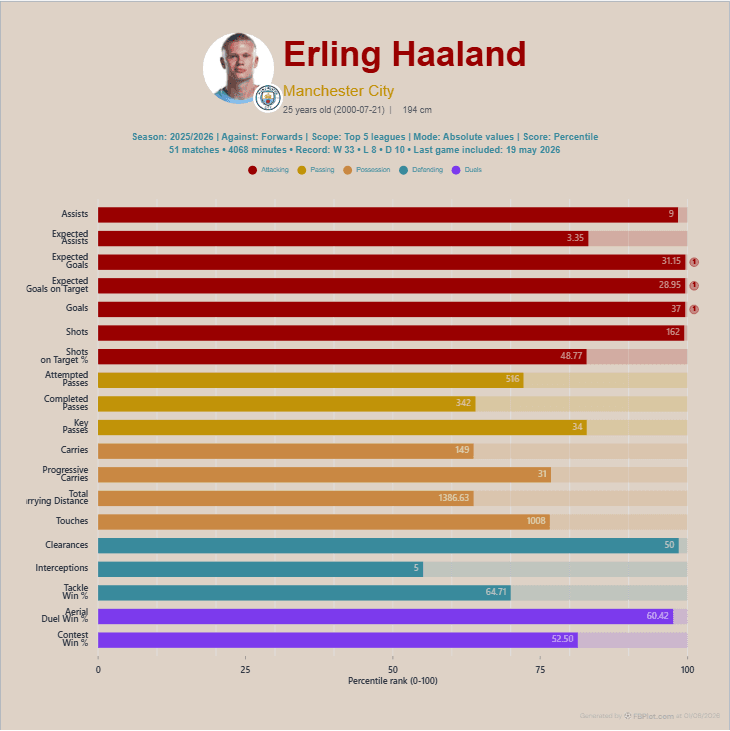
Use totals when the question is how much a player produced across the selected season.
Forward metrics · Absolute values
Use this setup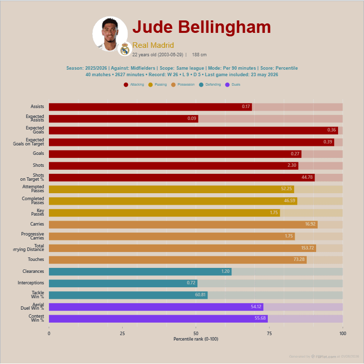
Normalise by playing time to compare the rate of creative actions.
Creator metrics · Per 90
Use this setup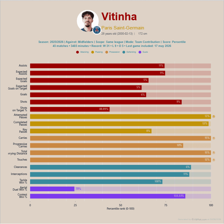
Show how much of the team's recorded activity came from the player.
Balanced metrics · Team contribution
Use this setupCheck the metric definitions and methodology before publishing a comparison.
Bars make exact labels, ordering and differences in magnitude easier to read. Pizza charts are better suited to a compact overview of profile shape.
Zero means no recorded output for that metric in the selected data. Missing means the value was unavailable or could not be calculated.
Yes. You can keep the selected order or sort the metrics to emphasise the strongest results.
Yes. The public editor can be used and exported without registration.
FBPlot Pro adds permanent chart storage, reusable presets and the complete competition dataset.