
Learn how to read a football player bar chart by separating the metric value from its percentile, defining the comparison group, and checking period, minutes, units, and metric direction before drawing a conclusion.
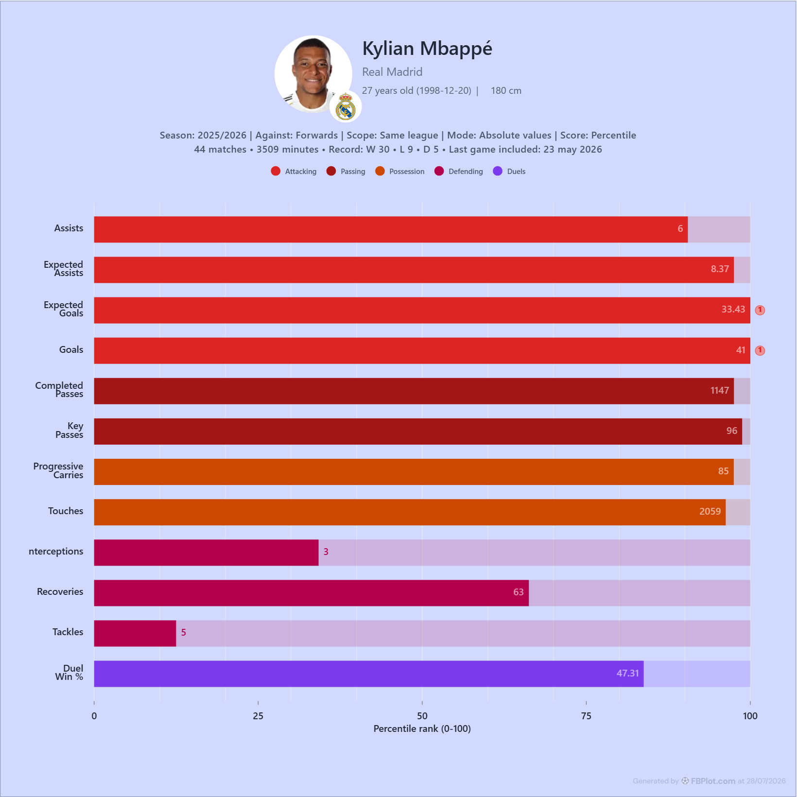
A player bar chart can make a profile easy to scan, but a long bar is not a universal rating. This guide shows how to interpret the value and percentile in each row, choose a defensible peer group, and preserve the context your reader needs.
A football player bar chart gives you a compact view of one player across several metrics. It is useful when you want to isolate individual strengths, retain the underlying values, and show how those values sit inside a defined comparison group.
The chart becomes misleading when that context disappears. A bar near 100 is not a universal player rating. It is a relative position for one metric, calculated from one population, over one period, with one unit. Change any of those inputs and the bar can change too.
This guide explains how to read that profile before you use it in a scouting report, article, presentation, or social post.
Start With the Question the Chart Answers
FBPlot's player bar chart answers:
Where does this player's value for each selected metric sit relative to the chosen comparison group?
It does not rank a list of players side by side, and it does not combine every row into one overall score. Each row is a separate comparison.
That makes the chart different from a radar chart, which emphasises the shape of a multi-metric profile, and from a scatter plot, which shows relationships between variables across many players.
Use a bar chart when individual metric values and their relative positions need to stay visible.
Read the Two Layers in Every Row
Each row contains two different pieces of information:
- The bar length shows the percentile score on a 0–100 scale.
- The printed number shows the observed metric value in the selected mode.
These numbers answer different questions. The value tells you what the player recorded. The percentile tells you where that value sits among eligible peers.
NIST's statistical reference on percentiles describes a percentile through the proportion of an ordered dataset that falls below a value. The important phrase for football analysis is ordered dataset: a percentile cannot exist without a population.
In FBPlot's current comparison query, the percentile is the percentage of positive peer values that are less than or equal to the target player's value. A score of 100 therefore means the player is at the top of that eligible set for the metric. It does not mean perfect performance, and it does not make scores from different populations directly interchangeable.
Define the Comparison Group Before Reading the Bars
The population is part of the result, not a setting to mention later. Check four fields before interpreting any row:
- Period: a season, rolling window, recent matches, or custom dates.
- Against: the position or role group used for comparison.
- Scope: the competition boundary applied by the tool. The current free Player Bar Chart Creator uses the same league and records that scope in the export.
- Eligibility filters: minutes, matches, age, and any other applied restrictions.
The current FBPlot query uses a base threshold of more than 360 minutes for peers, while always retaining the selected player. For serious analysis, apply a threshold appropriate to the decision and disclose it. A player with a short sample can produce an extreme rate without providing enough evidence that it is stable.
Keep the football question aligned with the population. Comparing a forward with all players may be useful for describing unusual defensive involvement, but it is usually less useful for judging finishing or chance creation than comparing with other forwards.
Choose the Unit Before You Choose the Story
FBPlot can show metric values in different modes. The choice changes both the value and the population ordering.
Absolute values
Use totals when accumulated output is the question and the period is meaningful. Totals preserve workload and availability, but players with more minutes have more opportunity to accumulate actions.
Per 90 minutes
Use per-90 values for count metrics when players have different minutes and you want a rate of involvement. Keep the minutes alongside the rate: normalization improves comparability, but it does not remove small-sample uncertainty.
A metric that is already a percentage, such as Duel Win %, has its own denominator. Do not describe it as a per-90 rate. Check the definition in the FBPlot Metrics Glossary before mixing totals, rates, and percentages in one explanation.
Contribution
Use contribution when the question concerns a player's share of team output. This answers a different question from volume or frequency and depends on the team environment.
Choose the mode from the analytical question. Do not switch modes simply because one produces more dramatic bars.
Use a Compact, Explainable Metric Set
A useful profile does not need every available metric. Select a small set in which every row has a job.
For an attacking profile, that might include:
- Goals and Expected Goals for scoring output and chance quality.
- Assists, Expected Assists, and Key Passes for creation.
- Progressive Carries for ball progression.
Add defensive or duel metrics only when they help answer the same role question. A broad "balanced" preset is useful for exploration, but a published chart should have a clearer purpose than showing everything available.
Metric direction also matters. A high percentile means a high value, not automatically a desirable outcome. More goals may support a positive claim; more errors, cards, or times dispossessed may not. Interpret the football meaning of the metric before treating bar length as quality.
A Reproducible Example
This example is designed to preserve the audit trail inside the graphic. It states:
- the player and club;
- the rolling period;
- the positional comparison group;
- the competition scope;
- the value mode and score mode;
- matches, minutes, record, and the last match included.
Read it in that order. Only then move to the bars.
The profile can support observations about where the recorded values sit among the eligible forwards in that period. It cannot, on its own, explain tactical role, league strength, opposition quality, team possession, or whether an action will transfer to another environment.
Audit the Chart Before You Share It
Use this checklist for every export:
- Can the reader identify the player, period, and competition context?
- Is the comparison position appropriate for the question?
- Is the scope explicit?
- Are minutes and matches visible or stated in the caption?
- Does each metric use the intended unit?
- Have you checked each definition in the glossary?
- Does a high value actually represent a positive outcome?
- Does the text describe the population rather than implying a universal rating?
- Is the data cutoff date visible?
- Would the conclusion still make sense with a reasonable change in the peer group?
If any answer is no, fix the configuration or narrow the claim.
Build the Chart in FBPlot
Open the free Player Bar Chart Creator and follow this sequence:
- Select the player.
- Choose the period.
- Confirm the comparison position and the scope shown in the preview; the current free creator uses the same league.
- Apply an appropriate minutes or matches threshold.
- Select absolute, per 90, or contribution values.
- Keep percentile as the score when relative position is the question.
- Choose the most relevant preset, or a compact custom metric set where that control is available.
- Order the rows to match the explanation.
- Check the context line and values in the preview.
- Export the chart and add a factual caption.
The best bar chart is not the one with the most bars. It is the one whose population, units, values, and conclusion can all be checked by the next reader.
Found this helpful? Share it with your network
More Articles
How to create a football scatter plot
FBPlot makes it easy to build scatter plots that are both analytical and publishable. In a few steps—Select Data → Customise → Appearance → Export—you can compare players across two performance dimensions while adding a third layer of insight through bubble size. The standout capability is flexibility: you can assign multiple metrics to each axis (FBPlot sums them to create a single X and Y value), which means you can define your own composite measures like Goal Impact or Chance Creation without spreadsheets. Then, you can scale bubble radius by any metric (Key Passes, xA, Minutes, Progressive Carries) to reveal context and separate true outliers from statistical noise. Finally, the Appearance controls let you style the chart for different audiences—clean and restrained for scouting reports, contextual and eye-catching for media—so every scatter plot can match the brand and format of the person using it.
Aligning Radar Charts with Your Identity
Explore seven historical FBPlot radar palette exports using the same Kylian Mbappé profile, with practical guidance on brand fit, contrast and publishing context.