
Learn what a football per-90 rate measures, how to calculate it, when it makes player comparisons fairer, and why minutes, role, period and population still matter after normalization.
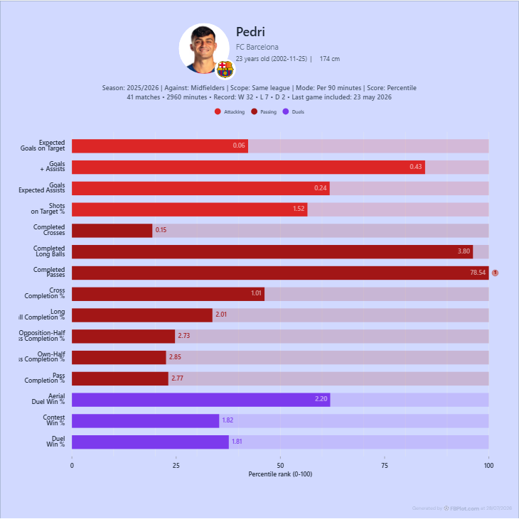
Per 90 puts player output on a common playing-time unit, but it does not solve small samples, different roles or unequal opportunities. This guide gives you a practical workflow for choosing between totals and rates in FBPlot.
Per 90 is a rate: it expresses a player's recorded output for every 90 minutes played. It can make two players with unequal playing time easier to compare, but it cannot make unlike roles, competitions or samples equivalent.
The useful question is not "should every metric be per 90?" It is:
Does this analysis need period volume or a rate conditional on playing time?
Answer that before changing the unit.
For the broader sequence—definition, unit, sample, population and supporting context—start with the beginner's guide to interpreting advanced football metrics.
The Per-90 Formula
For a metric that supports normalization, FBPlot calculates:
per 90 = 90 × metric total ÷ minutes played
If a player records 12 actions over 900 minutes, the rate is 1.2 per 90. If the same 12 actions come over 1,800 minutes, the rate is 0.6 per 90.
The numerator has not changed. The denominator has.
That distinction is why every per-90 chart still needs the metric definition and minutes context. The FBPlot Metrics Glossary is the source for current metric names and units; the formula only changes how a supported total is expressed.
StatsBomb's introduction to per 90 demonstrates the original practical problem: raw totals can make players with very different minutes look farther apart than their rates suggest.
Totals and Per 90 Answer Different Questions
Neither unit is automatically better.
| Unit | Question it answers | Useful for | Main risk |
|---|---|---|---|
| Total | How much did the player accumulate in the selected period? | season output, workload, contribution over availability | rewards playing time when exposure differs |
| Per 90 | At what rate did the player record the metric while on the pitch? | comparing output rates across unequal minutes | can amplify small or unusual samples |
A recruitment report may need both. The total describes sustained contribution across the period; the rate helps separate playing time from event frequency.
Hold Everything Else Constant
The cleanest way to understand the unit change is to keep the analytical setup fixed.
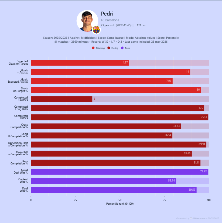
This one-variable-at-a-time comparison prevents a common mistake: changing the unit, period and population together, then attributing every visible difference to per 90.
The player bar chart interpretation guide explains the second layer in these charts: the printed value and its percentile position are different quantities.
Per 90 Does Not Remove Small-Sample Risk
A rate calculated from 90 minutes and a rate calculated from 2,700 minutes use the same formula, but they do not carry the same amount of evidence.
One match can contain an unusual scoreline, opponent, tactical assignment or substitute appearance. Dividing that output by minutes gives a valid rate for the observed sample; it does not make the sample stable.
That is why a comparison needs an explicit eligibility rule. In FBPlot, minutes and matches can be used to restrict the comparison population. The threshold should come from the task, not from a universal number:
- Define the period.
- Decide what level of exposure is credible for that decision.
- Apply the same rule to every eligible player.
- Record the rule in the chart or caption.
- Check whether the conclusion changes under a reasonable alternative threshold.
If it changes sharply, the uncertainty is part of the result.
Substitute Minutes Need Interpretation
Per 90 treats every minute as exposure in the denominator, but the conditions of those minutes can differ.
A regular starter may play long stretches at level scores. A substitute may enter against tired opponents, during a late attacking push or while protecting a lead. The rate describes what happened during those minutes; it does not adjust for game state or tactical role.
Do not discard substitute data automatically. Instead, ask whether starter and substitute minutes answer the same analytical question.
Role and Opportunity Still Matter
Two players can share a position label while receiving different instructions and opportunities. A wide forward who stays high, a winger who progresses the ball from deeper areas and a forward asked to defend aggressively may accumulate different events for structural reasons.
Per 90 does not correct:
- role or formation;
- team possession and territory;
- competition strength;
- opponent quality;
- event-provider definitions;
- score state;
- penalties or set-piece responsibility;
- the uncertainty of a small sample.
This is also why not every catalog metric supports every unit mode. Check the definition before assuming that a transformation is meaningful.
A Practical FBPlot Workflow
1. Write the Question
Use totals for questions about accumulated output:
Who produced the most over this competition and period?
Use per 90 for questions about rate:
Who recorded these actions most frequently while on the pitch?
2. Define the Population
State position group, competition scope, season or dates, and eligibility rules. A rate only becomes comparable inside a coherent population.
3. Inspect Minutes Before Ranking Rates
Look at the denominator before the result. Low-minute outliers should trigger investigation, not an automatic headline.
4. Compare Both Units
Switch between absolute and per-90 modes while holding the other settings fixed. Note which conclusions persist and which depend on the unit.
5. Preserve the Context
An export should retain:
- metric and unit;
- period;
- comparison group and scope;
- minimum-minutes or matches rule;
- relevant exclusions;
- data cutoff when the period is still changing.
When Per 90 Helps
Per 90 is useful when playing time is the main exposure difference and the underlying metric is meaningful as a rate. It is especially helpful for comparing event frequency among players who meet a defensible minutes rule.
It is less useful when the decision is about availability, accumulated season contribution or workload. In those cases, the total may be the evidence you actually need.
The strongest analysis often reports both:
- total output for sustained contribution;
- per-90 output for on-pitch rate;
- minutes and matches for sample context.
Build the Comparison
Open the FBPlot Player Bar Chart, choose a coherent period and population, and inspect the same metrics in absolute and per-90 modes. Do not export until you can state what the denominator adds—and what it does not solve.
Found this helpful? Share it with your network
More Articles
How to Choose the Right Chart for a Football Analysis Question
Choose between radar, player bar, scatter, bubble and swarm charts by defining the relationship your football analysis must show—not by choosing a visual style first.
How to Read a Football Player Bar Chart Without Losing Context
Learn how to read a football player bar chart by separating the metric value from its percentile, defining the comparison group, and checking period, minutes, units, and metric direction before drawing a conclusion.