
Learn what a football percentile says, why the comparison population matters and how to connect rank with the underlying value and distribution.
A percentile is a position inside an ordered population, not a universal player rating. This guide turns that definition into a practical scouting workflow.
A football percentile answers a relative question: where does an observed value sit when the comparison population is ordered?
It does not answer “how good is this player?” without qualification. Change the population, period, unit or metric definition and the percentile can change even when the player’s recorded value does not.
Read the Rank Literally
The NIST definition of a percentile starts with ordered observations. In practical chart reading, a high percentile means the value sits above much of the defined comparison set.
Three cautions follow:
- A percentile is not the same as the observed value.
- The distance between two percentile ranks does not reveal the distance between their values.
- Percentile calculations can use different conventions, so the implementation and population should be documented.
FBPlot’s chart context is therefore part of the result, not decoration.
Name the Population
“85th percentile” is incomplete. A useful statement looks more like:
85th percentile for this metric among eligible midfielders in the selected league, season and unit.
The population should include:
- competition scope;
- position or role group;
- period;
- minimum minutes or matches;
- any age or other eligibility rule;
- selected unit, such as absolute or per 90.
The fair player comparison guide helps define those choices before ranking begins.
Keep the Value Beside the Rank
Two populations can produce the same percentile from different underlying values. Likewise, two players can occupy nearby ranks while their observed values are separated by a meaningful gap—or almost no gap at all.
Use a player bar when you need the metric rows and printed values to remain visible. Use a swarm plot when density, gaps and outliers are central to the question. Use a radar when the task is to scan a multidimensional profile, while remembering that every axis has its own population-dependent rank.
The radar chart guide shows how changing comparison scope can alter a shape without changing the player’s recorded performance.
Do Not Average Percentiles Into a Player Rating
Combining percentile axes into one informal average hides several decisions:
- metric importance;
- overlap between metrics;
- whether higher is desirable;
- unequal reliability;
- role and team context.
A radar’s area has the same problem. It is a visual profile, not a validated overall score.
If a decision needs weights, state them before looking at the candidates and run a sensitivity check. A scouting judgement should remain separable from the descriptive statistics that informed it.
Check the Sample Behind the Rank
A rate from a small number of minutes can rank highly. The rank is correct for the supplied values, but the evidence may be unstable.
The small-sample guide recommends reporting minutes, matches and cutoff, then testing whether the conclusion survives a reasonable eligibility change. Do not choose a threshold only because it removes an inconvenient player.
A Percentile Reading Checklist
Before using a percentile in a report, answer:
- What is the metric and current definition?
- Is the value a total, rate, percentage or contribution?
- Which players are in the comparison population?
- What period and data cutoff apply?
- What exposure rule was used?
- Is the underlying value visible?
- Does the distribution contain gaps, clusters or extreme values?
- Would a different but reasonable population change the conclusion?
Reading One FBPlot Bar Without Skipping the Denominator
The chart below is useful because it puts two layers in the same row. The printed number is Mikel Jauregizar's absolute 2025/26 output for that metric; the bar length places that output inside the selected midfielder population. A reader who looks only at the long bar sees rank. A reader who looks only at the printed number sees volume. The interpretation needs both.
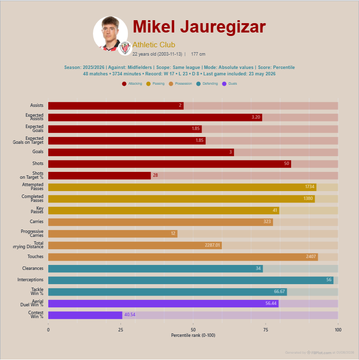
Take the goals row as a reading exercise, not a verdict. The chart prints the total and encodes the percentile relative to midfielders in the chosen league scope. It does not say that goals define midfield quality, nor that a higher rank transfers unchanged to another role or league. A percentile answers a narrow ordering question inside one eligible group.
This is also why averaging the bars would be seductive but weak. Assists, passes, carries and defensive actions do not become a coherent overall score merely because they share a 0–100 scale. Their football meanings and opportunities differ. Read the pattern as a set of prompts: which responsibilities does it support, which contextual factors might produce it, and which match evidence should be checked next?
Reproduce the Interpretation
Open the FBPlot Player Pizza Chart or a distribution view, select one explicit period and population, and record the player’s value alongside the percentile. Then change only the comparison scope. The difference you observe is the clearest reminder that a percentile belongs to a population—not permanently to a player.
Found this helpful? Share it with your network
More Articles
How to Document a Reproducible Football Chart
Record the minimum information another analyst needs to rebuild a football chart: question, source, period, population, metrics, units and configuration.
Small Samples in Football Analytics: Minutes, Matches and Uncertainty
Handle early-season and low-minute football data with explicit exposure rules, sensitivity checks and cautious language.