
Choose between radar, player bar, scatter, bubble and swarm charts by defining the relationship your football analysis must show—not by choosing a visual style first.
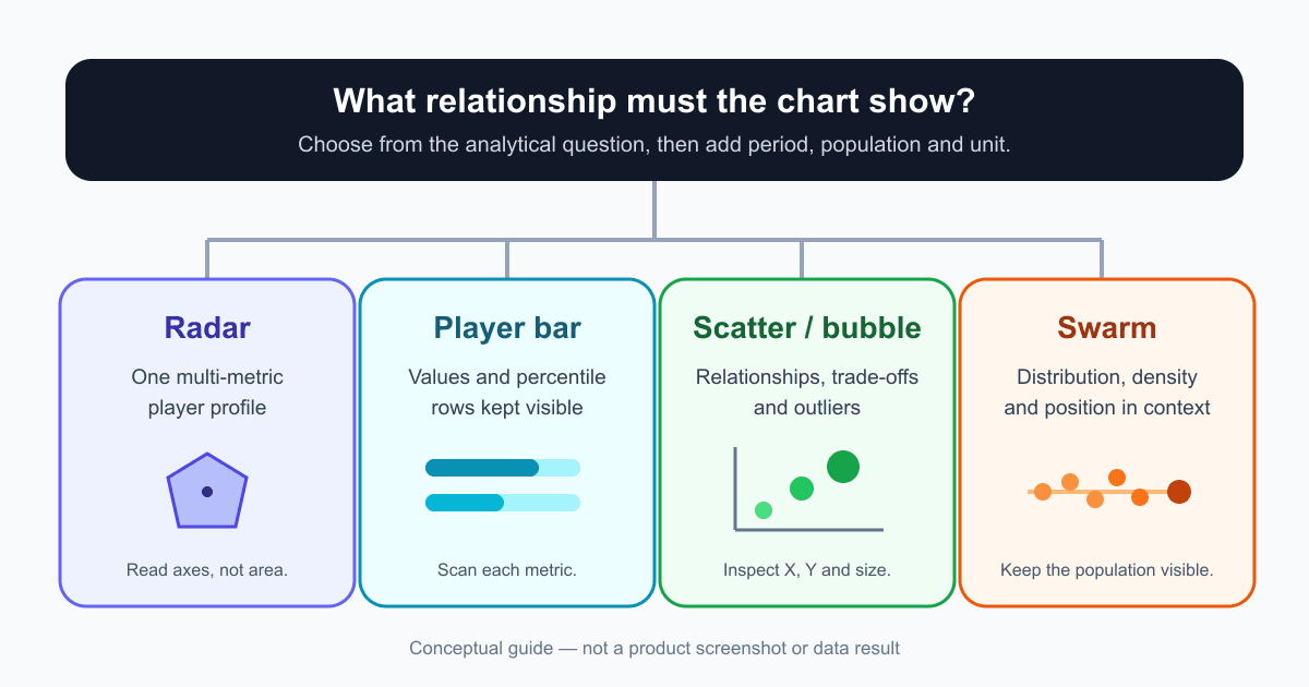
A practical question-first decision guide for football analysts, scouts and creators. Match profiles, metric rows, relationships and distributions to the FBPlot chart that communicates them most clearly.
The right football chart depends on the relationship you need the reader to see.
A radar, player bar, scatter and swarm can use some of the same metrics and players, yet answer different questions. Choosing by appearance first creates avoidable confusion: the chart may be attractive while encoding the wrong analytical task.
Start with one sentence:
I need the reader to see...
Complete that sentence before opening the chart creator.
The Short Decision
| If the reader must see... | Start with... | Do not use it as... |
|---|---|---|
| one player's multi-metric profile | radar | an overall rating |
| individual metric values and percentile rows | player bar | a multi-player ranking |
| a relationship or trade-off across many observations | scatter or bubble | proof of causation |
| a distribution, density and highlighted position | swarm | a sorted leaderboard |
This is a starting point, not a rule that every analysis needs one chart. A report can pair a primary chart with a supporting table or second view.
Choose Radar for a Multi-Metric Profile
Use a radar when the analytical sentence is:
I need the reader to see the shape of this player's profile across several related metrics.
Radar charts are compact and useful for scanning patterns. They work well when:
- the player or small comparison is already defined;
- the metric set follows a role hypothesis;
- the axes use a coherent scale such as percentiles;
- the population, period and unit are visible.
They are weaker for precise value lookup because each metric points in a different direction and the polygon can draw attention to area.
The complete football radar chart guide explains percentiles, comparison populations, units and axis order.
Choose Player Bar for Readable Metric Rows
Use a player bar when the analytical sentence is:
I need the reader to scan this player's value and relative position for each metric.
Bars preserve a common baseline and keep each row separate. In FBPlot's player bar workflow, the observed value and percentile can remain visible together.
That makes the chart useful for:
- a compact scouting profile;
- explaining which individual rows support a written observation;
- checking totals versus per-90 rates;
- presenting a profile where value lookup matters more than polygon shape.
It is not a ranking of many players. The player bar chart interpretation guide explains how to separate the printed value from the percentile score.
Choose Scatter for a Relationship
Use a scatter when the analytical sentence is:
I need the reader to see how two measures vary together across a population.
Each observation has an X and Y position. That supports questions about:
- relationships;
- trade-offs;
- clusters;
- unusual combinations;
- players who sit far from the main population.
A scatter does not prove that one metric causes another. It shows the observed pattern for the selected population.
Use bubble size only when a third measure adds necessary context. The size must have a clear unit and should not duplicate one axis without a reason.
The existing football scatter plot tutorial covers axes, bubble size, filters and export in the current workflow.
Choose Swarm for a Distribution
Use a swarm when the analytical sentence is:
I need the reader to see where a player sits inside the full distribution.
A swarm keeps observations visible instead of collapsing them into a single rank. It can reveal:
- dense and sparse regions;
- whether two ranks are practically close or far apart;
- outliers;
- the location of highlighted players;
- differences in distribution shape across rows.
This is valuable when a leaderboard would hide the distance between values. A player can rank tenth and still sit almost level with fourth—or far away from ninth. The distribution supplies that context.
Do not treat horizontal order alone as a complete evaluation. Population and unit still define the result.
When Bubble Is More Useful Than Plain Scatter
A bubble chart is a scatter with an additional size encoding. Use it when the third measure changes the interpretation.
For example, X and Y might describe two output rates while size records playing time. That can make low-exposure points easier to identify. It does not replace an explicit minutes rule, but it keeps the denominator visible.
Avoid bubble size when:
- the third measure has no clear role in the question;
- large circles hide nearby observations;
- the measure is already encoded on an axis;
- readers need exact lookup.
A Question Can Need Two Charts
Some analytical tasks have two stages.
Profile Then Population
Use a radar or player bar to describe one player, then a swarm to show where selected metrics sit in the wider distribution.
Relationship Then Detail
Use a scatter to identify an unusual player, then a player bar to inspect the metrics behind that observation.
Rate Then Volume
Use a per-90 view to compare event frequency, then an absolute view to check sustained contribution. The per-90 metrics guide gives the denominator workflow.
The second chart should answer a different question, not repeat the first in another style.
Context Every Chart Still Needs
Chart choice cannot rescue an incoherent comparison. Before export, record:
- Population: which players are eligible?
- Period: season, dates or rolling window?
- Competition scope: same league, several leagues or another boundary?
- Unit: total, per 90, percentage or contribution?
- Metric definition: what exactly is counted?
- Exposure rule: minimum minutes or matches?
- Data cutoff: when was the sample last updated?
These fields are part of the result. Removing them changes what the reader can claim.
A Five-Step Selection Workflow
1. Write the Relationship
Choose one: profile, rows, relationship or distribution.
2. Define the Population
Specify role, competition, period and eligibility before looking for an interesting result.
3. Choose the Unit
Decide whether the question concerns volume, rate, percentage or another supported unit.
4. Select the Smallest Sufficient Chart
Use the chart that expresses the relationship without unnecessary encodings.
5. Test the Caption
Write one factual sentence containing chart type, population, period and unit. If the sentence is unclear, the configuration probably is too.
Common Selection Mistakes
Using Radar for a Ranking
Many overlapping profiles are harder to compare precisely. Use scatter, swarm or a dedicated comparison when the population is the subject.
Using Bar Without Saying What the Bar Means
A bar can encode a value or percentile. Label the scale and keep the observed unit visible.
Using Scatter for Causation
An observed relationship is not proof that changing X will change Y.
Using Swarm as Decoration
The population distribution is the reason to use a swarm. If only the highlighted point matters, choose a simpler chart.
Adding Bubble Size Because It Is Available
Every encoding creates a reading task. Remove it if it does not answer the question.
Open the Matching Workflow
- Build a Player Radar Chart for a multi-metric profile.
- Build a Player Bar Chart for readable metric rows.
- Use the scatter plot workflow for relationships and outliers.
- Use the swarm workflow for distributions and highlighted observations.
Write the question first. Then choose the chart whose geometry matches the relationship you need to communicate.
Found this helpful? Share it with your network
More Articles
How to Read a Football Player Bar Chart Without Losing Context
Learn how to read a football player bar chart by separating the metric value from its percentile, defining the comparison group, and checking period, minutes, units, and metric direction before drawing a conclusion.
Per 90 Metrics in Football: When Normalization Helps and When It Misleads
Learn what a football per-90 rate measures, how to calculate it, when it makes player comparisons fairer, and why minutes, role, period and population still matter after normalization.