
Choose a readable number of radar axes by testing role coverage, redundancy, label space and export size instead of following a universal number.
Five, eight and twelve axes can all be defensible in different tasks. This method selects the smallest set that preserves the intended football profile.
There is no universal ideal number of metrics for a football radar chart.
Too few axes can omit an essential responsibility. Too many can create redundant evidence, crowded labels and a shape that readers scan without understanding. The defensible number is the smallest set that preserves the role question at the final publishing size.
Begin With Responsibilities
Do not begin by choosing eight because the template has space for eight.
Write the role hypothesis and map each essential responsibility to observable evidence. The role metric guide provides that process.
Every candidate axis should answer:
- Which responsibility does this metric represent?
- What is its current definition and unit?
- Is higher always interpreted the same way?
- Does another axis already capture similar evidence?
- Is the comparison population appropriate?
Build Three Versions
Create staged versions rather than editing one chart indefinitely.
Five-Axis Version
Use only the essential responsibilities. This version tests whether the profile can survive aggressive simplification.
Eight-Axis Version
Add supporting evidence where it changes the interpretation, not merely the appearance.
Twelve-Axis Version
Use the expanded set as a diagnostic. If labels become crowded or neighbouring axes repeat the same concept, remove rather than redesign around the excess.
These numbers are test conditions, not recommendations.
Check Redundancy
Adjacent or visually similar axes can make one concept dominate the shape.
Remove one metric at a time and ask:
- Does the role conclusion change?
- Was the removed metric providing unique evidence?
- Does another metric already communicate the same action family?
- Is the extra precision useful to the reader?
If removal changes nothing important, the axis is a candidate for deletion.
Test the Final Size
A radar that works in the creator can fail in a feed, report column or presentation.
At the intended output size, inspect:
- full metric labels;
- context line;
- player and comparison labels;
- legend;
- distinction between profiles;
- caption;
- reading order.
The mobile label guide and aspect-ratio guide provide destination-size checks.
Preserve Population and Unit
Reducing axes does not reduce the need for methodology. Every percentile still depends on period, population, role group, exposure rule and unit.
Use the complete radar guide to document those inputs. A clean shape without context remains easy to misread.
Avoid Area-Based Conclusions
Adding axes changes the polygon geometry. A fuller shape can result from metric selection and axis order as well as player values.
Do not select or order metrics to maximise area. Read each axis, not the enclosed surface, and avoid describing the radar as an overall player score.
Order Axes Deliberately
Group related responsibilities when that helps the reader:
- possession and progression;
- creation and shooting;
- defending and duels.
Keep the order stable across comparisons. Reordering axes changes the visual shape even when values remain identical.
A Removal Rule
Remove an axis when at least one condition is true:
- no clear role responsibility;
- duplicate evidence;
- unclear or unstable definition;
- inappropriate unit;
- unreadable label;
- unsuitable comparison population;
- no effect on the intended decision.
What Nineteen Axes Feel Like at Reading Speed
FBPlot's production Standard radar is intentionally broad. In the Mbappé example below, nineteen metrics cover attacking, passing, possession, defending and duels. The breadth is useful when the reader wants an inventory of the profile. It is less useful when a report needs to prove one narrow claim in a few seconds.
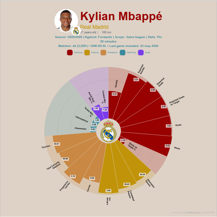
Try reading it in the order a busy scout might: player and period, comparison population, then two or three visually prominent axes. The remaining labels compete for attention before the reader has understood the first group. That is a design signal, not evidence that the extra metrics are unimportant.
For a focused question—say, how a forward generates and finishes chances—duplicate the chart and remove rows that do not test that question. Keep enough context to avoid a one-dimensional portrait, then export at the real destination size. If the eight-axis version tells the same defensible story as the twelve-axis version, the extra four axes are not adding depth; they are charging a reading cost.
The five-axis version is useful as another control. It often feels wonderfully clear, but clarity can become omission if every axis points toward the same strength. Add one metric that tests the cost or trade-off of the role, then check whether the conclusion becomes more balanced. The goal is not the smallest possible radar; it is the smallest set that can still challenge the hypothesis.
Axis order can reduce cognitive load without removing evidence. Place related measures together and use colour groups that remain distinguishable from their labels. When a reader can move from chance generation to finishing, then possession and out-of-possession work, the shape becomes a guided profile instead of a wheel of disconnected spikes.
Build the Final Radar
Open the FBPlot Player Pizza Chart, create the essential version first and export it at the intended destination size. Add supporting metrics one at a time. Stop when the role is adequately represented; the chart does not improve merely because another axis can fit.
Found this helpful? Share it with your network
More Articles
How to Document a Reproducible Football Chart
Record the minimum information another analyst needs to rebuild a football chart: question, source, period, population, metrics, units and configuration.
Small Samples in Football Analytics: Minutes, Matches and Uncertainty
Handle early-season and low-minute football data with explicit exposure rules, sensitivity checks and cautious language.