
Make football chart titles, axes, player names, values and methodology readable at the size where the audience will actually see them.
Desktop preview is not a legibility test. Use a destination-size hierarchy, selective labels and a factual caption before publishing.
A chart can be readable at full desktop width and unusable in a mobile feed. Shrinking the export reduces every label while the amount of information stays the same.
The solution is not to increase every font. It is to decide which text must survive at the destination size.
Establish a Text Hierarchy
Use four levels:
- Claim or neutral title: what the chart contains.
- Essential context: period, population and unit.
- Reading labels: axes, metrics, selected players and values.
- Method detail: cutoff, exclusions and source in a caption or linked note.
If every line is visually dominant, readers cannot find the analytical entry point.
Keep the Title Descriptive
A title should identify the plotted evidence, not announce a conclusion the chart cannot establish.
Prefer:
Progressive carries and completed passes in the opposition half, eligible midfielders, selected period
Avoid:
The next elite midfielders
The second title converts a descriptive chart into an unsupported recruitment claim.
Label Subjects Selectively
Dense scatter and swarm plots cannot support a name on every point at mobile size.
Label:
- the subject of the article;
- a small number of stated comparators;
- a relevant outlier;
- an explained benchmark.
Keep the remaining population visible. Selective labels should guide attention without pretending the unlabelled observations do not exist.
Protect Metric and Unit Labels
Never shorten a label until it becomes ambiguous. If space is limited:
- use a verified short form and define it;
- move methodology to the caption;
- reduce the number of metrics;
- choose another aspect ratio;
- split the chart into a series.
The aspect-ratio guide explains the verified FBPlot format options.
Use Meaningful Precision
Extra decimal places consume space and imply precision. Choose the smallest precision that preserves the comparison and apply it consistently.
Percentages, totals and per-90 values should remain distinguishable. A reader should not need the article body to discover the unit.
Check Contrast and Non-Colour Cues
WCAG 2.2 specifies contrast requirements for text, while its use-of-colour criterion says colour should not be the only way meaning is conveyed.
For a chart image:
- test label/background contrast;
- use direct labels, shapes or position alongside colour;
- avoid low-opacity text;
- check highlighted and unhighlighted states;
- inspect the actual exported pixels.
This does not by itself certify the entire article as accessible, but it catches common failures.
Test at Destination Size
Export first, then inspect the file:
- view it at approximate feed or report-column width;
- do not zoom;
- read every essential label;
- check the longest player and metric names;
- inspect dark and light backgrounds;
- verify that no label overlaps a mark;
- confirm the context and unit remain available.
If essential text fails, remove information or change the layout. Do not rely on the audience opening the image.
Use the Caption as Part of the Graphic
A factual caption can carry:
- period and cutoff;
- eligible population;
- minutes or matches rule;
- unit;
- highlighted-player rationale;
- important limitation.
The annotation guide explains how to separate native evidence from editorial additions.
The Shrink Test: What Disappears First?
This vertical FBPlot pizza is designed for a story canvas, but a reader may still encounter it reduced inside a narrow article column or messaging preview. The first casualties are rarely Lamine Yamal's headline. They are the context line, curved metric labels and small values—the exact fields that prevent a football chart from becoming ambiguous.
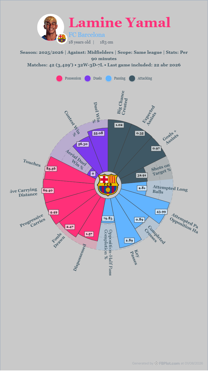
Do not solve the problem by enlarging everything. A larger title can steal the space needed by “Attempted Passes in Opposition Half” or “Progressive Carrying Distance,” and abbreviating those labels can change their meaning. Start by reducing what the graphic is trying to say: fewer slices, shorter but precise title copy and a caption that carries secondary methodology outside the plotting area.
Then test without colour. The categories in this chart use colour, but the slice labels and printed values still carry the meaning. That redundancy matters on small screens, in screenshots sent through messaging apps and for readers with colour-vision differences. A mobile audit is complete only when the chart remains interpretable after shrinking, not merely when it still fits inside the viewport.
The caption can carry what the plotting area cannot. Instead of squeezing the full eligibility rule into six-pixel text, keep player, period, role, unit and sample inside the export, then place the longer methodology directly below it in the article. The image and caption should still make sense when copied together.
Do one final test with the longest plausible content, not the neatest example. A short player name and “Goals” can hide layout problems that appear with a long club name, “Expected Goals on Target” or a two-line competition label. Designing against the worst credible label is how a template survives the rest of the season.
Run the Mobile Audit
Choose the intended aspect ratio in FBPlot, export the chart and inspect it at destination size. Keep the title, context, metric labels and selected subjects readable. Everything else must justify the space it occupies.
Found this helpful? Share it with your network
More Articles
How to Document a Reproducible Football Chart
Record the minimum information another analyst needs to rebuild a football chart: question, source, period, population, metrics, units and configuration.
Small Samples in Football Analytics: Minutes, Matches and Uncertainty
Handle early-season and low-minute football data with explicit exposure rules, sensitivity checks and cautious language.