
Add headlines, callouts and editorial context while preserving an untouched native chart and a record of every annotation.
Annotation can guide attention, but it must not move points, alter values or hide population context. Separate evidence, interpretation and design.
Annotation helps a reader find the subject, understand the comparison and connect the chart to an article. It becomes misleading when editorial changes alter the evidence rather than explain it.
The safest boundary is simple: preserve the native export, create annotations on a separate copy and record every addition.
Separate Three Layers
Evidence
The values, marks, axes, labels, period, population and unit produced by the chart configuration.
Interpretation
The analyst’s explanation of patterns, limitations and follow-up questions.
Editorial Design
Headlines, arrows, callouts, logos and layout added for publication.
These layers can coexist, but they should remain distinguishable.
Preserve the Native Export
Before editing:
- export the chart from FBPlot;
- retain the original file;
- preserve the configuration and cutoff;
- create a separate annotated derivative;
- use filenames or a manifest to link the two.
Do not overwrite the evidence file. The reproducibility guide explains the companion record.
Safe Annotation Tasks
Annotations can:
- identify the subject of the article;
- define a quadrant;
- state the period and population;
- explain a metric;
- mark an editorial benchmark;
- point to a gap or cluster;
- describe an uncertainty.
The text should state what is visible or make the interpretation clearly attributable.
Changes That Cross the Line
Do not:
- move a point to avoid overlap;
- change a value or label;
- remove inconvenient observations without disclosure;
- stretch one axis independently;
- crop away essential context;
- recolour marks so an unexplained category appears;
- add a trend line that was not calculated and documented;
- present a conceptual redraw as a product result.
If a native label overlaps, return to the chart configuration or use an external callout that does not move the underlying mark.
Write Neutral Callouts
Prefer:
Highlighted for follow-up: high recorded value on X within this eligible population.
Avoid:
Guaranteed elite signing.
The chart can support a descriptive observation. Recruitment suitability requires additional evidence.
Keep Population Context
Annotations often enlarge one player and fade everyone else. That can be useful, but the reference population should remain readable when the argument depends on relative position.
The swarm guide and scatter tutorial both rely on surrounding observations for meaning.
Make Colour Redundant
Use direct labels, shapes or line styles alongside colour. The WCAG use-of-colour guidance explains why colour should not be the sole carrier of meaning.
Also inspect label contrast in the exported pixels, not only in the design application.
Keep an Annotation Log
Record:
Native export:
Configuration:
Annotated derivative:
Editor:
Date:
Callouts added:
Elements faded or cropped:
External calculations:
Reason for each change:
If no data elements were changed, say so.
Publish the Derivative Responsibly
Use the annotated version in the article when it improves comprehension, but retain the native export for audit. A factual caption should identify the period, population, unit and editorial additions.
The weekly graphic workflow shows how to apply this boundary consistently across a recurring series.
An Annotation Can Lead the Eye Without Rewriting the Result
The FBPlot scatter below highlights selected under-21 players with arrows and text while leaving every point in the population visible. That distinction matters. The callouts help the reader find cases the article wants to discuss; they do not move the dots, replace the axes or erase inconvenient neighbours.
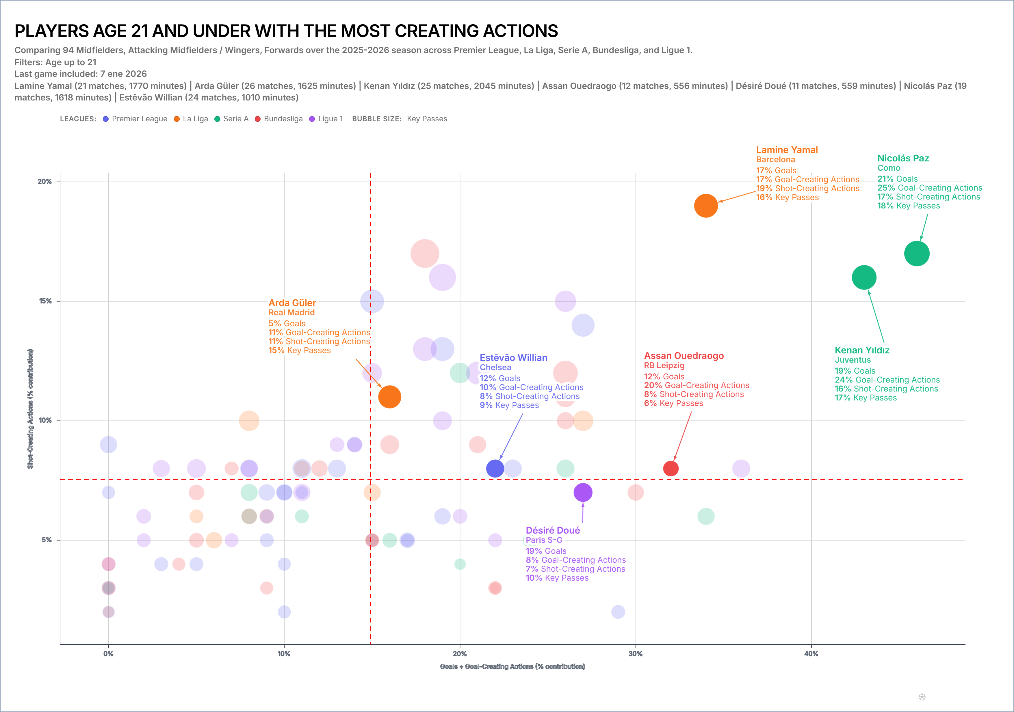
Notice the difference between “Nicolás Paz appears in the upper-right region of this configured sample” and “Nicolás Paz is the best creator.” The first sentence describes visible position under stated axes and filters. The second turns a two-dimensional graphic into an overall judgement it cannot support. Neutral annotation preserves that boundary.
A defensible production file would keep the unannotated FBPlot export beside this derivative and record each added label. If a callout overlaps a point, the editor moves the label—not the point. If the title changes, the configuration and date remain recoverable. That small provenance habit lets another person separate data, encoding and editorial emphasis when the graphic is challenged later.
There is a useful newsroom test for every callout: remove it and ask whether the underlying chart still says the same thing. If the answer is yes, the annotation is guidance. If removing it makes the claim disappear, the editor may have written a conclusion that the visual never established. In that case, revise the language or add the missing evidence rather than strengthening the arrow.
Annotations should also acknowledge crowded regions. Labelling only the isolated, famous names makes the plot feel more decisive than it is. One neutral note such as “several unlabelled players occupy a similar range” can restore the distribution to the story without turning every dot into unreadable text.
Annotate the Next Chart
Export a clean chart from FBPlot, duplicate it and add only the callouts needed to answer the reader’s question. Compare the derivative with the native file before publication. If an annotation changes what the plotted evidence appears to say, revise it.
Found this helpful? Share it with your network
More Articles
How to Document a Reproducible Football Chart
Record the minimum information another analyst needs to rebuild a football chart: question, source, period, population, metrics, units and configuration.
Small Samples in Football Analytics: Minutes, Matches and Uncertainty
Handle early-season and low-minute football data with explicit exposure rules, sensitivity checks and cautious language.