
Compare FBPlot and Tifolab for football player analysis: chart production, radar context, shortlists, exports, free limits, Pro features and pricing.
FBPlot and Tifolab can both compare football players, but one centres the publishable chart while the other connects profiles, comparisons and shortlists. Choose from the task rather than the longest feature list.
FBPlot and Tifolab overlap on a familiar football-analysis task: choose players, compare their statistical profiles and turn the result into something useful. The overlap is real, but their centre of gravity is different.
FBPlot is strongest as a chart-production workspace. Tifolab presents a broader path from profiles and comparison towards a saved scouting shortlist. That difference matters more than which radar has the most colourful outline.
An analyst preparing a public graphic needs control over the question, the population and the final format. A scout reducing a long list may care more about moving between player pages, comparison tables, saved candidates and downloadable rows. The right tool is the one that keeps the next decision close at hand.
The Short Answer
Choose FBPlot when the outcome is a defensible, publishable chart whose metrics, comparison scope, labels, colours and format need deliberate control. Consider Tifolab when the outcome is a scouting workflow that connects profiles, comparison and shortlists, subject to verifying that its documented coverage and paid features fit your competition.
The table separates verified FBPlot behavior from Tifolab features documented on its official pages. We did not operate Tifolab in a controllable browser, so the table does not score interaction speed or data accuracy.
| Criterion | FBPlot | Tifolab | Clear advantage |
|---|---|---|---|
| Main workflow | Build and publish configurable football charts | Explore profiles, compare players and maintain a shortlist | — |
| Free player comparison | Current editor supports profile comparison | Official page documents two-player comparison | — |
| Three-player comparison | Current editor supports up to three profiles | Pro documents up to three players | — |
| Comparison views | Radar/pizza plus separate bar, scatter, bubble and swarm workflows | Compare page documents radar plus raw, per-90 and percentile table | — |
| Population control | Same league, Top 5 or all available leagues, plus role and eligibility controls | Current population controls were not directly tested | 🟢 FBPlot for verified control |
| Shortlists | Saved searches, bookmarks and charts in Pro | Saved shortlists in Pro | — |
| Export | Publishing ratios and visual/brand controls | Free watermarked image; Pro removes watermark and documents CSV up to 500 rows | — |
| Free coverage | Top 5 leagues | Vendor documents public tools across its available coverage | — |
| Paid coverage | Every competition available in FBPlot | Vendor claims 51 domestic leagues and 74 total competitions | — |
| Paid price checked 18 Sep 2026 | €9/month or €72/year | €2.99/month | 🔵 Tifolab on listed entry price |
The absence of a winner in several rows is intentional. A CSV and a branded social graphic are different deliverables; a competition count and a usable comparison population are different facts.
Start With the Decision After the Chart
Tool comparisons often begin with the landing page. A better approach is to begin five minutes after the output is created.
If the next action is to place the visual into a report, article or social post, the image itself needs to carry the argument. The chart should disclose the season, role, unit and population; its metric selection should support one claim; its aspect ratio and visual identity should fit the destination. This is the workflow FBPlot is designed around.
If the next action is to save a candidate, revisit a profile, compare a second pair or export a working list, the chart is one step inside a longer scouting process. Tifolab's official pages place Compare alongside player profiles and, in Pro, saved shortlists and CSV export. That can reduce movement between separate research tools—provided the competitions and definitions needed by the project are present.
This framing prevents a misleading conclusion such as “more features wins”. A feature only matters when it shortens or improves the real decision chain.
Why Population Control Changes the Story
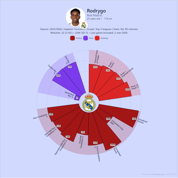
A percentile does not belong to the player alone. It belongs to the player inside a defined population. Change the eligible peers and the relative score may change even when the player's observed value does not.
The two FBPlot captures below isolate that principle. Player, season, role, metrics and per-90 mode remain fixed; the comparison scope changes.
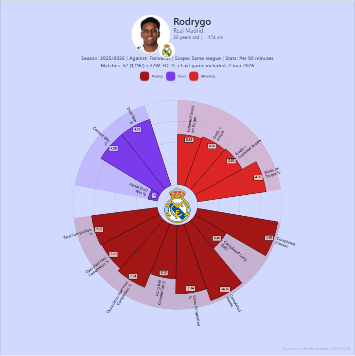
This is not evidence that one population is better. Same-league peers can answer a domestic-context question; a wider group can provide a broader reference. What matters is that the analyst chooses the population deliberately and the reader can identify it.
Tifolab's official Compare page documents raw, per-90 and percentile table views next to a radar overlay. That combination can be valuable because the raw observation and the relative rank answer different questions. We did not operate the interface, so we cannot verify which population controls remain visible through its current comparison journey.
Before treating any two radars as equivalent, use the checklist in football percentiles explained: period, position group, competition scope, exposure threshold and data cutoff must match.
Radar Presets Are a Beginning, Not a Verdict
Tifolab's official Radar Generator page documented four role presets when checked on 18 September 2026. Presets can make the first comparison faster because the analyst does not have to invent an axis set from scratch.
FBPlot also uses role-oriented metric presets, but its chart workspace is built to continue editing: choose a different metric set, change the scope, switch value mode, alter the presentation or move to another chart family when the question changes.
The analytical risk is the same in either product. A preset may look authoritative even when it does not match the role or hypothesis being investigated. A winger profile, for example, may need to separate chance creation from ball progression; adding several correlated attacking metrics can make the polygon look dominant without adding independent evidence.
Treat every preset as an editorial proposal. Read the metric definitions, remove duplicates and explain why each remaining axis belongs. Our guide to choosing football metrics by position offers a reproducible way to do that.
Comparing Two Players Is Not Always a Radar Job
An overlaid radar is efficient when the question concerns profile shape across a compact, coherent set of metrics. It becomes harder to read as more players, axes and similar colours accumulate.
FBPlot's current comparison editor supports two or three player-season profiles, including the same player across seasons. Tifolab documents two players in its free comparison and three in Pro. But the maximum number of profiles is not the same as the useful number.
When exact row-by-row differences matter, a table or bar chart may be clearer. When the goal is to discover candidates across a population, a scatter or swarm can expose combinations and distributions that a hand-picked radar cannot. When the goal is to preserve a shortlist, the surrounding save-and-review workflow matters more than the polygon.
This is why a fair trial should include the next task. Do not stop after generating the first attractive image.
Visual Identity Versus Export Utility
FBPlot gives the finished visual a large role in the workflow. The current product supports publishing-oriented aspect ratios, visual presets, manual colour and typography decisions, labels and brand styles. The value is not decoration for its own sake. A consistent graphic can make the source, hierarchy and analytical conventions recognisable across a club report or publication series.
Tifolab's pricing page documented watermarked image export on Free and watermark-free export on Pro. It also documented CSV export of up to 500 rows for Pro. Those outputs serve different needs: the image communicates a finished finding; the CSV carries working data into another analytical process.
We did not execute either Tifolab export. Before subscribing, verify what the downloaded file contains, whether the context survives the export, and whether any licence or attribution requirement fits the intended publication.
Coverage Numbers Need a Real-World Test
Tifolab claimed 51 domestic leagues and 74 total competitions on the official pages checked on 18 September 2026. Its Pro plan was listed at €2.99 per month, with saved shortlists, three-player comparison, watermark-free exports and CSV export up to 500 rows.
FBPlot pricing listed Free at €0 for Top 5 league access and Pro at €9 per month or €72 per year. Pro unlocks every competition available in FBPlot along with saved searches, bookmarks, charts, metric presets and brand styles.
These figures are not a database-quality ranking. The useful coverage test is narrower:
- Search for the competition and season in the current product.
- Confirm that the players and minutes match the intended period.
- Open the metric definition and unit.
- Identify the comparison population and minimum-exposure rule.
- Export the actual format the project requires.
A headline total cannot tell you whether one specific second division, cup season or youth player is usable.
What We Could Verify—and What We Could Not
FBPlot behavior in this comparison was checked against the current repository, production pricing and recorded chart evidence. Tifolab functions, prices and coverage are attributed to its Compare, Radar Generator and pricing pages.
No controllable browser was connected during this review, so we did not create a Tifolab account, manipulate its current controls or export a file. Consequently, this article does not claim that one interface is faster, easier or more accurate. A direct capture should be added before publication if the copy is expanded to describe interaction details.
That limitation is not cosmetic. Vendor documentation can establish what a provider currently advertises; only a reproducible session can establish what happened in a specific test.
Which Workflow Fits?
Choose FBPlot when the chart itself is the deliverable and you need to control the analytical population, metric set, chart family, publishing format and visual identity in one workspace.
Consider Tifolab when your work is organised around profiles and a shortlist, its documented competition coverage includes your market, and the comparison table or CSV is more important than extensive chart authorship.
Either way, run the same assignment before paying: one real player pair, one season, one position group, one minutes rule and one destination. Record how much context survives to the final output and whether the next decision—publish, shortlist or widen the search—is easy to complete.
You can begin that test in the FBPlot player comparison workflow. Keep the fair player-comparison guide open beside it so the period, population, role, units and sample stay fixed while you evaluate the tool rather than the most flattering shape.
Found this helpful? Share it with your network
More Articles
FBPlot vs FBCharts: Web Chart Builder or FBref Extension?
Compare FBPlot and FBCharts by the workflow each one creates: a standalone football chart workspace or a browser extension built around FBref reports.
DataMB Football vs FBPlot: Which Player Comparison Tool Fits Your Workflow?
Compare FBPlot and DataMB through the same Kylian Mbappé 2025/26 workflow, including radar design, metric choice, percentile populations, visible values, free access, exports, and the limits of a numerical comparison.