
Compare FBPlot and FBCharts by the workflow each one creates: a standalone football chart workspace or a browser extension built around FBref reports.
FBPlot and FBCharts have similar names but solve the radar-chart job from different starting points. This evidence-led comparison covers workflow, data context, templates, player slots, visual control, exports and pricing.
FBPlot and FBCharts sound as if they might be two versions of the same product. They are not. The most important difference appears before a chart has even been created: FBCharts starts from an FBref scouting report, while FBPlot starts in an independent football-chart workspace.
That distinction shapes the entire job. If you are already reading a player on FBref and want a radar to appear in that context, an extension can remove several steps. If the chart is heading into an article, recruitment deck or branded social post, an independent editor gives the analysis and presentation their own workspace.
This is therefore not a contest between two radar shapes. It is a choice about where the source, analytical decisions and final visual should live.
The Short Answer
Choose FBCharts when your natural starting point is an FBref scouting report and you want its documented extension workflow to turn that page into a radar. Choose FBPlot when you want to search, compare and design in a standalone application, move between chart types, or make the output follow a club, publication or personal visual identity.
The marks below identify a clear workflow advantage only where the available evidence supports one. A dash means the criterion depends on the job or was not tested equivalently.
| Criterion | FBPlot | FBCharts | Clear advantage |
|---|---|---|---|
| Starting point | Standalone web application | Browser extension on FBref reports | — |
| Installation | Opens in the browser | Extension documented for Chrome/Edge and Firefox | 🟢 FBPlot for no extension requirement |
| Source-page continuity | Player is selected inside FBPlot | Begins on the FBref report already being read | 🔵 FBCharts |
| Chart families | Radar/pizza, bar, scatter, bubble and swarm workflows | Radar-focused extension | 🟢 FBPlot for range |
| Comparison | Two or three player-season profiles in the current FBPlot editor | Premium documents three-player comparison | — |
| Population controls | Same league, Top 5 or all available leagues, with role and eligibility controls | Current population controls were not directly tested | — |
| Templates | Metric presets plus visual presets and manual controls | Official site documents 24 Premium templates and custom templates | — |
| Publishing control | Aspect ratios, labels, colours, typography and brand styles | Current export styling was not directly tested | 🟢 FBPlot for verified publishing controls |
| Free entry | Free Top 5 workflow | Free extension workflow documented | — |
| Paid price checked 18 Sep 2026 | €9/month or €72/year | £3/month | 🔵 FBCharts on listed entry price |
This table does not score data accuracy. Different data paths, samples, definitions and comparison groups prevent a responsible numerical winner without a controlled test.
Two Starting Points, Two Very Different Sessions
Imagine an analyst writing a short recruitment note. The first task is to inspect a forward's season; the second is to make a figure that another person can understand without reopening the source page.
In the workflow described on the official FBCharts site, the analyst starts on an FBref scouting report. The extension adds radar creation around that environment. This is a strong fit when FBref is already the centre of the research session: the source page and the chart-making action remain close together.
FBPlot begins elsewhere. The analyst opens a chart workflow, selects the player or profiles, defines the comparison group, chooses metrics and decides how the result should be presented. The extra separation is useful when the deliverable has requirements of its own: a square post, a report figure, a consistent palette, a reusable preset or a chart that must later become a bar, scatter or swarm.
Neither path is inherently more rigorous. Rigor comes from preserving the season, population, units, minutes rule and metric definitions. The difference is which product makes those decisions part of its main workspace.
What the Outputs Can—and Cannot—Prove
The historical FBCharts-branded image below is already present in the FBPlot repository. It shows the visual language of one past output: a filled percentile radar, contextual headings and exact values below the plot.
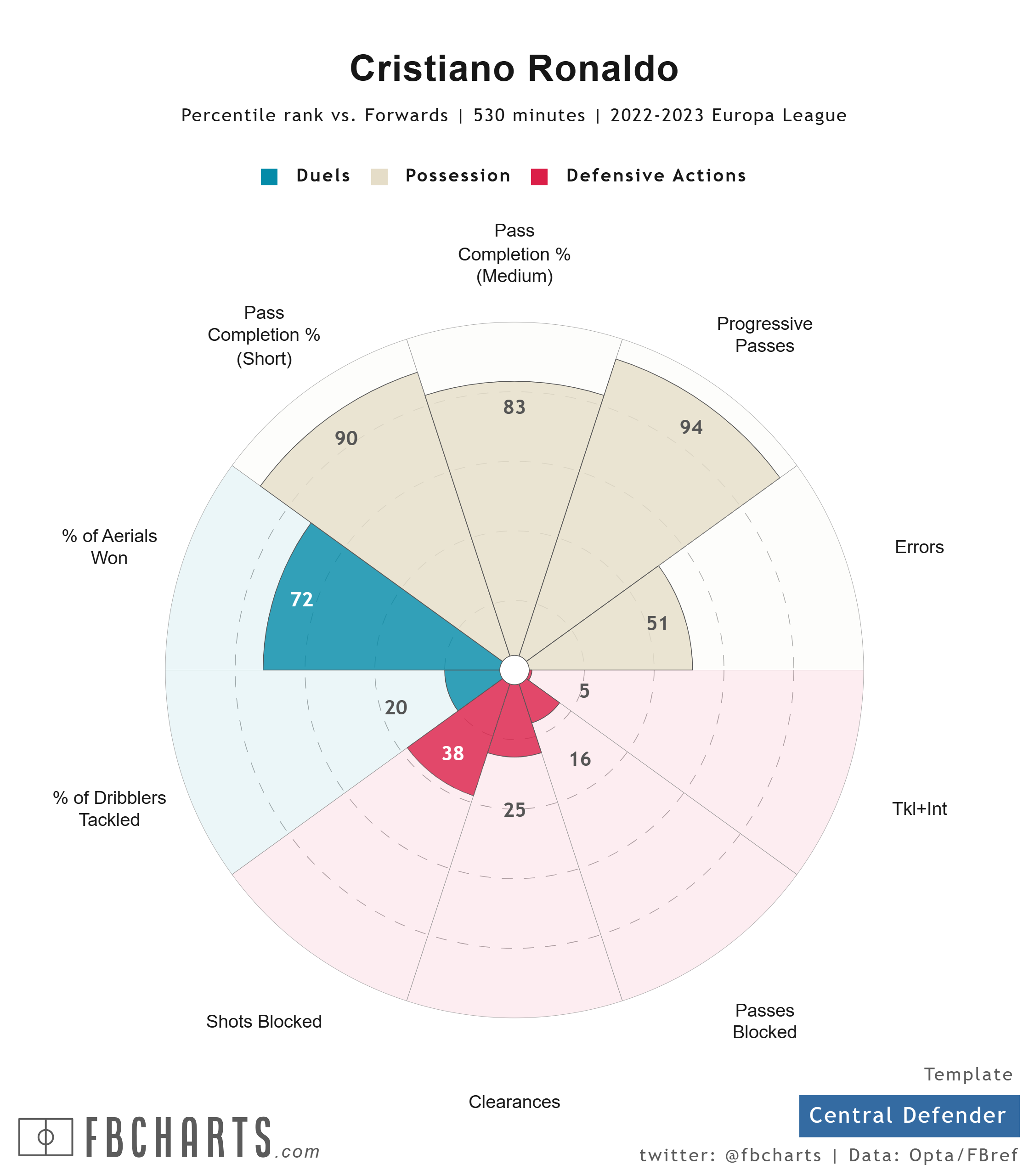
It would be tempting to compare that polygon with a current FBPlot radar and decide which player profile looks stronger. That would be invalid. The players, seasons, competitions, metrics and eligibility populations are not aligned.
The useful comparison is instead about disclosure. Does the exported figure preserve enough information for a reader to reconstruct what it means? A chart should ideally identify the player, period, role or comparison population, units and sample. Anything absent from the graphic belongs in the caption.
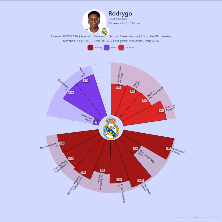
Here is a separate FBPlot example:
This image is evidence of FBPlot's output, not a like-for-like result against FBCharts. The difference matters: screenshots can verify visible labels, but only a controlled session can compare the work needed to produce them.
Data Convenience Is Not Data Equivalence
FBCharts describes its extension as creating radars from FBref scouting reports and attributes that context to FBref/Opta. FBPlot provides its own player and competition selection inside the application. Those are different routes into an analysis.
Even when both products display an axis called “Expected Goals”, the result is not automatically comparable. A defensible comparison would have to align:
- the exact metric definition;
- the season and competition scope;
- totals versus per-90 values;
- the eligible position group and minimum-minutes rule;
- the percentile population and update date.
Without that contract, matching labels can hide different denominators. Our guide to fair football player comparison explains how to lock those variables before reading the shape.
Templates: Speed Versus Authorship
Templates are valuable because they reduce repeated decisions. They can also hide decisions when a reader assumes the chosen axes are universal.
FBCharts' official site documented 24 templates for Premium users and the ability to create custom templates when checked on 18 September 2026. We did not install the extension, so we cannot judge how those templates behave in the current interface.
FBPlot combines analytical presets with visual controls. A role-oriented preset can provide a sensible first draft, after which the analyst can remove redundant axes, change the comparison scope and build a visual treatment for the destination. That makes the author responsible for more choices, but it also allows the chart to carry a recognisable editorial identity instead of looking like an anonymous default export.
The right test is simple: open the same player question in the workflow and count how many decisions improve the argument. Controls that do not clarify the question are not an advantage; controls that preserve the meaning or make the finished graphic reusable are.
Comparison Slots Are Only Part of Comparison Quality
Both products document multi-player workflows. FBCharts Premium advertises comparison of up to three players. FBPlot's current comparison editor supports two or three player-season profiles, including the same player across seasons.
Three overlapping shapes do not automatically produce a clearer comparison. Before adding the third profile, ask whether the reader needs another reference point or whether a bar chart would make the differences easier to inspect. The football chart selection guide maps profile, value, relationship and distribution questions to more suitable geometries.
Population controls matter just as much as the number of profiles. A percentile against forwards in one league answers a different question from a percentile against forwards across several leagues. If the output does not display the population, record it in the caption.
Price and Scope, Dated Rather Than Frozen
On 18 September 2026, FBCharts listed Premium at £3 per month and documented three-player comparison, all 24 templates and custom templates. Its official page claimed support for 28 competitions and offered Chrome/Edge and Firefox downloads. These are current vendor statements, not an independent audit of the extension.
On the same date, FBPlot pricing listed Free at €0 for Top 5 league access and Pro at €9 per month or €72 per year. Pro included every competition available in FBPlot, saved searches and charts, metric presets and brand styles.
The lower sticker price does not settle the decision because the products are not selling an identical workflow. A person who only wants an FBref-adjacent radar may value the extension model. A creator producing several chart types may value the broader authoring environment. Check the actual competition, season and output you need before paying for either.
Which Tool Fits You?
FBCharts is the more natural candidate if your work consistently begins on FBref, a radar is the intended final chart, and keeping the analysis close to that source page matters more than having a separate design workspace.
FBPlot is the more natural candidate if the deliverable dictates the workflow: you need several chart families, explicit comparison scopes, saved work, publication formats or a visual system that looks like your club or publication rather than a generic template.
There is also a perfectly reasonable mixed workflow. An analyst might use FBref for research, write down the period and definitions, then rebuild a deliberately scoped visual in FBPlot. The important part is not to silently treat values from different providers as interchangeable.
A Five-Minute Decision Test
Take one real assignment, not a demo question. Define the player, season, role, population, unit and final destination. Then ask:
- Does the session naturally begin on an FBref report or in a chart editor?
- Can the workflow reproduce the population and metric set you actually need?
- Does the exported figure preserve enough context to stand alone?
- Can you impose the visual identity and aspect ratio required by the destination?
- Would another chart type explain the finding better than a radar?
That test will reveal more than comparing feature counts. You can start it in the FBPlot player comparison workflow, then use the complete football radar guide to audit the population, units and sample before export.
Found this helpful? Share it with your network
More Articles
FBPlot vs Tifolab: Which Player Comparison Workflow Fits?
Compare FBPlot and Tifolab for football player analysis: chart production, radar context, shortlists, exports, free limits, Pro features and pricing.
DataMB Football vs FBPlot: Which Player Comparison Tool Fits Your Workflow?
Compare FBPlot and DataMB through the same Kylian Mbappé 2025/26 workflow, including radar design, metric choice, percentile populations, visible values, free access, exports, and the limits of a numerical comparison.