
Compare FBPlot and DataMB through the same Kylian Mbappé 2025/26 workflow, including radar design, metric choice, percentile populations, visible values, free access, exports, and the limits of a numerical comparison.
FBPlot and DataMB both turn football data into player-comparison visuals, but their free radar workflows answer different questions. This evidence-led comparison shows what each product makes visible, what it leaves fixed, and why their numbers should not be treated as interchangeable.
FBPlot and DataMB both help turn football statistics into visual player comparisons. That overlap makes a direct comparison useful, but it does not make their charts numerically interchangeable.
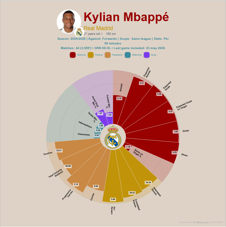
We tested the public workflows with the same player and season: Kylian Mbappé, Real Madrid, 2025/26. The result exposed an important difference. DataMB Free presents a fixed seven-axis striker radar built from percentiles. FBPlot's production Standard preset presents a broader 19-metric profile, with per-90 values printed on the chart and a same-league comparison scope.
That means the practical question is not simply “which radar looks better?” It is:
Do you want a concise positional summary, or a more configurable chart-production workflow with more context visible in the output?
FBPlot vs DataMB at a Glance
The coloured marker identifies an advantage only when the criterion has a clear winner: 🟢 FBPlot, 🔵 DataMB, ⚪ even, and 🟡 depends on the job.
| Criterion | FBPlot | DataMB | Advantage |
|---|---|---|---|
| Tested player and season | Kylian Mbappé, 2025/26 | K. Mbappé, 2025/26 | ⚪ Even |
| Minutes in the screenshots | 3,509 across all competitions in FBPlot's seasonal view | 2,826 from league data only | 🟡 Different samples |
| Comparison population | Forwards, same-league scope | Top 7 leagues by position and season | 🟡 Depends on the question |
| Default tested chart | Circular multi-category radar | Traditional filled radar | 🟡 Design preference |
| Metrics shown | 19 in the production Standard preset | 7 fixed striker metrics | 🟢 FBPlot for breadth |
| Value modes | Absolute, per 90, percentile and team contribution where supported | Percentiles on the Free radar | 🟢 FBPlot for analytical choice |
| Metric editing | Public presets and metric controls | Fixed positional radar; broader custom tools are part of Pro | 🟢 FBPlot |
| Player comparison | Supported | Supported | ⚪ Even |
| Image output | Native PNG export | Camera/screenshot control documented | ⚪ Even |
| Brand and design control | Colours, typography, labels, styles and publishing aspect ratios | Fill/outline and colour controls documented | 🟢 FBPlot |
| Mobile | Responsive web workflow | Android and iOS apps documented | 🔵 DataMB |
| Free access | Public radar without registration | Public Top 7 radar | ⚪ Even |
| Paid data access | Pro unlocks every league and competition available in FBPlot, including available cup and continental data | Pro documents 55 leagues and seasons back to 2022/23; its guide says all tools use league data only | 🟡 Depends on the competitions and history required |
This is a task-based scorecard, not a universal product ranking. A marker rewards the stronger fit for that specific criterion; it does not make unlike statistics directly comparable.
How We Made the Comparison
We started with the same player, season and broad role. We then recorded:
- The metrics visible on the radar.
- Whether the displayed numbers were raw, per 90, percentages, or percentiles.
- The comparison population stated by the interface or methodology.
- The minutes shown for the player.
- The amount of control available before export.
- Whether an output could preserve enough context to be interpreted later.
This method follows the same principles as our guide to a fair football player comparison: period, population, role, units and sample must be visible before two outputs can be treated as equivalent.
The two products did not expose identical samples. DataMB showed 2,826 minutes because its tools use league data only. FBPlot showed 3,509 minutes because its 2025/26 seasonal view aggregates the player's available competitions. The same-league setting visible in FBPlot controls the comparison population; it does not turn the player's seasonal total into a league-only sample. We therefore compare workflows and disclosures, not the underlying numerical values.
What the FBPlot Standard Radar Shows
The production FBPlot Standard preset displayed 19 metrics across attacking, passing, possession, defending and duel categories. The chart included per-90 values for count metrics and percentages for rate metrics.
The visible Standard metrics were:
- Assists, expected assists, expected goals, expected goals on target, goals, shots and shots-on-target percentage.
- Attempted passes, completed passes and key passes.
- Carries, progressive carries, total carrying distance and touches.
- Clearances, interceptions and tackle-win percentage.
- Aerial-duel and contest-win percentages.
The main advantage is breadth. A reader can inspect several phases of the player's profile without moving to another chart. The colour groups also make the role of each metric easier to identify.
The trade-off is density. Nineteen axes demand more reading effort, particularly on a small screen. A focused preset is usually better when the chart needs to support one claim. Our guide to choosing football metrics by position explains why adding more axes does not automatically create a better scouting profile.
FBPlot can also switch supported metrics to team contribution. Instead of asking only how often an event occurs per 90, this mode asks what share of the team's output came from the player. That can reveal a player's importance inside their own environment, although percentage and derived metrics that do not have a meaningful team-share denominator remain outside this mode.
What the DataMB Free Striker Radar Shows
The supplied DataMB Free screenshot used its striker template and displayed seven percentile axes:
- Non-penalty goals: 90.8.
- Non-penalty expected goals: 95.7.
- Goal conversion: 57.4.
- Aerial-duel win percentage: 74.8.
- Touches in the penalty area: 98.6.
- Expected assists: 90.8.
- Offensive duels won: 96.5.
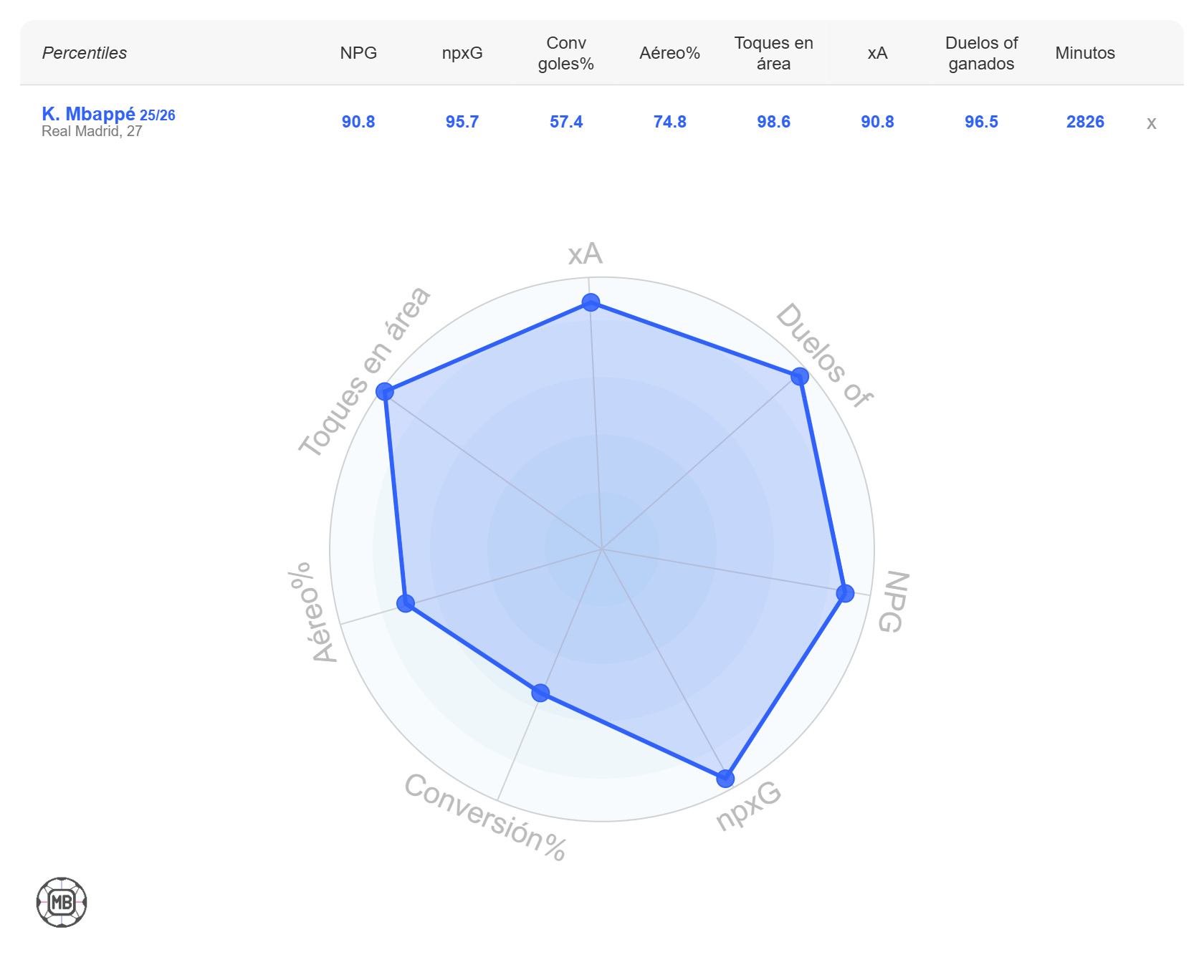
The main advantage is focus. The reader receives a compact positional profile without choosing metrics first. The table above the radar also makes every percentile easy to transcribe.
The trade-off is that the free radar fixes the positional template. DataMB's official platform guide says its free radar uses seven key metrics per position and combines Top 7 league players for each position and season. Raw per-90 values are not printed on this radar, although the guide says they are available in other DataMB tools.
If you need a fast summary, that constraint can be helpful. If you need to investigate a narrower hypothesis, it can become limiting.
Why the Numbers Must Not Be Compared Directly
Placing both screenshots side by side does not create a controlled statistical comparison.
The minutes differ
DataMB shows 2,826 league minutes. FBPlot shows 3,509 minutes from the competitions included in its full-season view. The higher FBPlot total is therefore a scope difference, not evidence that one provider has counted league minutes more accurately. A different sample changes every rate, percentile and eligibility decision.
The populations differ
DataMB documents a combined Top 7 population by position and season for its free radar. FBPlot visibly states “Same league” and “Forwards.” A percentile only describes a player's place inside its own comparison group.
For example, a 90th percentile result does not mean “nine out of ten in every league.” It means the value ranked above approximately 90% of the eligible observations in that particular sample. See football percentiles explained for the full interpretation checklist.
Similar labels can use different definitions
DataMB's striker radar uses non-penalty goals and non-penalty expected goals. The FBPlot Standard radar uses goals and expected goals. Removing penalties changes the measure.
The same caution applies to duels, touches in the penalty area, expected metrics and provider-specific event definitions. Labels that sound similar are not proof of identical calculations.
The charts expose different numbers
FBPlot prints per-90 values and percentages on the chart while the radial length represents relative performance. DataMB prints percentiles in the accompanying table and uses them as the radar coordinates.
Neither approach is automatically better. Per-90 values retain the observed rate; percentiles make relative standing faster to scan. A responsible workflow often needs both. Our guide to per-90 football metrics explains what normalization solves and what it cannot solve.
Metric Choice and Customisation
FBPlot is the more open-ended chart builder in the tested public workflow. Its production interface offers role-oriented public presets and controls for metrics, styles, comparison settings and output format. That suits analysts and creators who already know the question they want the chart to answer.
DataMB Free is more guided. You choose a positional template and players, then receive the predefined profile. That reduces setup time and makes repeated comparisons consistent.
DataMB Pro documents a much wider database and additional tools:
- Plot for up to three metrics.
- Rank profiles with bars and a customisable pizza chart.
- Index leaderboards.
- Attribute-based player search.
- AI Chat.
We did not test those paid functions. They should not be treated as observed behavior in this comparison. When checked on 29 July 2026, DataMB listed Pro at €9.99 monthly, €54.99 biannually and €104.99 yearly.
Data Coverage and Season Access
DataMB's public radar is intentionally constrained. Its current radar index lists the Top 7 leagues and the 2024/25 and 2025/26 seasons. The vendor says Pro expands access to 55 leagues and seasons back to 2022/23. Those coverage totals are DataMB's claims, not an independent database audit.
FBPlot Free covers players from the Top 5 European leagues. FBPlot Pro unlocks every league and competition available in the platform, including available domestic cups and continental competitions. DataMB Pro also broadens its database, but its official guide says its tools use league data only. This makes the paid plans comparable in broad access, not identical in competition inventory or historical depth.
Neither product's practical advantage is established by quoting a larger headline number. The relevant question is whether the competition, season, player and comparison population needed for your analysis are available in the current interface.
Before choosing either product, test your real use case:
- Search for the competition and season you need.
- Confirm the player's minutes.
- Read the metric definition.
- Identify the percentile population.
- Check whether the exported image preserves that context.
Export and Publishing Workflow
Both products can produce an image from the radar workflow. Their outputs emphasize different things.
DataMB's screenshot is clean and familiar. Seven axes are legible, the shape is easy to compare, and the table preserves exact percentiles. It works well when the positional template already matches the intended argument.
FBPlot's output carries more analysis context inside the graphic: season, comparison role, scope, statistic mode, matches, minutes and last included game. It also supports publishing-oriented aspect ratios and style presets in the current product.
That additional context is useful for an article or scouting document, but the chart still needs an accurate caption. An export cannot explain an undisclosed population or resolve different provider definitions by itself.
For help matching the output to its destination, see how to choose the right football chart and our football chart aspect-ratio guide.
Which Tool Fits Which Workflow?
Choose DataMB Free when:
- You want a quick positional radar without selecting metrics.
- A seven-axis percentile summary answers your question.
- You want to compare players from the documented Top 7 population.
- Consistency between repeated positional profiles matters more than customisation.
Consider DataMB Pro when:
- You need its broader documented league and season coverage.
- You want its Plot, Rank, Index or attribute-search workflows.
- You have verified that its paid database and metric definitions cover your actual recruitment question.
Choose FBPlot when:
- You want to select a role-oriented preset or build a more specific metric set.
- You need several chart types rather than one fixed radar workflow.
- You want absolute, per-90, percentile or team-contribution views where the metric supports them.
- You want the chart to carry your club, publication or personal brand through its colours, typography, labels and format instead of looking like a generic export.
- You need cup, continental or other available competition data through FBPlot Pro.
The Practical Verdict
FBPlot and DataMB are legitimate direct competitors for visual player comparison, but they optimize the free radar workflow differently.
DataMB Free requires fewer metric decisions when its fixed positional template is exactly what you need. FBPlot is more suitable when you want to shape the evidence, retain more context in the output, and move between radar, bar, scatter and distribution views.
There is no defensible numerical winner from the Mbappé screenshots. The samples, populations, metric definitions and visible units differ. The useful conclusion is about workflow:
- Choose the guided template when speed and consistency matter most.
- Choose the configurable chart workflow when the question, evidence and publishing format need more control.
You can open the FBPlot Player Pizza Chart and reproduce the decision with your own player, season, comparison group and metric preset. Before exporting, record the same five fields used in this review: period, population, role, units and minutes.
Found this helpful? Share it with your network