
Choose among FBPlot's verified 4:5, 1:1, 9:16 and 16:9 chart formats from the communication constraint rather than from a platform guess.
Aspect ratio changes available label space and visual hierarchy. Map the current presets to reports, square feeds, vertical stories and landscape layouts.
An aspect ratio is not a decorative crop. It determines how much horizontal and vertical space the chart has for labels, marks, context and hierarchy.
FBPlot’s current chart-ratio configuration includes Post 4:5, Feed and Square 1:1, Story 9:16 and Landscape 16:9. These are layout presets, not promises about the latest upload requirements of any external platform.
Start With the Destination
Before choosing a preset, identify:
- where the graphic will appear;
- the approximate displayed size;
- whether surrounding text carries methodology;
- how many labels must remain visible;
- whether the chart is viewed alone or in a sequence.
The destination determines the constraint. The chart type and content then determine whether that constraint is workable.
Post 4:5
The 4:5 format provides more vertical space than a square while remaining relatively compact.
It can suit:
- a bar chart with several rows;
- a radar plus a concise context block;
- a publication card with title and caption space;
- a report figure that benefits from a portrait orientation.
Check long metric labels and avoid filling the extra height with non-essential decoration.
Feed or Square 1:1
A square is predictable and reusable. It can work well for a single radar, compact scatter or short bar profile.
The constraint is label density. If the subject needs a long title, many metrics and extensive methodology, the square may force text below a readable size.
Use the mobile label audit after export.
Story 9:16
The vertical format provides height but limited width.
It can support:
- a sequence of one idea per frame;
- vertical bar arrangements;
- a small number of directly labelled subjects;
- a chart plus a concise contextual header.
Long horizontal axes, many player labels or wide legends may fail. Do not assume that moving a landscape chart into a vertical frame preserves its reading task.
Landscape 16:9
Landscape provides room for wide scatter plots, presentation slides and report sections.
It can help when:
- X-axis resolution matters;
- several highlighted points need labels;
- a title and subtitle must sit above a wide plotting area;
- the chart will appear in a video or presentation layout.
At small mobile display widths, however, a wide graphic may be scaled down more aggressively than a square or portrait image.
Do Not Crop After Export
Cropping can remove:
- axes or metric labels;
- the comparison population;
- period and unit;
- data source;
- highlighted-player labels;
- watermark or provenance.
Choose the destination ratio inside the chart workflow and rebuild the layout. A post-export crop is not equivalent.
Test the Longest Content
Use the longest realistic player, team and metric names during review. A template tested only with short labels can fail in the next edition.
The weekly graphic workflow recommends a template stress test before a series is locked.
Export Checklist
For each ratio:
- verify title and subtitle;
- verify every essential axis or metric label;
- inspect highlighted subjects;
- confirm period, population and unit;
- check whitespace and mark density;
- view the exported file at destination size;
- keep the original configuration for regeneration.
The Same Analysis Is Not the Same Composition
These three FBPlot exports ask the layout to do different work. The square bar gives the player block and each metric row predictable vertical room. The 4:5 pizza gives a dense forward profile more height without becoming a full-screen story. The 9:16 version makes the player header and radial labels part of a much taller reading path. None is a neutral container.
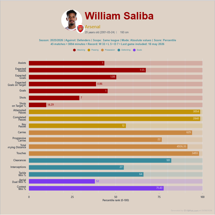
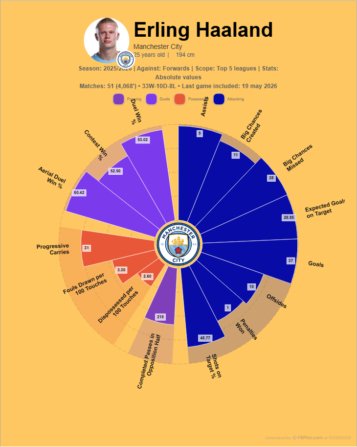
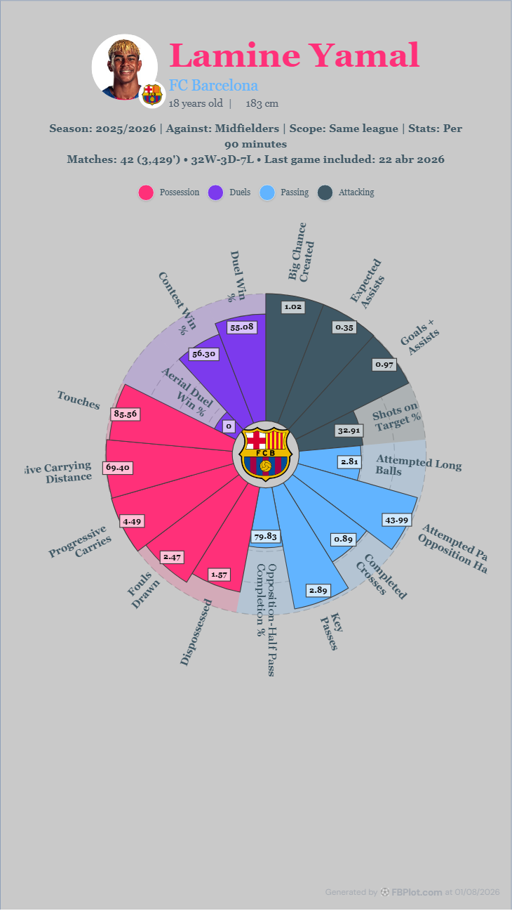
If the square chart is cropped into a story after export, the player name or final duel rows may disappear. If the 9:16 pizza is squeezed into a short card, the radial labels become a reading test and much of the canvas turns into dead space. The solution is not to design once and crop later. Choose the destination first, reopen the chart in that ratio and rebalance the content while the analytical context is still visible.
This is also why “social size” is too vague a brief. A story, feed card, report page and presentation slide create different reading distances and safe areas. The correct ratio is the one that preserves the longest real title, the longest metric label and the methodology line at the final displayed size.
Choose the Format
Open the relevant FBPlot creator, select Post, Feed/Square, Story or Landscape, and inspect the final export without zooming. Pick the ratio that preserves the analytical task. If none does, reduce the content or split it into a sequence rather than compressing the evidence.
Found this helpful? Share it with your network
More Articles
How to Document a Reproducible Football Chart
Record the minimum information another analyst needs to rebuild a football chart: question, source, period, population, metrics, units and configuration.
Small Samples in Football Analytics: Minutes, Matches and Uncertainty
Handle early-season and low-minute football data with explicit exposure rules, sensitivity checks and cautious language.