
Combine multiple football metrics on a scatter axis without hiding components, units, direction or weighting.
Composite axes can summarise a concept, but simple sums can mix scales and duplicate evidence. Use an explicit encoding contract and sensitivity check.
A composite scatter axis combines more than one metric into a single coordinate. It can reduce a complex idea to a readable view, but it can also conceal incompatible units, arbitrary weights and duplicated evidence.
Use a composite only when the analytical concept is defined before the metrics are combined.
Start With One Sentence
Write what the axis is intended to represent:
The horizontal axis summarises recorded chance-creation volume from the selected component metrics during the stated period.
That sentence must be narrower than “attacking quality.” A descriptive sum cannot establish a complete quality judgement.
List Every Component
For each metric, record:
- current glossary name;
- definition;
- unit;
- direction;
- period;
- transformation;
- weight;
- missing-value treatment.
If FBPlot combines selected metrics through a simple sum in the current workflow, say so. Do not call the result an index, model or rating unless it has been designed and validated as one.
The existing scatter plot tutorial explains the creator workflow. This article focuses only on the composite definition.
Do Not Sum Incompatible Units Silently
Adding totals to percentages or values with very different scales can make one component dominate.
Possible responses include:
- use a single metric instead;
- put separate concepts on X and Y;
- transform components to a documented common scale outside the chart;
- use small multiples;
- keep multiple raw measures visible in another chart.
The correct choice depends on the question. The important rule is that the transformation must be reproducible.
Check for Double Counting
Two metrics can partially describe the same events. Summing them may count one underlying action twice.
Ask:
- Does one component include another?
- Are both derived from the same event chain?
- Are outcome and precursor being combined?
- Would removing either metric materially change the concept?
Use the Metrics Glossary and provider documentation rather than relying on labels alone.
Keep Direction Consistent
If higher values mean different things across components, the sum becomes hard to interpret. A metric where lower is preferable requires an explicit transformation before combination.
Do not reverse a metric merely to make every component point “up.” Explain why the direction relates to the concept.
Build a Baseline View
Before using the composite:
- chart each component separately;
- inspect ranges and missing values;
- compare the single-metric views with the composite;
- identify which component drives the order;
- remove one component at a time.
If the story changes after removing a weakly justified component, the sensitivity belongs in the report.
The expected-goals chart guide and the progression-metrics comparison show why distinct concepts may deserve separate axes.
Write the Encoding Contract
Publish this beside the chart:
Population:
Period and cutoff:
Eligibility rule:
X components and formula:
Y components and formula:
Units or transformations:
Bubble-size metric, if used:
Important exclusions:
If the formula cannot fit in a caption, link to a methodology note.
Use Bubble Size Sparingly
A third variable should add context at the same observational grain. Minutes can provide exposure context; another performance metric may create an overloaded chart.
Readers compare area less precisely than position on a common scale. Treat bubble size as supporting context, label important subjects and retain the underlying value.
A Real Composite Needs to Be Read Before It Is Admired
This FBPlot scatter uses more than one action on each axis. The horizontal position combines goals with goal-creating actions as a share of team output; the vertical position uses shot-creating actions; bubble size adds key-pass contribution. That produces a rich picture, but it also creates three analytical contracts that the reader must be able to recover.
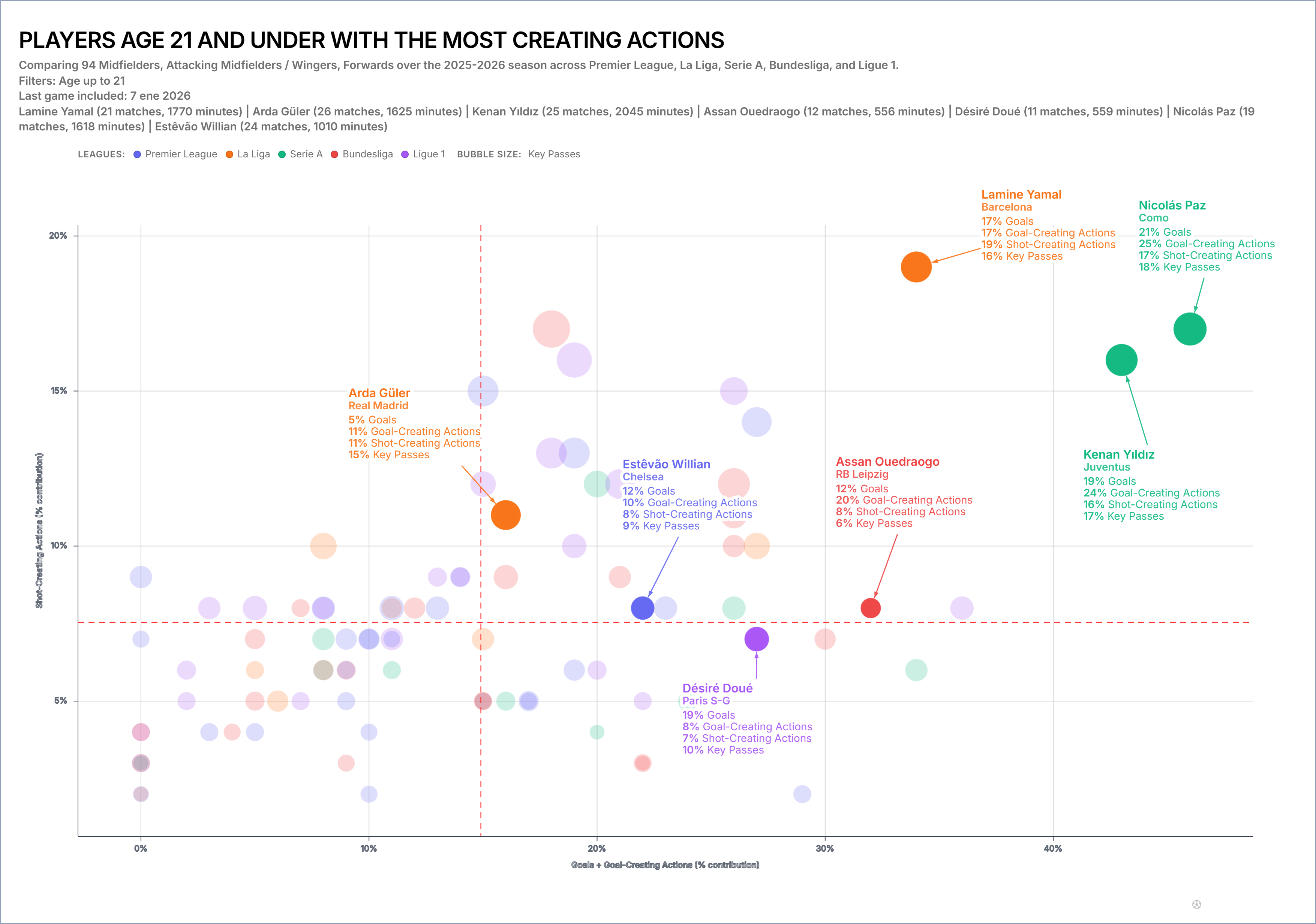
The plot becomes misleading if “goals plus goal-creating actions” is treated as a natural unit. Goals and creative actions describe different events; adding them is an editorial choice. The chart therefore labels the components explicitly and keeps the contribution unit consistent. A reader can disagree with the combination without having to reverse-engineer it.
The next test is redundancy. If goal-creating actions already include sequences closely related to the selected vertical or bubble metrics, one player may be rewarded repeatedly for the same underlying behaviour. Rebuild the scatter with a single metric on each axis. If the highlighted story collapses, the composite may be manufacturing separation rather than revealing it. The baseline version is not a dull preliminary—it is the control experiment.
Build the Scatter
Open the FBPlot Scatter Plot Creator, begin with one metric per axis and preserve that baseline. Add a component only when it has a clear role in the axis definition. Export the chart together with the encoding contract and the single-metric sensitivity views.
Found this helpful? Share it with your network
More Articles
How to Document a Reproducible Football Chart
Record the minimum information another analyst needs to rebuild a football chart: question, source, period, population, metrics, units and configuration.
Small Samples in Football Analytics: Minutes, Matches and Uncertainty
Handle early-season and low-minute football data with explicit exposure rules, sensitivity checks and cautious language.