
Publish football rankings with explicit eligibility, sorting, units, labels and sample context instead of letting bar length imply more than the data.
A bar chart makes comparison fast, which also makes missing context easy to overlook. Use this audit before publishing a ranked football graphic.
Bar charts make ordered comparisons easy because readers can judge length against a common baseline. That clarity creates a responsibility: if the eligibility rule, unit or period is hidden, the chart can make a fragile ranking look definitive.
This guide concerns population rankings. For a single player’s multi-metric profile, use the player bar chart interpretation guide.
Define Who Can Be Ranked
The title should not be broader than the eligible population.
Record:
- competitions;
- season or dates;
- position or role group;
- minimum minutes or matches;
- age or other filters;
- data cutoff;
- excluded cases.
“Top midfielders” is misleading if the underlying data covers only selected leagues or players above an unstated minutes threshold.
Choose Total or Rate From the Question
Totals answer accumulated contribution over the period. Per-90 values answer recorded frequency conditional on minutes played.
A season-output article may need totals because availability is part of the story. A rate comparison may need per 90, but only after an exposure rule is applied. The per-90 guide explains that denominator choice.
Do not place totals and rates on the same axis.
Sort Deliberately
Descending order is useful for a leaderboard, but it is not the only responsible order.
Consider:
- descending value for an explicit ranking;
- alphabetical order when rank is not the message;
- grouped order for categories with a clear analytical purpose;
- highlighting a subject while retaining the full reference group.
State how ties are handled. Small display differences can otherwise imply a meaningful separation that is not present.
Keep the Baseline Honest
Bar length is interpreted from its baseline. Truncating the scale can exaggerate small differences.
If a non-zero baseline is essential, disclose it and consider whether a dot plot or table would communicate the comparison more honestly. Do not use decorative depth or perspective that changes apparent length.
Research on graphical perception is a useful reminder that readers decode quantitative marks; visual choices affect that decoding.
Label the Evidence
The chart should make these visible or recoverable in its caption:
- metric name;
- unit;
- exact period;
- eligibility rule;
- source or glossary definition;
- value labels with appropriate precision;
- whether the list is complete or selected.
The mobile label guide explains how to preserve essential context at small sizes.
Do Not Rank Noise
An ordered list can still contain unstable estimates. Check minutes and matches, especially for rate metrics and early-season samples.
Use the small-sample workflow to run a stricter exposure check. If the top positions change sharply, report that sensitivity rather than choosing the version with the strongest headline.
Use Colour for Emphasis, Not Value
Bar length should carry the quantitative comparison. Colour can identify a subject, group or editorial focus, but it should not introduce an unexplained second ranking.
Keep labels readable against their background and do not rely on colour alone to identify meaning. The WCAG use-of-colour guidance recommends additional cues such as text or shape.
Publication Audit
Before exporting:
- Re-read the title against the actual population.
- Confirm unit and period.
- Confirm the same eligibility rule applies to all rows.
- Inspect the baseline and sorting.
- Reduce decimals to meaningful precision.
- Test labels at final size.
- Add the cutoff and exclusions.
- Verify that the conclusion survives a reasonable sample check.
When a Blank Value Is More Honest Than a Rank
Wesley Fofana's FBPlot profile contains a useful warning for anyone publishing rankings. Some attacking rows display --- rather than a number. That is not an invitation to treat the value as zero, push the player to the bottom and continue. It tells the editor that the current sample or metric does not support the same comparison as the populated rows.
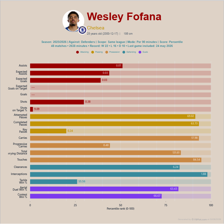
Imagine turning this profile into a “top defenders” graphic. The responsible route is to define the eligible metric first, then exclude rows that cannot be compared consistently. Filling blanks with zero would change missing evidence into negative evidence. Dropping the affected players without disclosure would change the population after seeing the result.
The chart also records 48 matches and 2,638 minutes in FBPlot's seasonal view. Those fields should travel into the ranking caption because a per-90 order without availability context can reward a short, unusual spell. The most useful ranking is not the one with the cleanest podium; it is the one whose audience can reconstruct who was eligible, what was measured and why any case was omitted.
Build the Ranking
Use FBPlot’s relevant bar or population workflow with one explicit metric and population. Export only after the reader can reconstruct who was eligible, what was measured and why the bars are ordered that way. A ranking should accelerate comparison—not hide its conditions.
Found this helpful? Share it with your network
More Articles
How to Document a Reproducible Football Chart
Record the minimum information another analyst needs to rebuild a football chart: question, source, period, population, metrics, units and configuration.
Small Samples in Football Analytics: Minutes, Matches and Uncertainty
Handle early-season and low-minute football data with explicit exposure rules, sensitivity checks and cautious language.