
Turn a football metric definition into a chart by preserving its unit, period, population, denominator and communication purpose.
A glossary explains what a metric is. This workflow decides what question it can answer, which chart fits and which context must travel with the export.
Knowing a metric’s name is not enough to chart it responsibly. A definition must be connected to a question, unit, period, population and visual encoding.
This workflow starts with the FBPlot Metrics Glossary and ends with an export whose interpretation can be checked.
1. Read the Current Definition
Record:
- exact metric name;
- what event or calculation it represents;
- unit;
- whether higher has an obvious interpretation;
- supported normalisations;
- important exclusions;
- provider-specific caveats.
Do not carry a definition from another provider merely because the label looks familiar.
2. Write the Analytical Question
Different questions can use the same metric:
- Who accumulated the most during the period?
- Who recorded the action most frequently per 90?
- How does the metric relate to another measure?
- Where does a player sit inside a defined population?
- How is the population distributed?
The question chooses the unit and chart.
3. Choose the Unit
Use totals for accumulated output and per-90 rates for playing-time-normalised frequency when the metric supports that transformation.
Percentages and contribution shares require their own denominator context. Do not convert every catalog entry automatically.
The per-90 guide explains the rate decision, and the expected-goals case study applies it to one current metric.
4. Define the Population
State:
- competitions;
- position or role group;
- period;
- minutes or matches rule;
- age or other filters;
- cutoff.
A percentile or rank is meaningful only within this set. The percentile guide explains the dependency.
5. Select the Chart
Use a:
- bar for an ordered one-metric comparison or readable player metric rows;
- scatter for a relationship between measures;
- bubble when a third same-grain variable adds necessary context;
- swarm for a distribution;
- radar for a compact multidimensional profile.
See the football chart selection guide before configuring the creator.
6. Build a Baseline
Start with the simplest defensible chart:
- one metric;
- one coherent population;
- one unit;
- one period;
- no decorative encoding.
Add complexity only when it answers a stated question. Preserve the baseline so the effect of each addition can be reviewed.
7. Write the Caption Before Export
A useful caption includes:
Metric and unit:
Period and cutoff:
Population:
Eligibility rule:
Highlighted subjects:
Important limitation:
Writing it early exposes missing context while the configuration can still be fixed.
8. Test the Result
Check:
- values against the expected unit;
- labels at final size;
- title against the actual population;
- links to the current definition;
- unsupported causal language;
- sample sensitivity;
- whether another chart answers the question more directly.
The visualization mistakes audit provides the final review.
When “Contribution” Changes the Question
Declan Rice's FBPlot profile demonstrates why the glossary must come before the chart mode. In this export, supported rows are expressed as a share of team output rather than as totals or per-90 rates. The player has not performed three different seasons; the analyst has asked a different question of the same period.
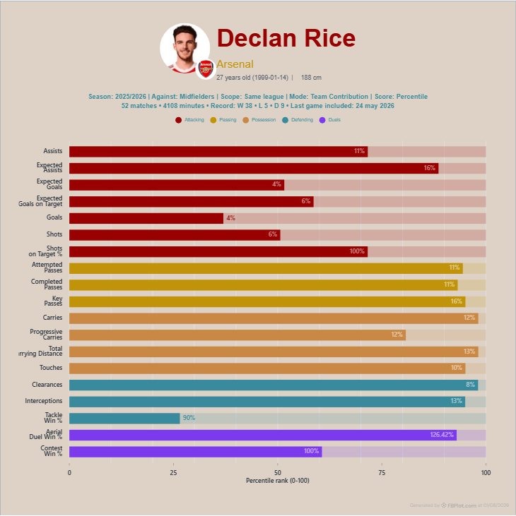
Consider attempted passes. A contribution percentage can describe how much of the team's recorded total belongs to the player. That is different from attempted passes per 90, which describes frequency while he is on the pitch, and from a percentile, which describes rank inside a population. Mixing those interpretations would turn one label into three incompatible claims.
The unusual values are precisely why the definition should stay close. A contribution can exceed an intuitive 100% benchmark when player and team denominators are not simple interchangeable counts or when a derived rate is involved. Do not smooth that away in the caption. Verify whether the metric supports contribution, read its denominator and switch to total or per 90 when the team-share question is not meaningful.
Suppose the row is a win percentage. The observed value already contains a denominator—the number of relevant contests. Asking for its share of a team percentage may no longer describe an intuitive piece of team output. That is different from goals or attempted passes, where a player count can often be related to a team count more directly. The catalog's support rules are part of the football meaning, not a technical inconvenience.
The safest workflow keeps a small note beside every selected metric: definition, base unit, transformation and population. When the chart surprises you, inspect that note before celebrating the insight. Many “advanced” discoveries are simply denominator mistakes dressed in a polished visual.
Build From a Definition
Open one metric in the glossary, write a question it can actually answer and choose the simplest FBPlot chart that exposes the required relationship. Export the chart with its definition and population context. The glossary is the provenance start—not the finished analysis.
Found this helpful? Share it with your network
More Articles
How to Document a Reproducible Football Chart
Record the minimum information another analyst needs to rebuild a football chart: question, source, period, population, metrics, units and configuration.
Small Samples in Football Analytics: Minutes, Matches and Uncertainty
Handle early-season and low-minute football data with explicit exposure rules, sensitivity checks and cautious language.