
Audit football charts for mismatched questions, hidden populations, mixed units, unstable samples, overloaded encodings and unreadable exports.
Correct values can still produce a misleading graphic. Map each common failure to a reproducible review question before publication.
Accurate data does not guarantee an honest chart. The question, population, unit, encoding and editorial framing can still create a misleading impression.
Use this audit after the chart is configured and before it enters a report, article or social feed.
Mistake 1: Choosing the Chart Before the Question
A radar, bar, scatter and swarm answer different relationship tasks.
Audit: Can the intended question be stated in one sentence, and does the chart expose that relationship?
Use the chart selection guide if the answer is unclear.
Mistake 2: Hiding the Population
A percentile, outlier or “top” label has no stable meaning without the eligible group.
Audit: Are competition, position, period, minutes rule and scope visible or recoverable?
Mistake 3: Mixing Units
Totals, per-90 rates, percentages and contribution shares answer different questions.
Audit: Does every axis or row name its unit, and are unlike units kept separate?
See the per-90 guide.
Mistake 4: Treating a Small Sample as Stable
A high rate from limited minutes can dominate a chart.
Audit: Are minutes and matches available, and does the finding survive a reasonable exposure change?
The small-sample workflow provides the test.
Mistake 5: Reading a Radar’s Area as a Rating
Radar geometry depends on metric selection and axis order.
Audit: Does the text read individual axes and comparison context rather than polygon area?
Use the complete radar guide.
Mistake 6: Hiding Components in a Composite
Summed axes can mix scales, double-count actions or introduce arbitrary weights.
Audit: Are components, formulas, units and sensitivity views disclosed?
Mistake 7: Ranking Without Eligibility
A descending bar chart can imply a complete leaderboard when it is a filtered subset.
Audit: Does the title describe the actual eligible population and sorting rule?
Use the responsible bar ranking audit.
Mistake 8: Labelling Only Famous Players
Selective labels can turn an exploratory population chart into celebrity confirmation.
Audit: Were highlights chosen by an explicit editorial rule, and does the rest of the population remain visible?
Mistake 9: Using Colour as the Only Cue
Not every reader distinguishes colours in the same way.
Audit: Do direct labels, shape, position or line style preserve the meaning?
WCAG’s use-of-colour guidance provides the accessibility principle.
Mistake 10: Designing Only at Desktop Size
Labels and context can disappear when the image is scaled.
Audit: Has the exported file been inspected at destination size without zoom?
Use the mobile label guide.
Mistake 11: Cropping Away Methodology
Post-export crops can remove axes, scope, cutoff or source.
Audit: Was the correct aspect ratio selected before export, and is all essential context preserved?
Mistake 12: Turning Description Into Prediction
A chart describes the supplied data and method. It does not guarantee transfer performance, future output or causal explanation.
Audit: Does every conclusion stay within the evidence, with alternative explanations and missing context stated?
A Real Chart Can Contain Several Traps at Once
Bukayo Saka's team-contribution profile is a useful audit exercise because it looks polished and still demands careful reading. The rows mix counts, percentages and derived rates; the bars encode percentile rank while the printed labels show contribution values. A reader who assumes every percentage has the same denominator can build a confident but false story.
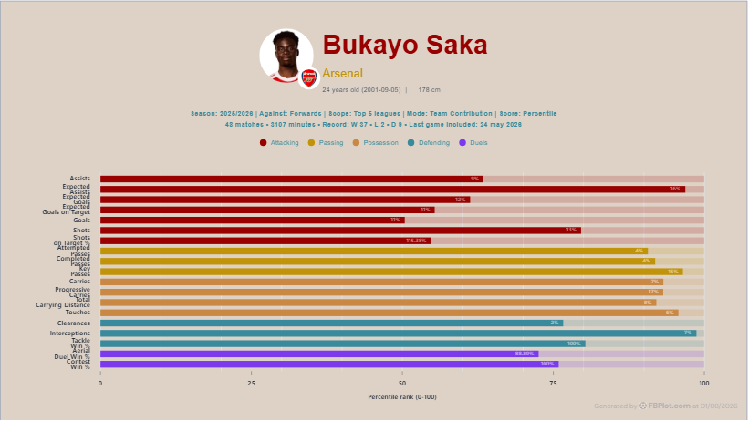
Start at the top. The chart states season, comparison role, same-league scope, Team Contribution mode, percentile score, matches and minutes. Those fields prevent several mistakes in the list above. They do not solve the denominator question for you. A contribution label above 100% or a rate-based row is a signal to open the glossary and confirm whether the transformation is meaningful.
Then challenge the story produced by colour and length. A long purple duel bar may attract the eye more than a shorter passing row, but prominence is not tactical importance. The audit should end with a sentence that could falsify the graphic: “If this metric uses a different denominator than assumed, or the comparison population changes, does the conclusion still hold?” If the answer is no, the caption needs more context or the row should leave the chart.
In an editorial workflow, run that challenge before anyone writes the headline. Once a dramatic phrase exists, people tend to defend the chart that supports it. Reverse the order: inspect the configuration, write a neutral description of the visible evidence and only then decide whether a stronger conclusion survives.
Ask a colleague to read the graphic without the draft article. If they cannot identify the unit or believe a percentile is a raw percentage, the visual hierarchy has failed. If they reach a much stronger football conclusion than the caption permits, the encoding may be overselling certainty. The audit is successful when it catches that gap before publication.
Run the Final Audit
For the next FBPlot export, review all twelve questions and record any correction. Preserve the original configuration and the final file. A chart is ready for human approval when its evidence, limitations and visual emphasis agree—not merely when it looks finished.
Found this helpful? Share it with your network
More Articles
How to Document a Reproducible Football Chart
Record the minimum information another analyst needs to rebuild a football chart: question, source, period, population, metrics, units and configuration.
Small Samples in Football Analytics: Minutes, Matches and Uncertainty
Handle early-season and low-minute football data with explicit exposure rules, sensitivity checks and cautious language.