
General
How to Document a Reproducible Football Chart
Record the minimum information another analyst needs to rebuild a football chart: question, source, period, population, metrics, units and configuration.
8/17/20265 min read
Read more
Allow anonymous usage analytics from Google Analytics and Microsoft Clarity to help improve FBPlot. Read the privacy policy .
Learn the strategies to create stunning football visualizations, understand advanced metrics, and turn your data into compelling stories
Record the minimum information another analyst needs to rebuild a football chart: question, source, period, population, metrics, units and configuration.
Handle early-season and low-minute football data with explicit exposure rules, sensitivity checks and cautious language.
Audit football charts for mismatched questions, hidden populations, mixed units, unstable samples, overloaded encodings and unreadable exports.
Translate one scouting observation into a chart whose population, metrics, claim and caption support a specific report decision.
Produce a consistent weekly football graphic by freezing the question, configuration and review process while documenting every data refresh.
Compare two channels of ball progression while preserving current metric definitions, role, opportunity, unit and population context.
Choose an expected-goals chart from the question: accumulated xG, xG per 90, shot context or a relationship with another metric.
Turn a football metric definition into a chart by preserving its unit, period, population, denominator and communication purpose.
Add headlines, callouts and editorial context while preserving an untouched native chart and a record of every annotation.
Choose among FBPlot's verified 4:5, 1:1, 9:16 and 16:9 chart formats from the communication constraint rather than from a platform guess.
Make football chart titles, axes, player names, values and methodology readable at the size where the audience will actually see them.
Choose a readable number of radar axes by testing role coverage, redundancy, label space and export size instead of following a universal number.
Combine multiple football metrics on a scatter axis without hiding components, units, direction or weighting.
Select football metrics from role responsibilities instead of copying a universal position template or filling every available radar axis.
Publish football rankings with explicit eligibility, sorting, units, labels and sample context instead of letting bar length imply more than the data.
Use football swarm plots to see distributions, clusters, gaps and highlighted players that a rank table can hide.
Compare players across competitions while keeping league, role, sample and population effects visible instead of collapsing them into one ranking.
Build a football scouting shortlist from explicit filters, role evidence and reviewable charts instead of an unexplained ranking.
Learn what a football percentile says, why the comparison population matters and how to connect rank with the underlying value and distribution.
Compare football players without mixing roles, minutes, periods or populations. Use a five-part comparison contract before choosing a chart.
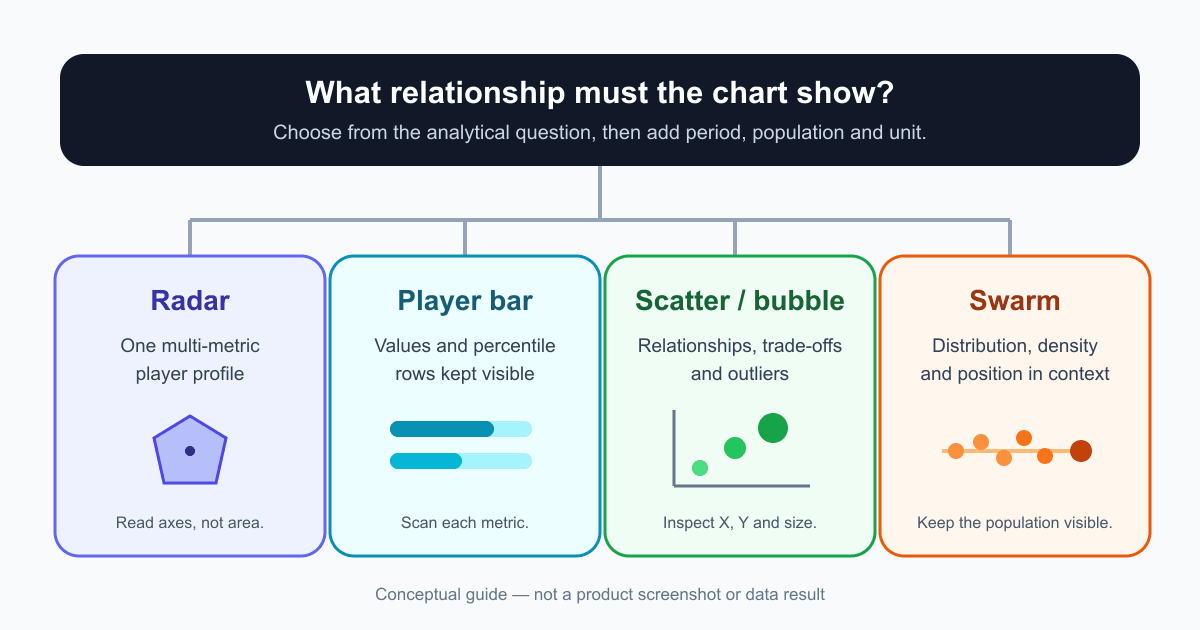
Choose between pizza, player bar, scatter, bubble and swarm charts by defining the relationship your football analysis must show—not by choosing a visual style first.
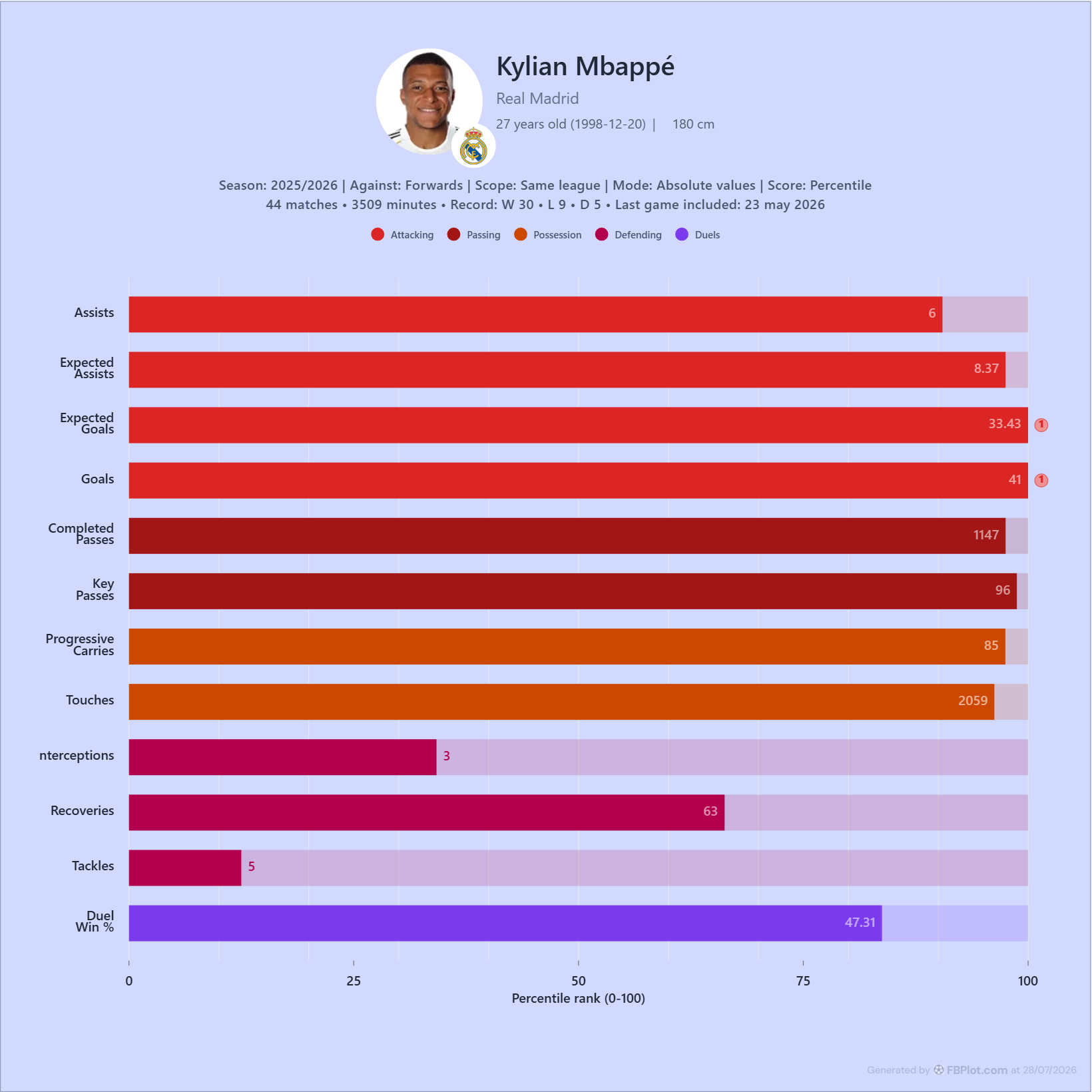
Learn how to read a football player bar chart by separating the metric value from its percentile, defining the comparison group, and checking period, minutes, units, and metric direction before drawing a conclusion.
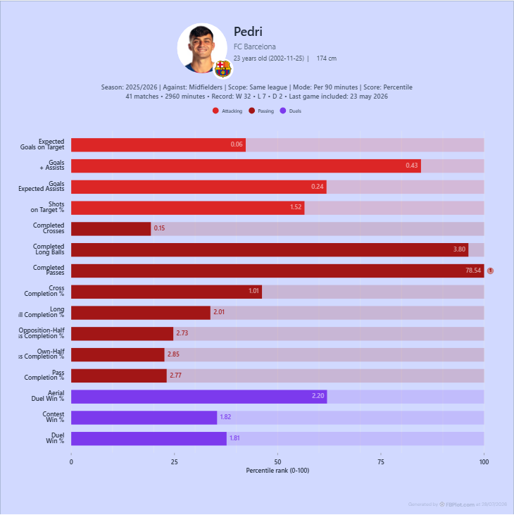
Learn what a football per-90 rate measures, how to calculate it, when it makes player comparisons fairer, and why minutes, role, period and population still matter after normalization.
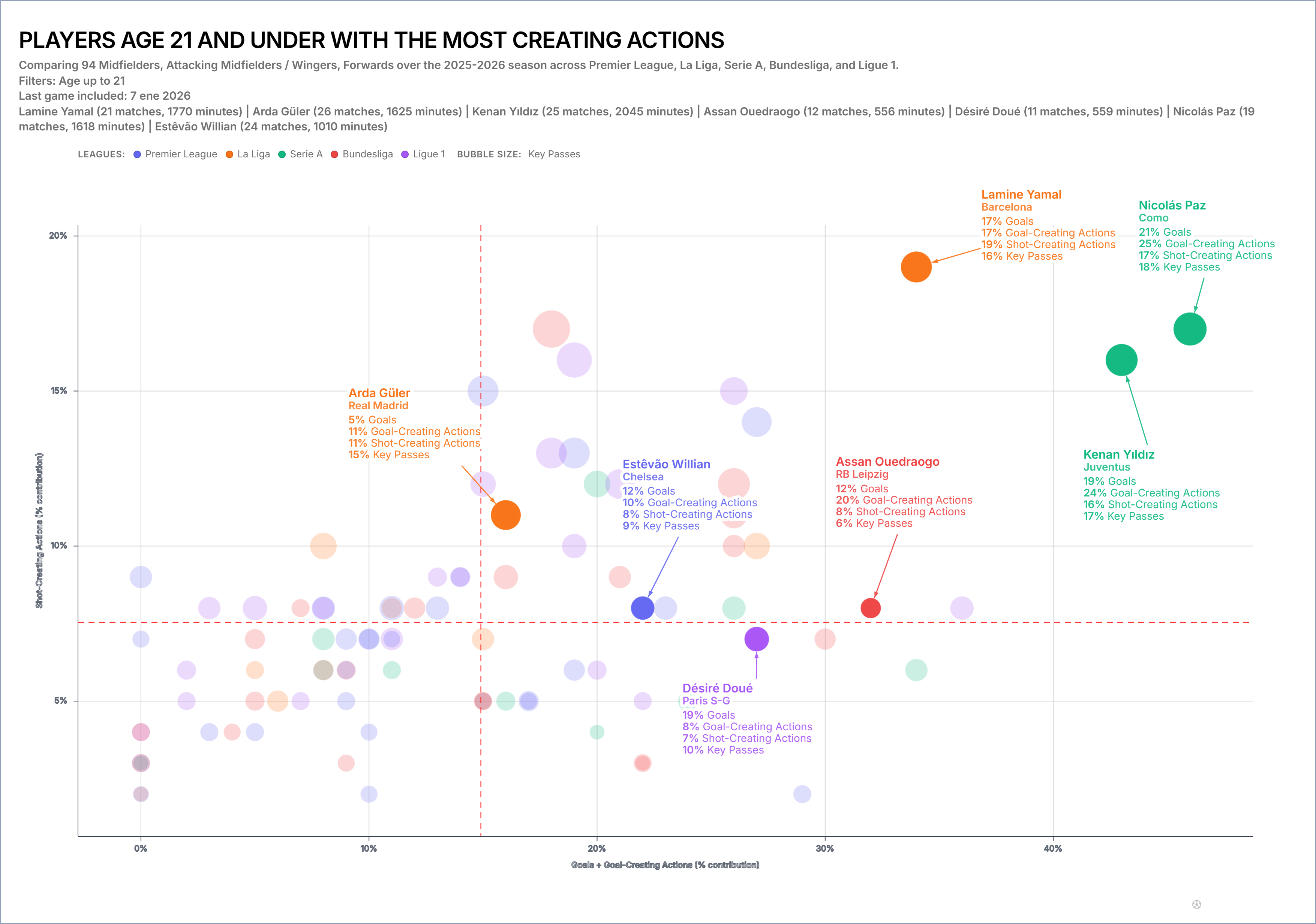
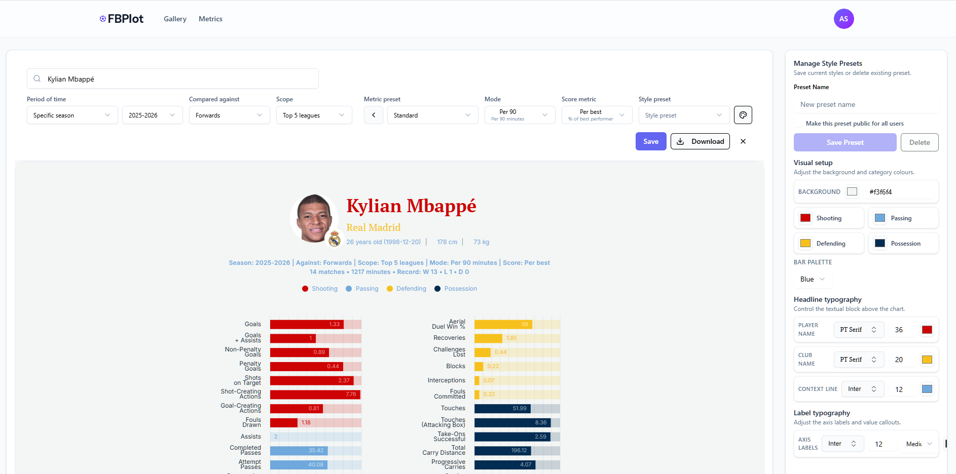
FBPlot makes it easy to build scatter plots that are both analytical and publishable. In a few steps—Select Data → Customise → Appearance → Export—you can compare players across two performance dimensions while adding a third layer of insight through bubble size. The standout capability is flexibility: you can assign multiple metrics to each axis (FBPlot sums them to create a single X and Y value), which means you can define your own composite measures like Goal Impact or Chance Creation without spreadsheets. Then, you can scale bubble radius by any metric (Key Passes, xA, Minutes, Progressive Carries) to reveal context and separate true outliers from statistical noise. Finally, the Appearance controls let you style the chart for different audiences—clean and restrained for scouting reports, contextual and eye-catching for media—so every scatter plot can match the brand and format of the person using it.
 Featured
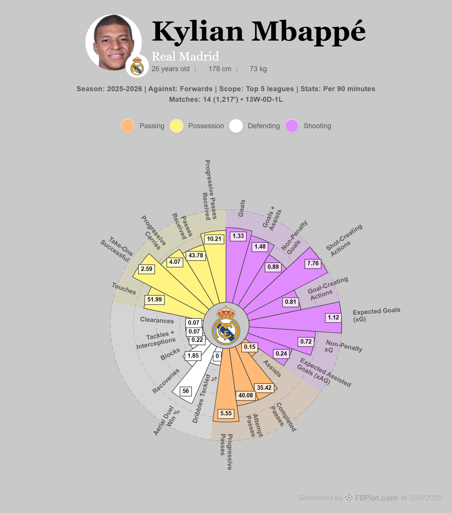
Explore seven historical FBPlot radar palette exports using the same Kylian Mbappé profile, with practical guidance on brand fit, contrast and publishing context.
Learn how to build and read football radar charts using explicit comparison groups, percentiles, units, samples and a compact set of role-relevant metrics.
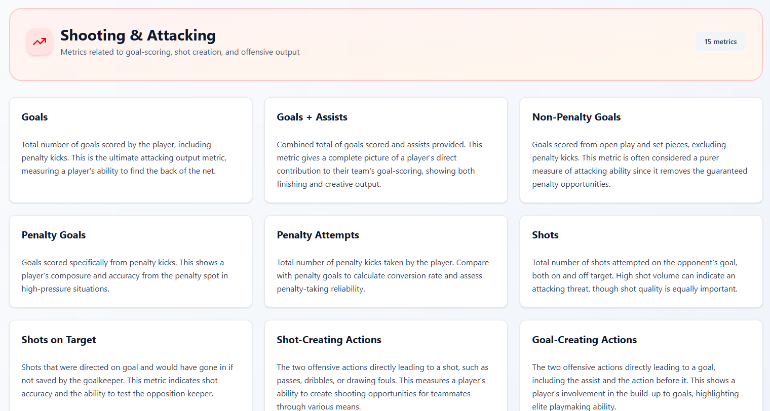
Learn how to interpret football metrics in context: check units and sample, compare similar roles, combine complementary signals, and use the FBPlot Metrics Glossary for canonical definitions.
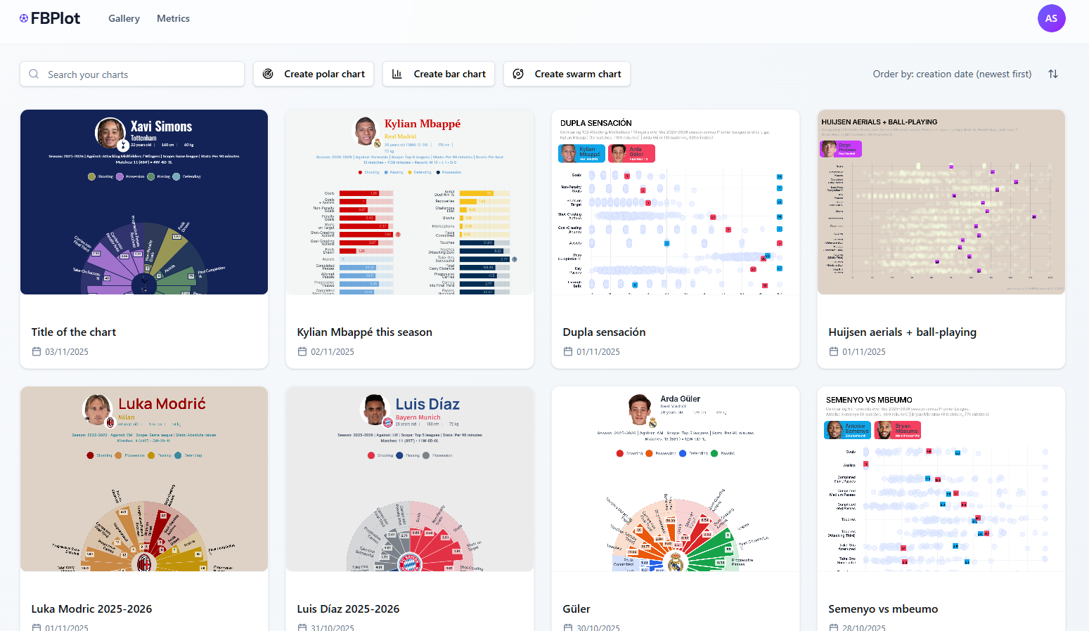
The original introduction to FBPlot and its football visualization workflow.